-
Educating the bluegrass
Brand Development, Design, Wesbite Design
-
KET Education is part of KET Television, and in a sense is their middle name. They produce digital educational tools for the classroom and are Kentucky’s highest-quality source for public affairs and cultural programming. It’s well-known within the homes and schools of the Bluegrass, and a brand that Kentuckians have come to know and trust.
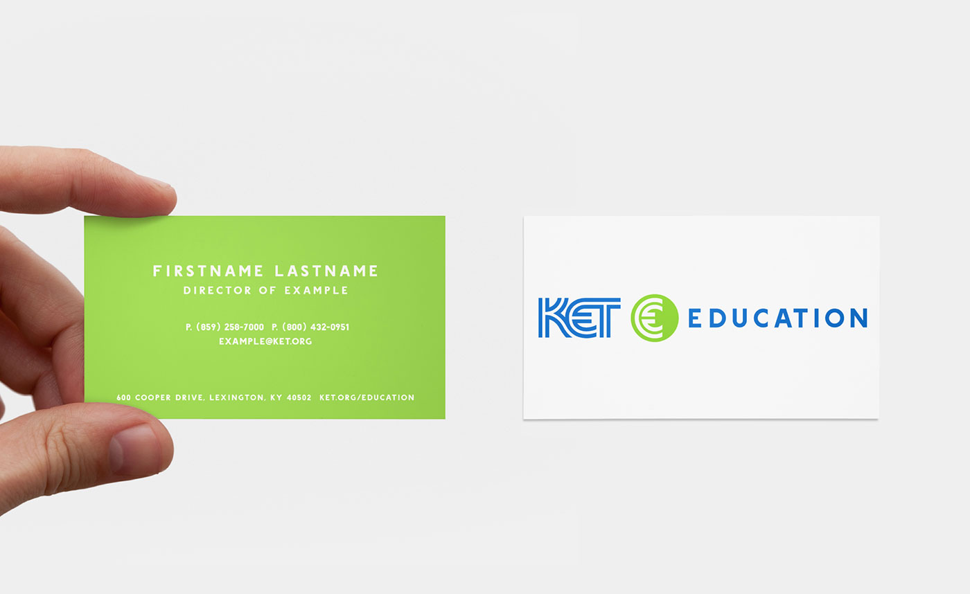
They were in need of a visual language that informed, and inspired a sense of community better than their current system. Oculus was tasked with creating the new visual system, as well as designing their new website.

-

-
Building Kentucky’s largest classroom
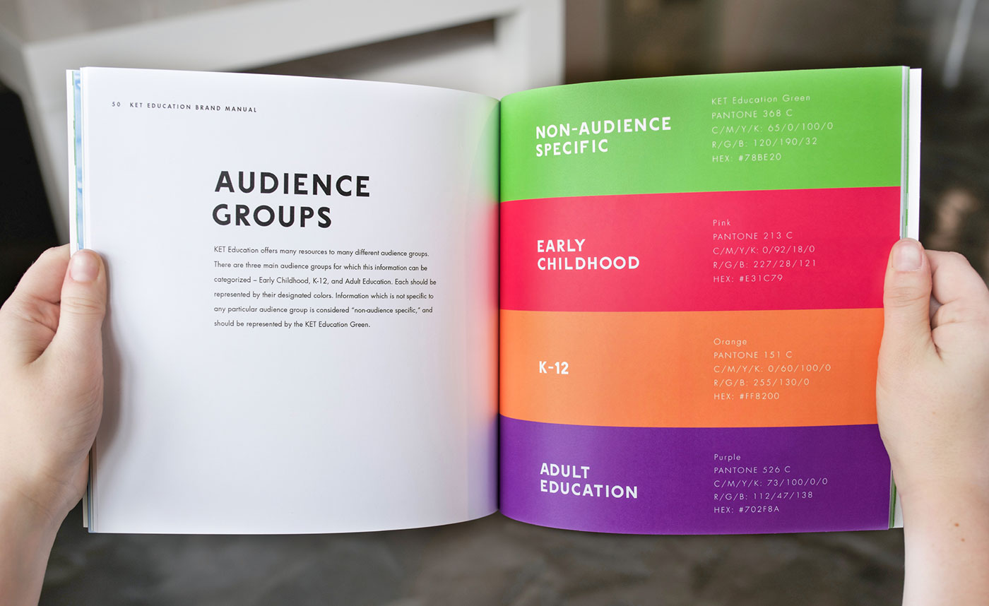
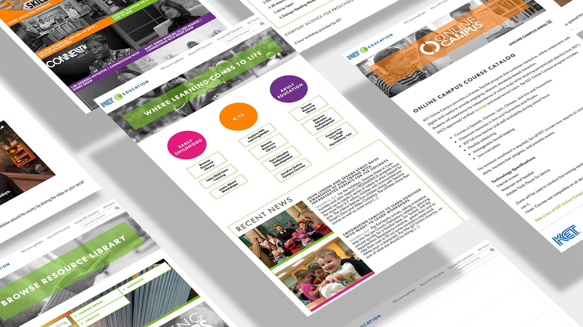
We set out to create a visual hierarchy for their differentiating educational age groups. We accomplished this by using strong, bright colors that could be easily integrated into the various avenues of potential student interactions. From photo overlays, to classroom signs, to hover effects for the website, the goal was eliminate any potential for visual ambiguity. The end result was a website and website lockup that is clear, and easy to navigate so the faculty and students could concentrate on teaching and learning.
-
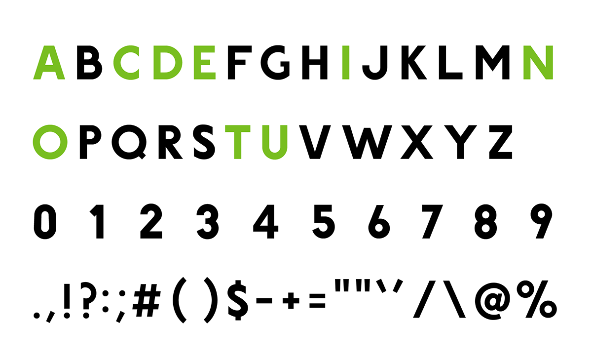
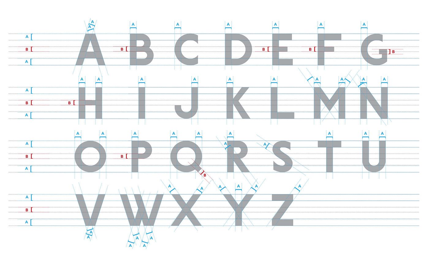
Creating a custom font
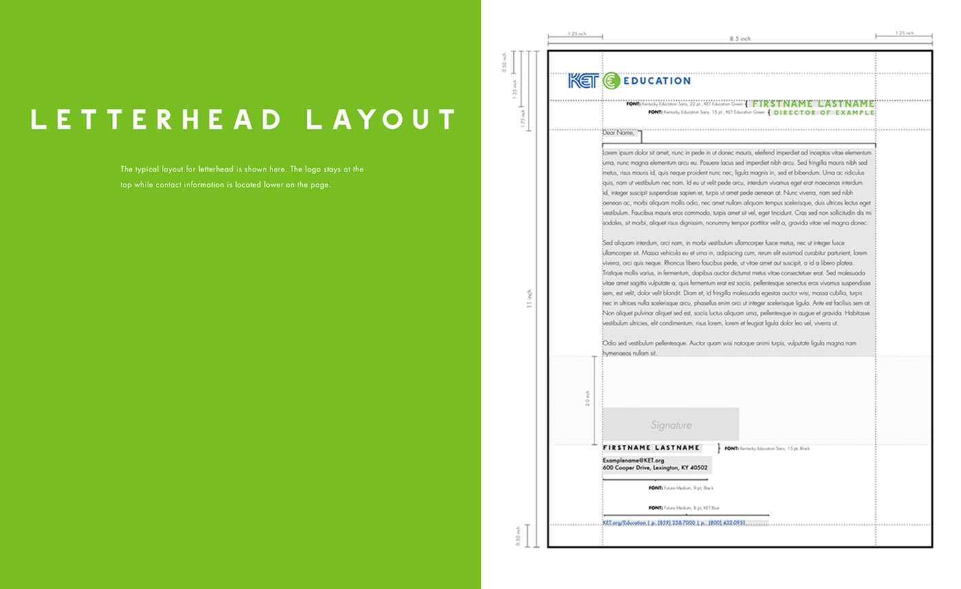
One of the most important aspects of KET’s visual rebrand was a truly custom designed font to call their own. We wanted to help ensure that the KET brand is just as unique as the Bluegrass itself that Kentucky is known for. To do that, we did a deep dive into typeface design of their most used fonts internally. We carefully crafted each curve and point of each letter to form a beautiful, bold font that they can be happy to truly call their own. -
