-
BRUSHING UP ON THE BASICS
Brand Management, Commercial Production, Graphic Design, Print
-
How do you create a brand to live up to one of the top 25 female dentists in the world? We set off to find out, and ultimately settled upon going against the grain of industry peers and paving our own way, just as Dr. Laura Justice did for herself.
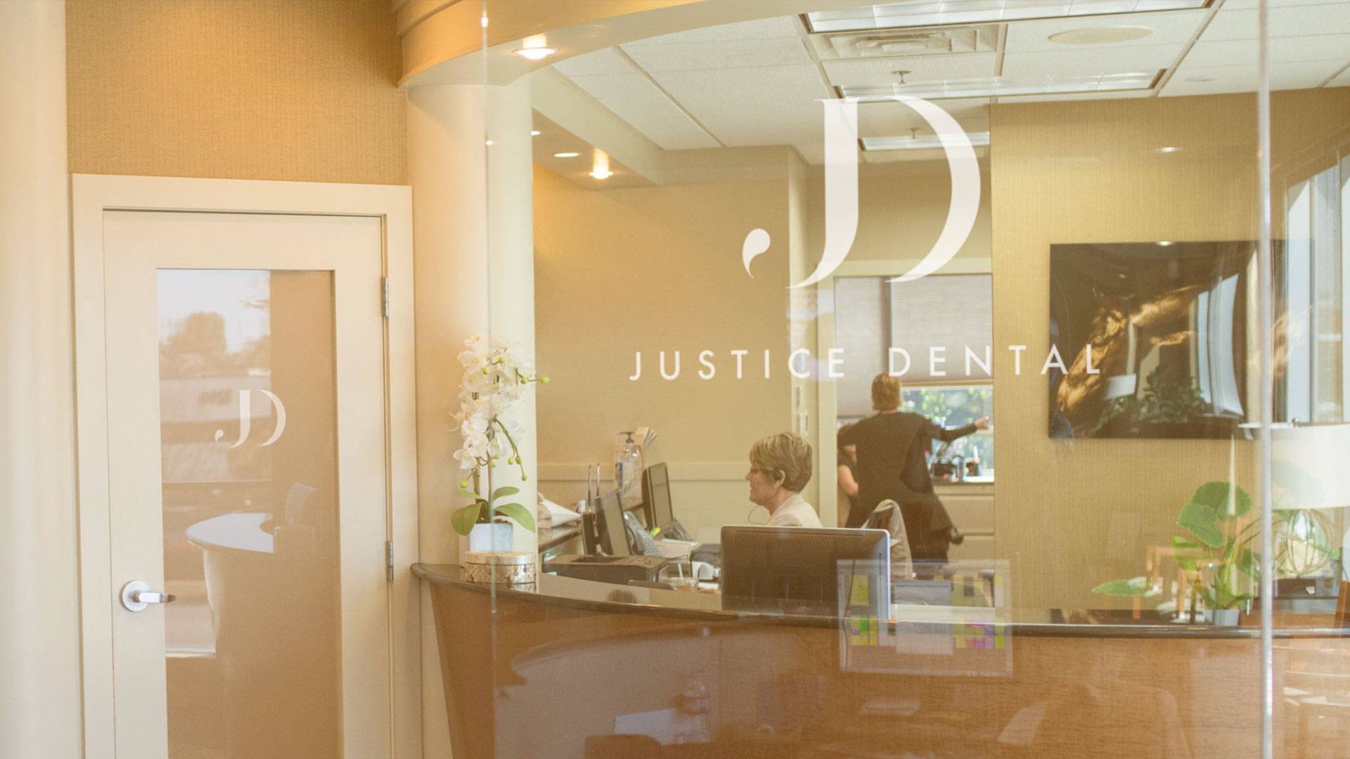
With a massive renovation just being completed, new locations planned, and a partner retiring, Dr. Justice approached Oculus to help formulate a completely new look. We wanted to help push the brand into a high-end, quality feel, very much in the vein of a luxury clothing or handbag company. The staff were ecstatic and jumped right into researching clothing and accessory brands for inspiration, and there might have been a little shopping involved as well...but we won't tell if you don't.

Building a brand that resonates with the consumer starts by getting to the root of who you are, and how you can improve peoples’ lives.
-
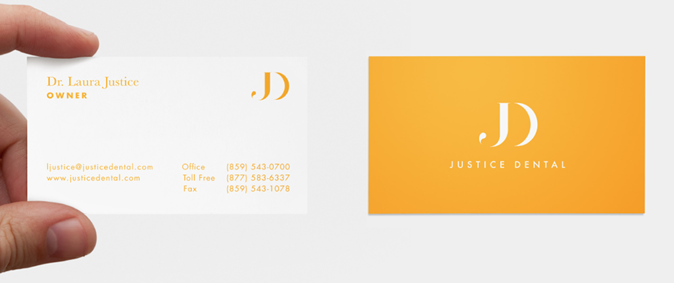
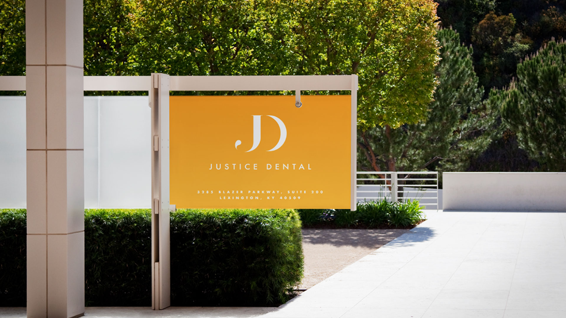
Leaning into a strong name, we set off into what we call “intrinsic ideation,” where we internally incubate countless concepts and variations on what we feel the new logo should be, and what it should say about the client. The result was a logo that encapsulates the strong name, as well as the opulent feel of Dr. Justice’s work and the spa-like environment they provide to their patients…in combination with a bold color that plays against the cool blue trends of most dentists.
-


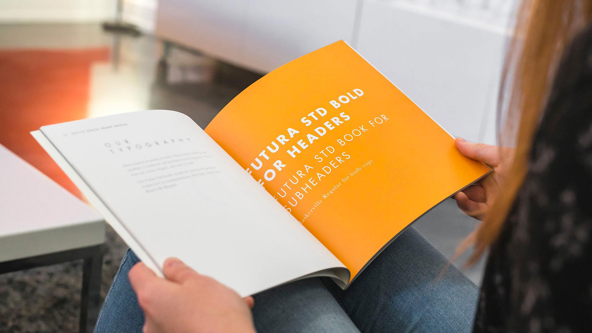
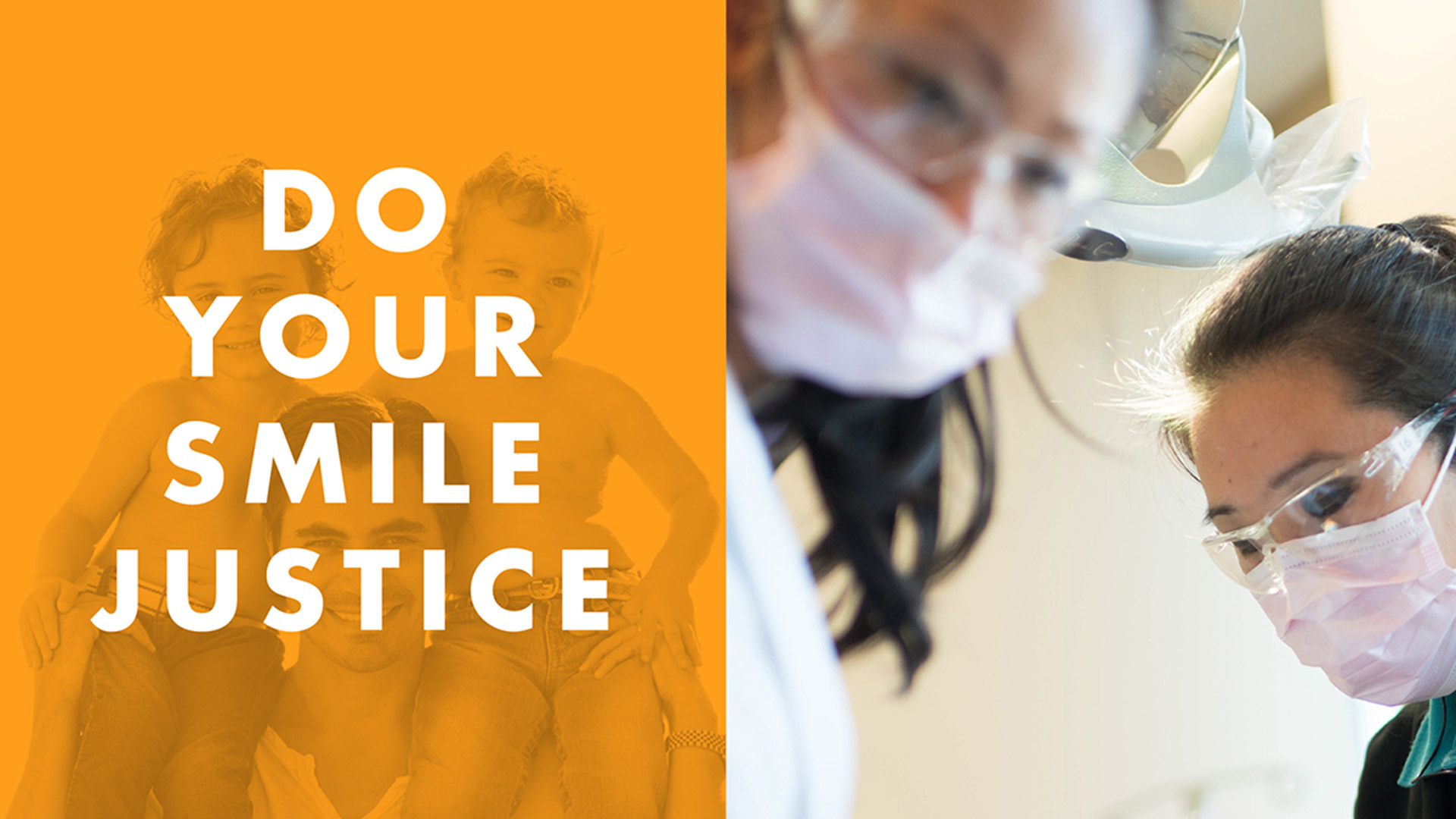
Jumping off from a locked identity, we continued into what we lovingly call a ‘Brand Bible,’ which consists of establishing photo styles, fonts, colors and lockups that can be disseminated to their staff and all their partners. This process is critical for all businesses, and we take great care to ensure a client’s brand is represented well in every scenario. Brand consistency is all that potential customers have to go off of when evaluating decisions for themselves and their families. Being top-of-mind means consistency in brand placement, and consistency in design language.
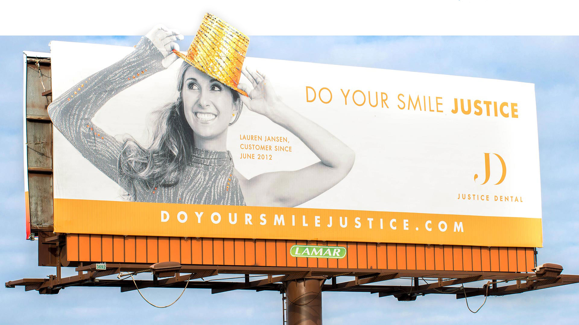
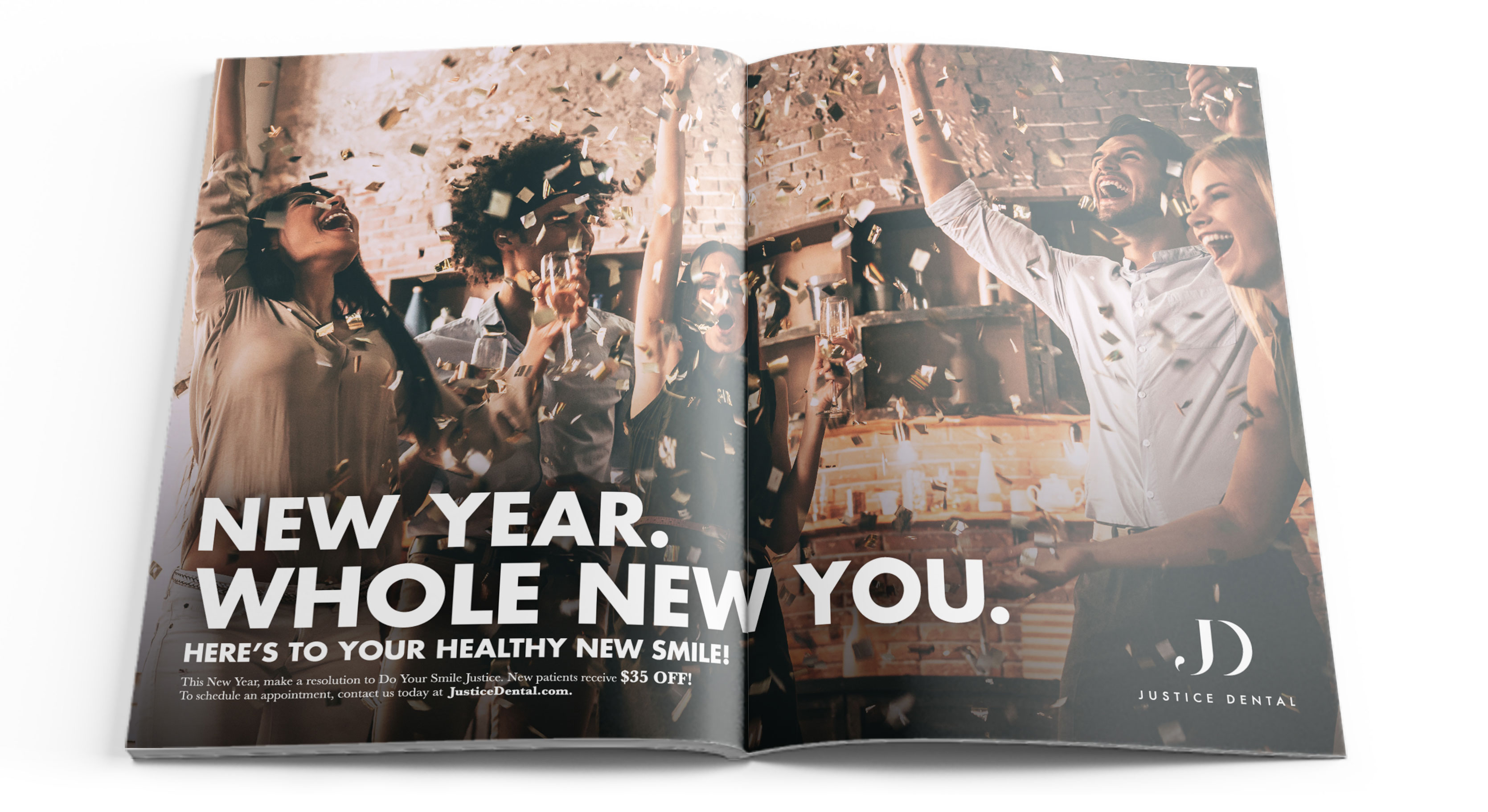
With a locked brand, it was time to translate that identity into a marketing strategy that elevated Justice Dental above their competition.

-

-
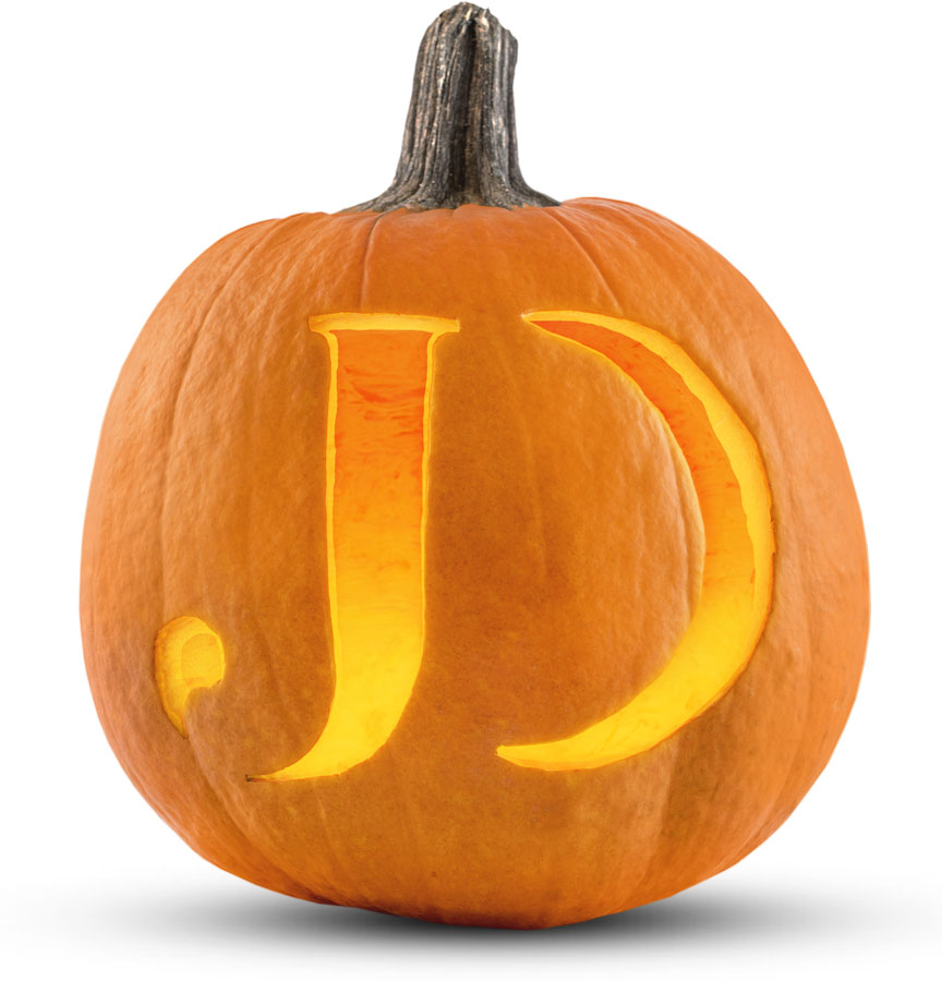
One of the things we really enjoy doing are seasonal appropriate ads. A fun one for example is this carved pumpkin we created for Halloween in which we designed a logo jack-o-lantern of sorts. Ensuring a brand is fresh while piggy-backing on cultural or current-events keeps a company relevant in the minds of consumers, and shows a tenacious and created attitude, ultimately humanizing the company into a relatable entity.


We were honored to be a part of Justice Dental’s new direction, serving at the intersection of artistry and healthcare.


