-
A rebrand? We'll bite
Design, Logo, Photography
-
When a local company that stands as a favorite in the community trusts you enough to come to you for a rebrand, it's both a humbling and energizing experience. When that company just so happens to create some of the tastiest doughnuts around? Well, then it's a no-brainer.
As with any rebrand, we're presented with what can sometimes be a uniquely challenging task: update and modernize without sacrificing the soul of the original design. The goal is to entice new customers to check out the brand without alienating the loyal fanbase that has developed throughout the years.

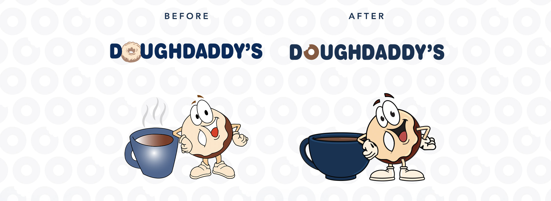
With Doughdaddy’s, we wanted to stay as true as possible to their current visual language by updating the parts that speak the loudest: their doughnut mascot. This friendly little personified doughnut received a subtle, but ultimately impactful makeover. With bolder lines, a stronger and more contrasting color palette, and a little bit more personality and life added to its eyes, we boosted the visibility of the mascot without taking away from any of the previous charm. We swapped out the previous iteration’s coffee cup for a darker color and arranged it at a more visually-believable angle.

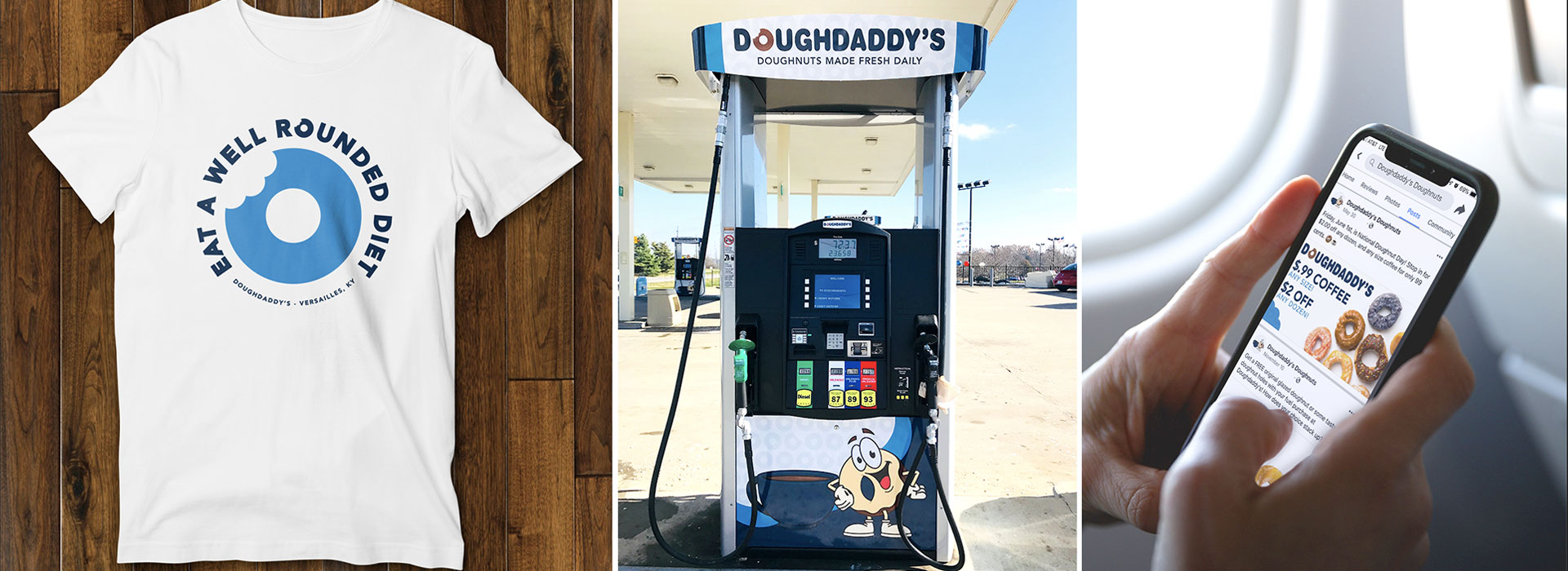
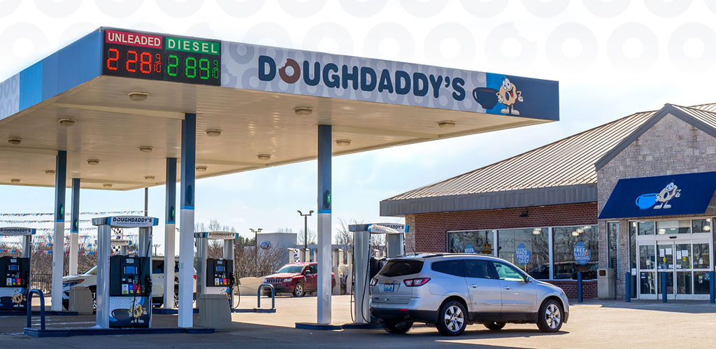
This rebrand brought about other opportunities for updates as well. With the new mascot standing tall, we were able to design and create new collateral for digital signage, printed items available at gas pumps, a brand new canopy wrap for the gas station, employee t-shirts, and more.

This project stands as a delicious example of how a rebrand doesn’t necessarily mean a complete overhaul. An update to branding could be as simple as taking existing materials and updating them for newer clientele. Sometimes, all we need is an update by way of a little bit of polish, a bolder line, and a fresh doughnut (or two).
