-
We Better Design
Design, Logo, Web Design
-
Commonwealth Credit Union, a longtime client of Oculus Studios, is a cooperative, not-for-profit financial institution owned and operated by its members exclusively to meet their financial needs.
Commonwealth CU sets out to better the lives in their communities every single day, so when they reached out for some branding updates, we were excited to dive in.

When you’re part of the Commonwealth CU family, you’re not just a number – you’re an owner. Even better? You’re treated like one. The community impact and outreach that Commonwealth CU carries out is unlike any other, thanks to their numerous contributions to bettering lives. Even their logo subtly reflects this, wherein the bold C shape ripples out into the surrounding areas, mirroring the positive impact that the credit union has on its communities.

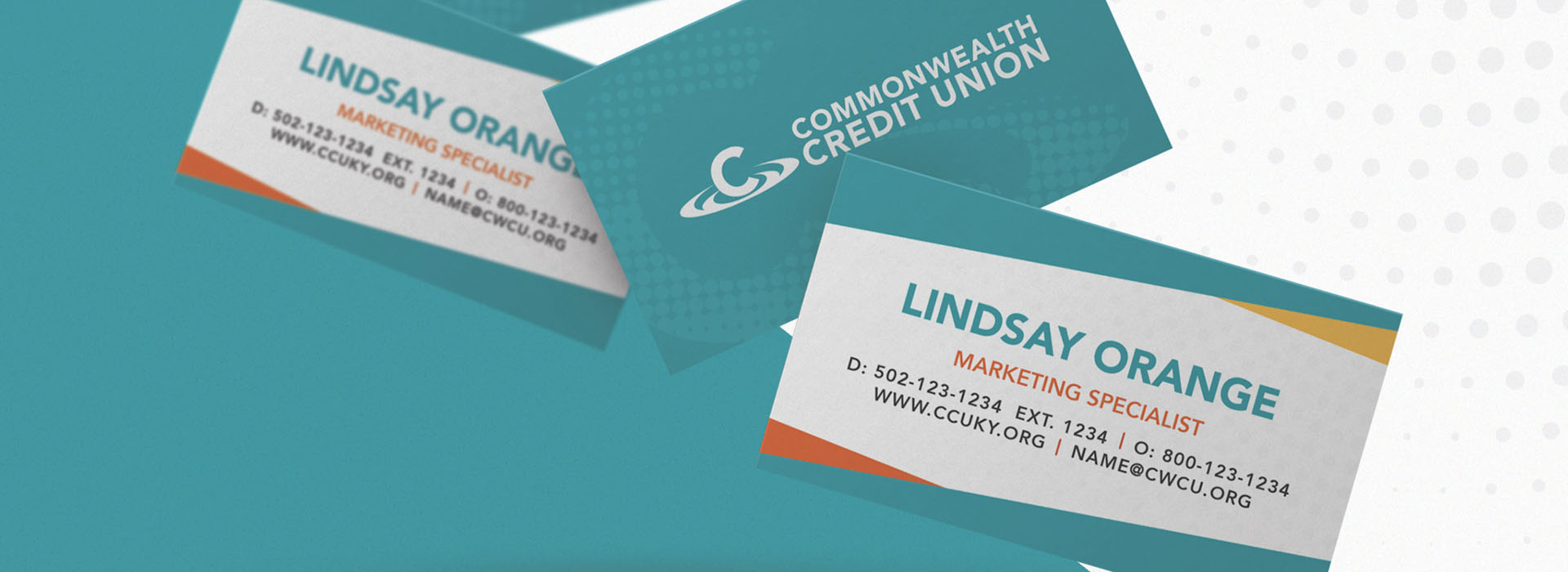
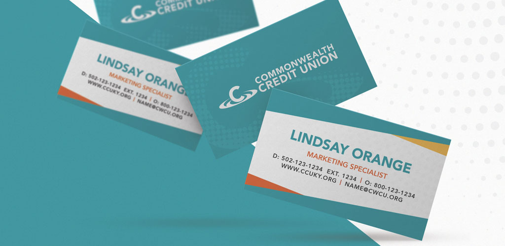
Oculus Studios creates collateral that not only represents but also embodies the credit union’s community-forward philosophy. With bright, striking colors such as teal, yellow, and red, we draw the eye around both digital and printed collateral, livening up and brightening information about loans, savings accounts, membership benefits, and more.

Commonwealth Credit Union’s commitment is to bettering lives, and Oculus Studios strives for each piece of marketing collateral to reflect this goal. Clearly outlining benefits with people-first imagery and easy to both read and understand materials not only cements that this credit union ain’t a bank, it’s also led by the very people who use and depend on its services.
