Auto-Magic
-
GET YOUR MARKETING INTO GEAR
Video Production, Radio Production, Print Design, Social Media
-
Oculus Studios makes marketing your dealership simple. No more working on script ideas or dealing with TV station creative limits. You can finally get a coherent message across all of your marketing platforms without having to stress. We handle the whole creative process, and ensure all of your advertising is co-op pre-approved so you avoid denied claims. Say goodbye to dealing with co-op submission. We've got everything covered from day one.
Our goal is to streamline the process so you can focus on your business. We have the market expertise to ensure your message captures the attention of your audience and gets them into the buying process. Your campaigns are continuously monitored to track performance and to make sure any discrepancies are promptly made good by the vendor so your advertising dollars don't go to waste. Take a look at our video reel above for a better look at the type of creative we can do in all mediums, or scroll down for an overview of the creative work we're doing for dealerships.


You want your marketing efforts to be simple? How about efficient? We marry the two by bringing media creation and delivery into one package. Which means you spend more time on your business and less time reviewing endless station reports, catching invoice errors, tracking digital trends, or making sure your advertising is co-op approved. Our market expertise means we ensure campaigns include only the most relevant media channels to maximize your spend while our vendor relationships mean added value for your advertising in the form of bonus media.
Find your best ROI from traditional media? We create eye-catching outdoor marketing designed to turn heads. We can unify your messaging across billboards, radio, tv, and digital and track how every medium is performing. Oculus Studios gives you a single point of contact and a partner to solve the problems you’re facing.
Doing Logo Design Justice
-
Creating a Brand to smile about
Brand Development, Design, Photography
-
Every company will reach a crossroads at some point with their brand. For Justice Dental, that came with the exit of one of their partners. Their existing brand was entirely built on those two partners, so logos, signs, website, and all branding materials had their old name. They suddenly had to handle what so many companies dread…complete brand restart.
To handle the task of protecting the business during this process, Justice Dental turned to Oculus Studios to create their new logo design in Lexington. This was a complete reboot from logo to name. Our team came on to design a brand new logo, produce printed materials, carry out photo and video sessions with our in-house photographers and videographers, and manage social media for Justice.

The Justice Dental team sought to upgrade their branding with a new logo, and the Oculus team set to work to encapsulate the entirety of the brand within a single mark. View some of our process below, as well as the finalized mark that we moved forward with for the updated branding.


With a new logo comes a bevy of new printed materials, graphics, and collateral. With that in mind, Oculus designed and developed a brand manual specifically for Justice Dental, which would guarantee that materials would be consistent and on-brand for this striking new look. By utilizing step-by-step instructions for how the logo and branding should be represented across a variety of media, we were able to create a comprehensive guide that could easily be followed.


By focusing on the warm interiors and inviting spaces within Justice Dental, we were able to show a side to cosmetic and general dentistry not often seen. Instead of the bland, sterile environment that many know (and some fear) of a typical dentist office, Oculus Studios captured the spa-like experience that Justice Dental cultivates.
Retail Marketing
-
AD-ING SOME SPARKLE
Brand Development, Design, Photography
-
Local Lexington, Kentucky store Sash and Bow, named after its owner Sasha Bowlby, is a high-end boutique that specializes in chic, sophisticated fashion and accessories for women. When it came time for creating marketing in Lexington, she turned to Oculus Studios to create in-store print materials, gift cards, product packaging and more to promote the boutique. We jumped at the chance to create something truly memorable that would stand out as a statement to reflect both Sasha’s shining personality and the items found in her store.
Since Sash & Bow had an already-established logo, Oculus Studios implemented it into a variety of printed materials that would not only help spread the word about the boutique, but would also represent it properly. By utilizing earring and clothing tags, as well as unique gift cards, we were able to create a more interactive way for the logo to be seen and distributed.

An unforgettable gift requires an equally unforgettable gift box. With this thought in mind, it was obvious to us that we would need to meticulously design and produce a custom-made box for Sash & Bow’s shimmery gift cards. Because we went this route, we were able to create a truly one-of-a-kind reversible gift box that would not only be unique, but would invite conversation and further inquiry into the Sash & Bow brand.


Kentucky Ale Marketing Campaign
-
SWEETER SIDE OF BOURBON COUNTRY
Brand Management, Commercial Production, Photography, Graphic Design, Print
-
Alltech reached out to Oculus Studios to develop a campaign for their brand new Kentucky Vanilla Barrel Cream Ale beer release. Oculus jumped at the chance, and quickly set off to develop an entire campaign. Crafting a slogan, conceptualizing tone and message, to professional photography and radio/TV commercials. Additionally, we tackled multiple social media campaigns, print ads and hundreds of variations for a total digital ad blitzkrieg...
First and foremost, we set out to dismiss the idea that vanilla was boring, and instead branded it with a new identity using edgier imagery and vocabulary. Thus was born the 'Delicious' campaign. With extensive photography shoots in both Kentucky and Florida, we covered all of our primary target audiences in both mood and message.

In creating this campaign for Kentucky Ale, Oculus had to craft unique messages for each target audience across seven states. Touching on many different demographics and locations, each campaign had to work across print, video, and digital. The campaign lasted 3 months and reached tens of millions of people across the United States, pushing Kentucky Vanilla Barrel Cream Ale into their number one product by far – within its first quarter on the market.


-
We thrive on these types of projects, allowing each division of our in-house team to shine through their respective expertise. Our copywriters furiously scribbled down possible taglines for print and radio, our video production team took off to the brewery for interviews, and our photographer began dressing the product with fake water droplets and mood lighting for the most dramatic shots imaginable. The end result was a local brewery competing creatively on a national scale. We challenge ourselves constantly to put as much effort into each product as this client put into the nuanced flavors in theirs.
-
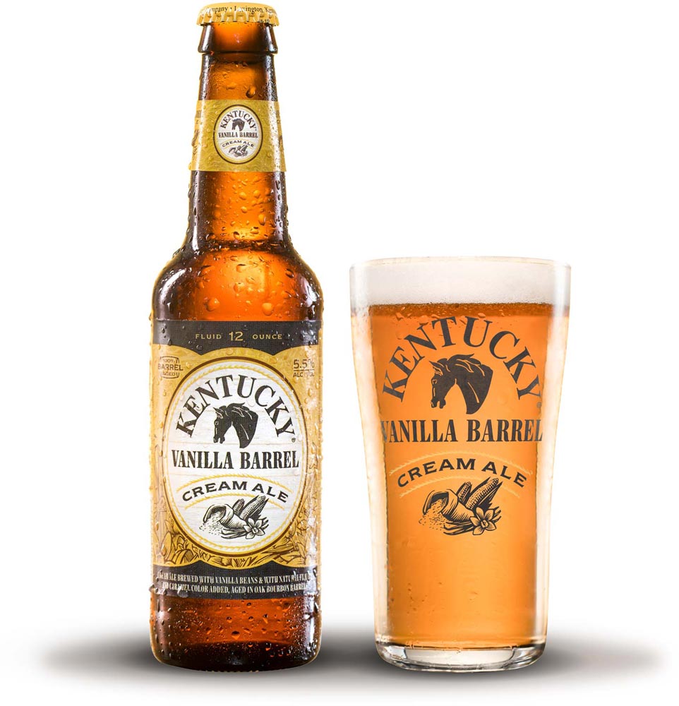


With A Sincere Thank You To Kentucky Ale’s Parent Company, Alltech.
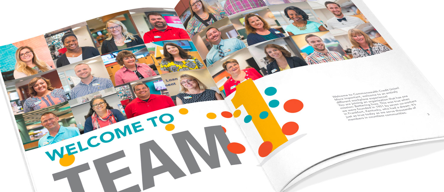
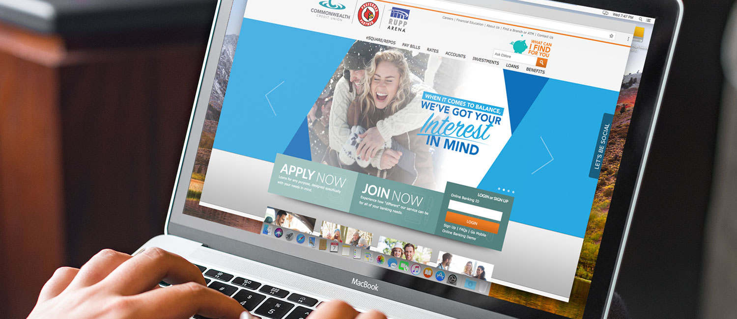
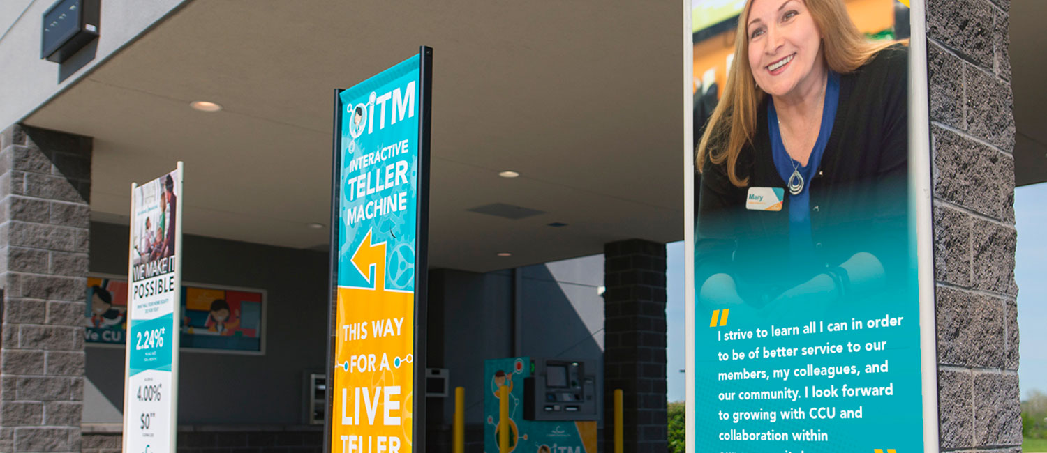
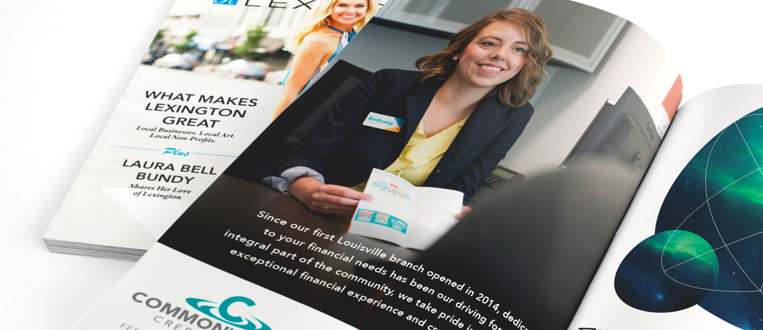
Commonwealth Credit Union
-
FINANCIAL 'MARKETING' INVESTMENTS
Brand Management, Website Design, TV, Radio, Print, Asset Creation
-
Since 2012, Oculus Studios has been partnering with Commonwealth CU to make powerful marketing content that will help them reach new members, as well as inform their existing member base. Commonwealth CU now stands proud at over 90,000+ members. Since working with Oculus, 'CCU' has grown by over 25% and crossed over into the billion dollar mark in total assets.
Since creating the slogan 'We CU Differently™, Oculus has continued to empower Commonwealth as they seek to better the lives of their communities.
The Lexington Philharmonic Marketing
-
STORIES THAT STRIKE A CHORD
Commercial Production
-
The Lexington Philharmonic has been a leader in having multiple organizations work together in order to showcase the immense talent found within the group, and the only perpetual orchestra found within the city. They make an incredible effort to reach out into the community to local universities and colleges to ensure that the creation of local, mature art includes live performances. The Lexington Philharmonic depends greatly on contributions, and we were honored to have helped have a hand in telling their story. Their vision is creating a vibrant, living performing arts organization, being innovative in what they do, how they do it, and touching the hearts and lives of as many people as possible through music and relationships.
One of the other ways the Philharmonic reaches out in a tangible way, is sending member to local elementary schools to perform, interact and answer any questions the children might have. They are an innovative, evolving orchestra that strives to create a vibrant, living performing arts organization that will continue to benefit the city of Lexington for years to come.


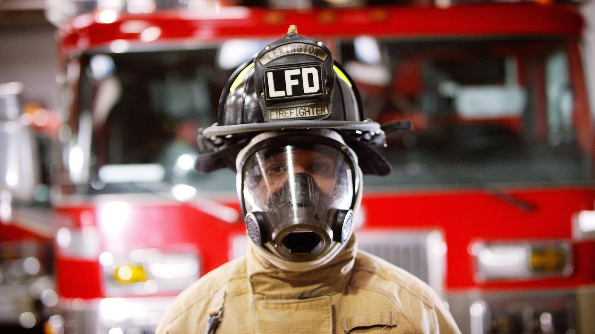
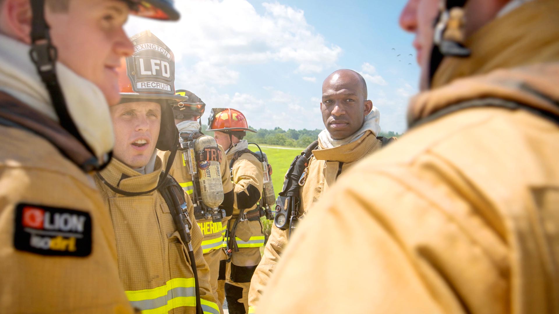
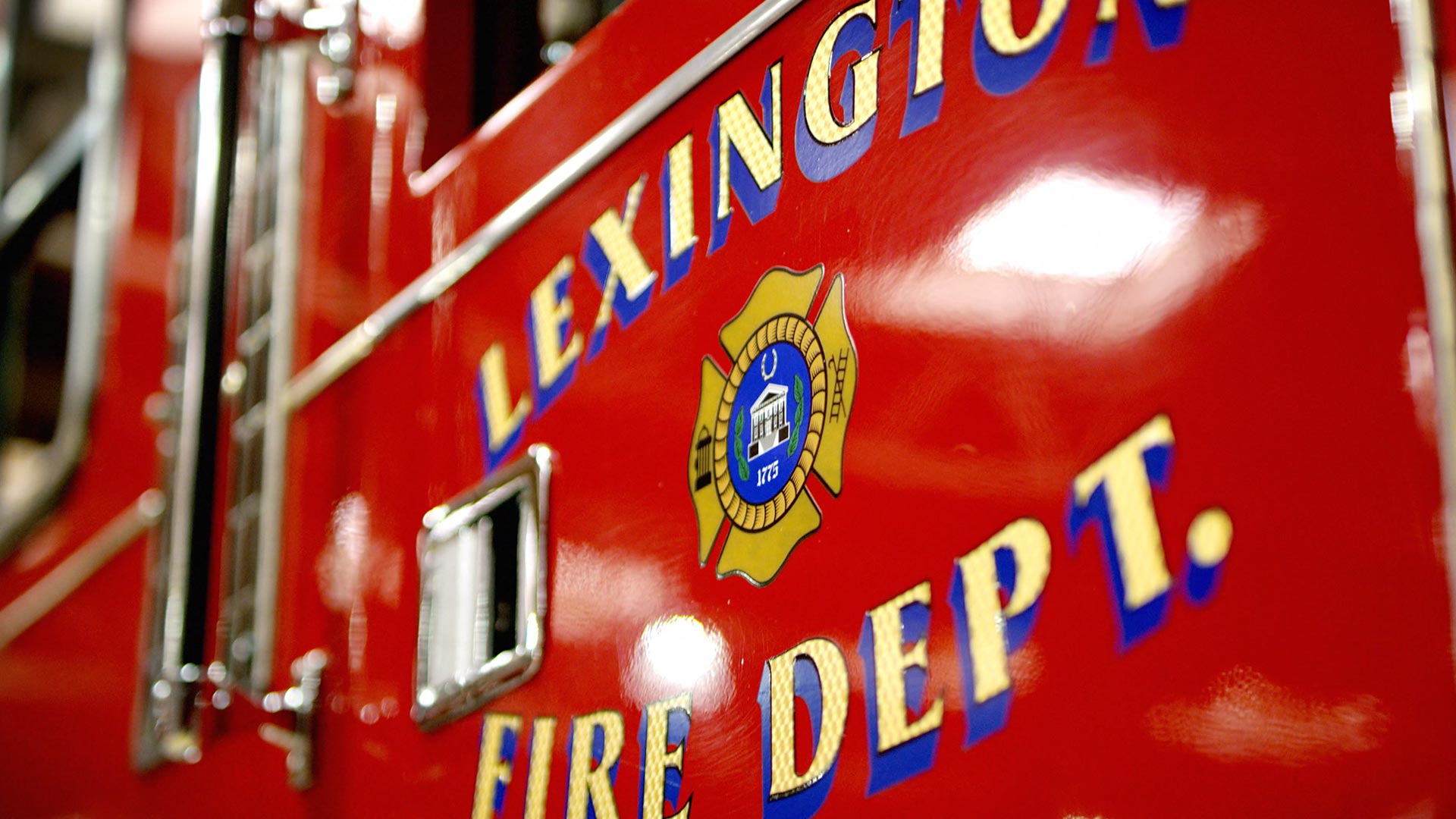
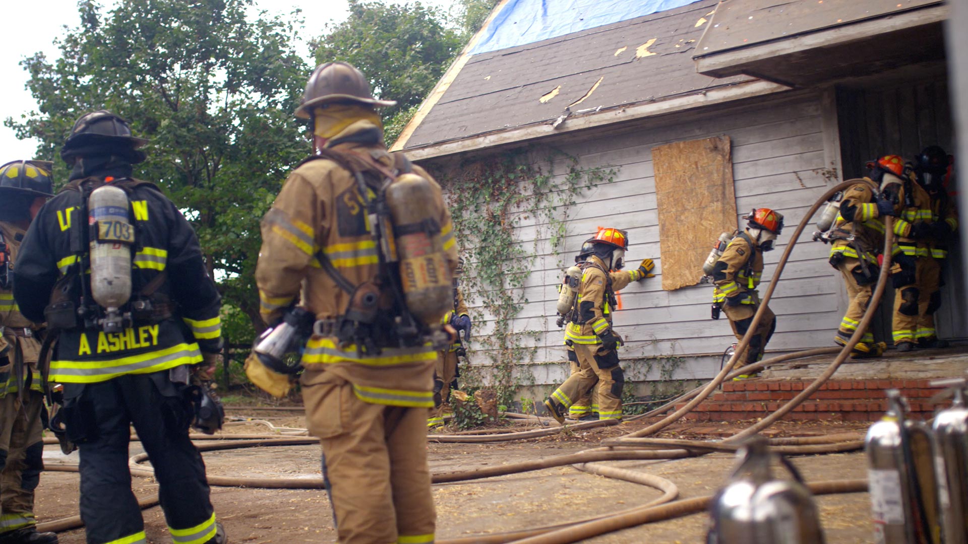
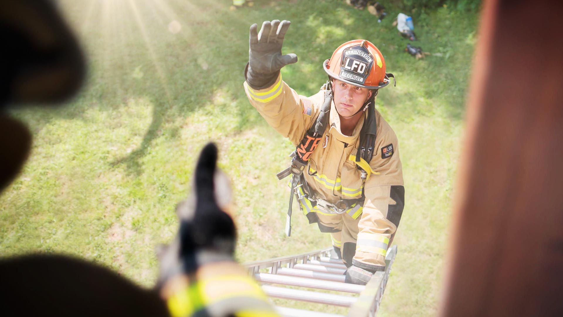
Lexington Fire Department
-
KICKIN' ASH WITH LEXINGTON'S BRAVEST
Video Production
-
We're gonna go ahead and state the obvious right up front...we have the utmost respect and gratitude for what our local fire department does to help protect and save the lives of our community. But did you know there are a lot of crucial things the LFD is involved in that most people aren't even aware of? For instance, not only do they put out fires, but they have their own hazardous materials unit, ice rescues, their own dive team...the list goes on and on. So when they reached out to us to help them create a recruitment video we jumped at the opportunity.
We spent a few weeks with the department, getting to know them as people, the rigorous training they go through, and familiarizing ourselves with some of the challenges they overcome as a group. It was genuinely inspiring, and our admiration for them only grew. The message was clear: the Lexington Fire Department is passionate about people from all walks of life who are willing and eager to start training to join their family. We had a blast crafting this video to show just a small slice of all the amazing things the LFD does. They truly are some of the bravest men and women of the Bluegrass.


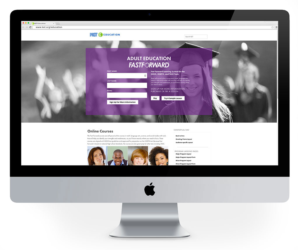
KET Education Brand Development
-
Educating the bluegrass
Brand Development, Design, Wesbite Design
-
KET Education is part of KET Television, and in a sense is their middle name. They produce digital educational tools for the classroom and are Kentucky’s highest-quality source for public affairs and cultural programming. It’s well-known within the homes and schools of the Bluegrass, and a brand that Kentuckians have come to know and trust.
They were in need of a visual language that informed, and inspired a sense of community better than their current system. Oculus was tasked with creating the new visual system, as well as designing their new website.
-
-
Building Kentucky’s largest classroom
We set out to create a visual hierarchy for their differentiating educational age groups. We accomplished this by using strong, bright colors that could be easily integrated into the various avenues of potential student interactions. From photo overlays, to classroom signs, to hover effects for the website, the goal was eliminate any potential for visual ambiguity. The end result was a website and website lockup that is clear, and easy to navigate so the faculty and students could concentrate on teaching and learning.

-
Creating a custom font
One of the most important aspects of KET’s visual rebrand was a truly custom designed font to call their own. We wanted to help ensure that the KET brand is just as unique as the Bluegrass itself that Kentucky is known for. To do that, we did a deep dive into typeface design of their most used fonts internally. We carefully crafted each curve and point of each letter to form a beautiful, bold font that they can be happy to truly call their own. -


MedMyne Digital Animation
-
MYNE-ING CREATIVITY
Illustration, Animation, Sound Design, Asset Design
-
What if there was a world where we could cut lung-cancer deaths in half by preemptively screening those who were pre-dispositioned to it; whether by genetics, lifestyle, or merely environmental factors? With today's healthcare records transitioning from filing cabinets in hospital basements to cloud-based digital databases, one company saw an opportunity to create a machine-learning system to explore the information for previously unrecognized correlations.
MedMyne came to us with an excitement and vigor we just couldn't ignore, and together we set off to create an informative animation that eloquently encapsulates their complex business solutions into a playful and fun video that anyone could easily understand. We began with writing a script and settled on a colorful, soft design language for our protagonist to live in. We had a blast dreaming up such endearing little characters and in the end, the final animation was just what the doctor ordered.

In creating this campaign, Oculus had to craft over 100 unique objects in order to populate the world of each scene. Each one was drawn individually and animated with care to help tell the story. Our goal is to draw your eye to something new you hadn’t noticed before every time you watch it. MedMyne really let us have fun with this project, and as a result, we feel the charm shines through.

-

-
When working with animations, one thing that is of utmost importance is creating a sense of emotion, even if that means through inanimate objects. For instance, in a live-action commercial, the audience can easily relate to the protagonist through his or her body language, facial expression, and eyes. When working with illustrations, it’s always important to exaggerate for clarity. In addition, just like set dressing on a practical shoot adds context and mood, giving those objects their own supportive emotions in animation helps drive the story forward. We end up becoming quite fond of these little characters, even if it is in our own little anthropomorphic way.
-
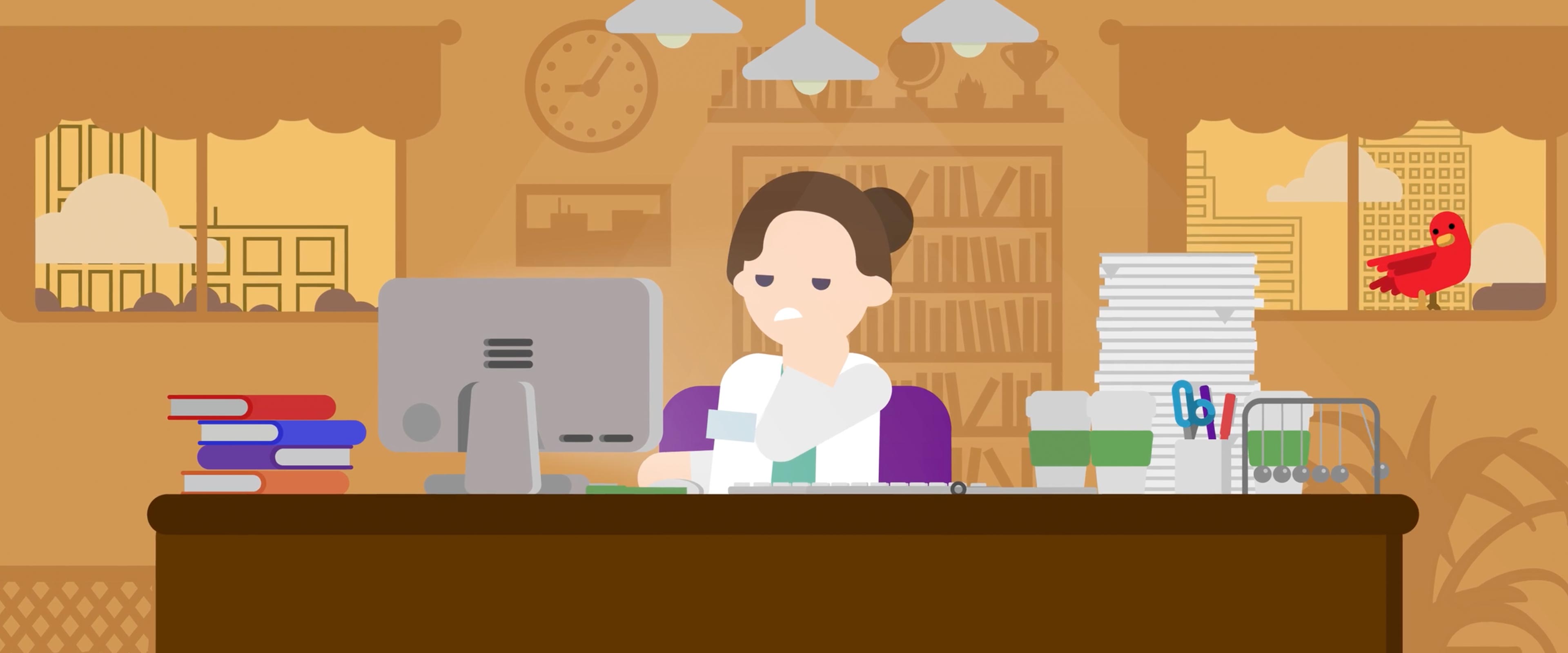
It’s important to us that we create characters we feel most of our target demographic can identify with. In this instance we chose a female who works in a hospital – she’s overworked and stressed about having to input, manage, or search through clinical records. In the video, we can see this is a common thing that is required of her year round, and sometimes requires overtime or burning the midnight oil to complete. In the end, we successfully introduce a problem, identify a fix, and finally show her and the audience exactly how to acquire that fix.
-

We live to tell stories that connect us all as individuals, and love to flex those creative muscles in new directions with each project. But it’s ultimately even more empowering and fulfilling to flex those muscles to help expand awareness of an important, and possibly life-saving, breakthrough. We were honored to be a part of this movement, and hope our part helps spread new awareness about these amazing new machine-learning, and ultimately life-saving advances.
![]()
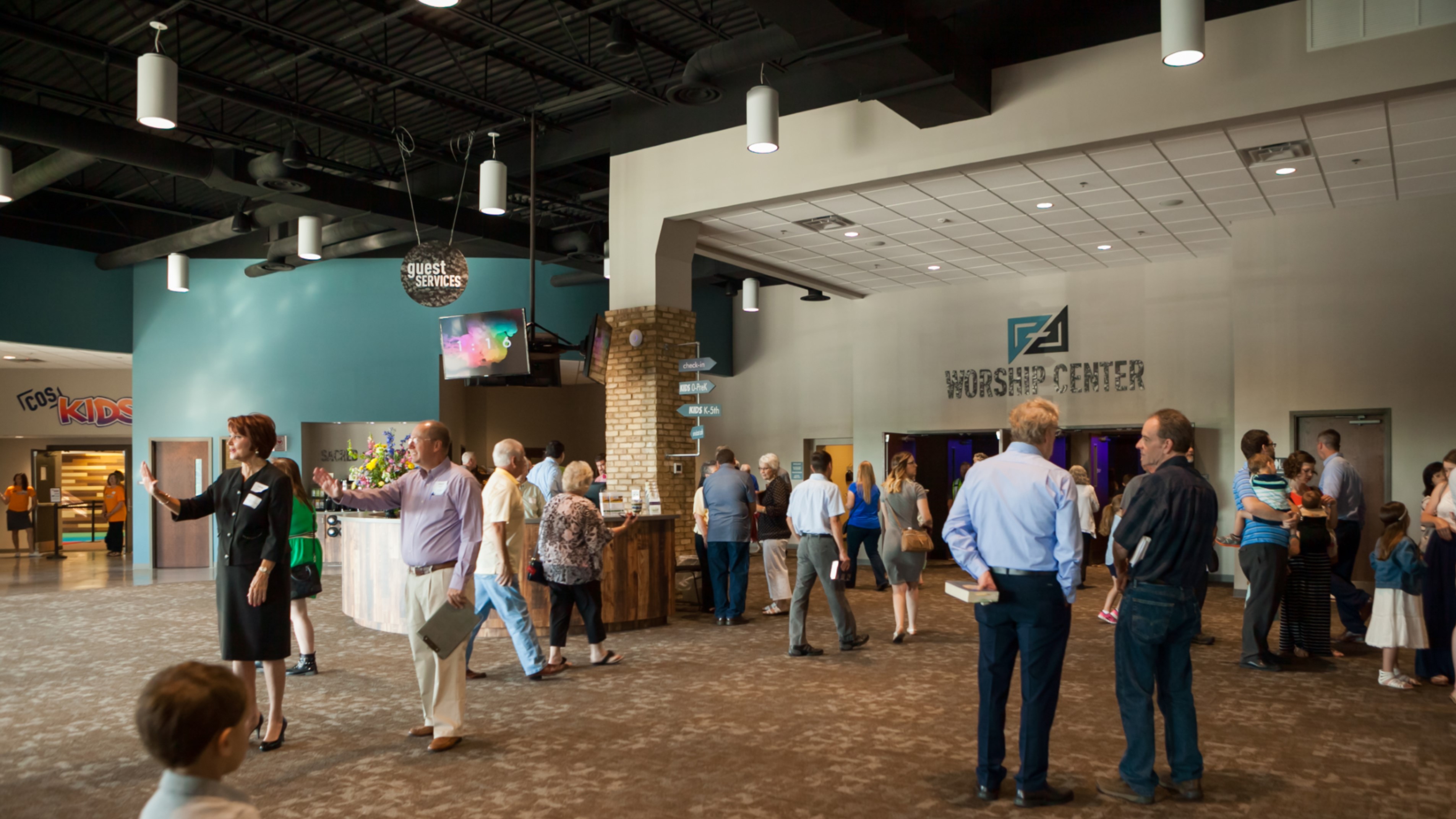
Church of the Savior Brand Development
-
On a mission to serve everyone
Brand Management, Graphic Design, Print
-
Not every logo has implications that span this world and the next, but that was the goal Oculus set when working with Church of the Savior. The brand is built on the message of Acts 13:47... For this is what the Lord has commanded us: I have made you a light for the Gentiles, that you may bring salvation to the ends of the earth.
By focusing on reaching everyone, all over the world, this brand took on a new level of care and inclusiveness.
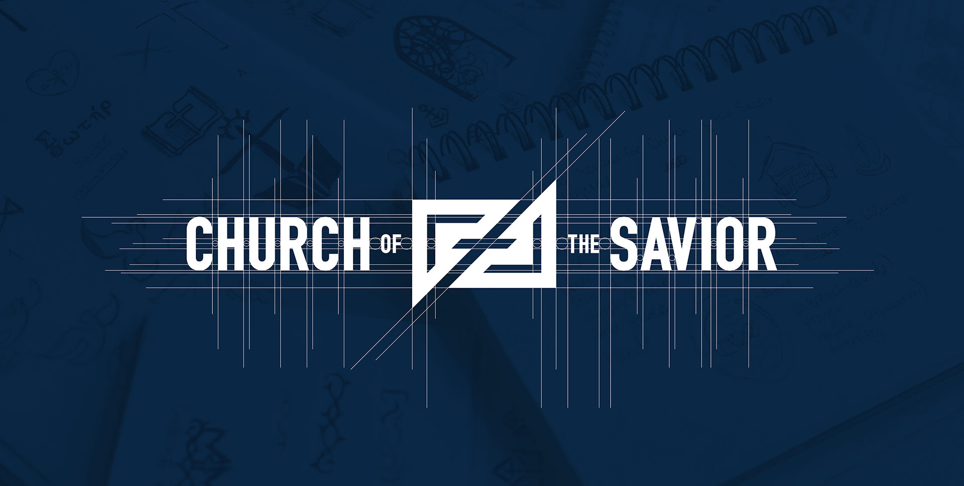
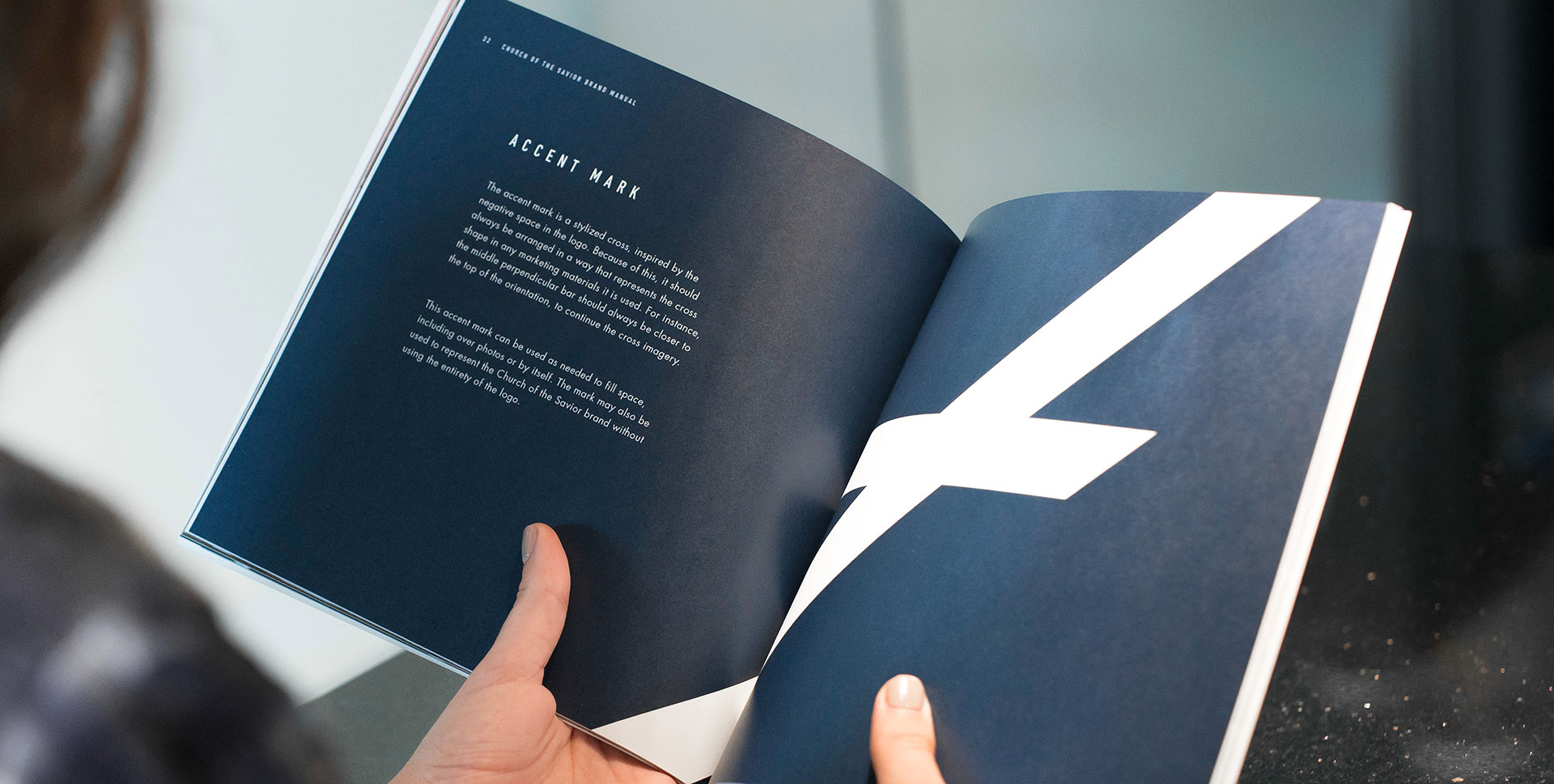
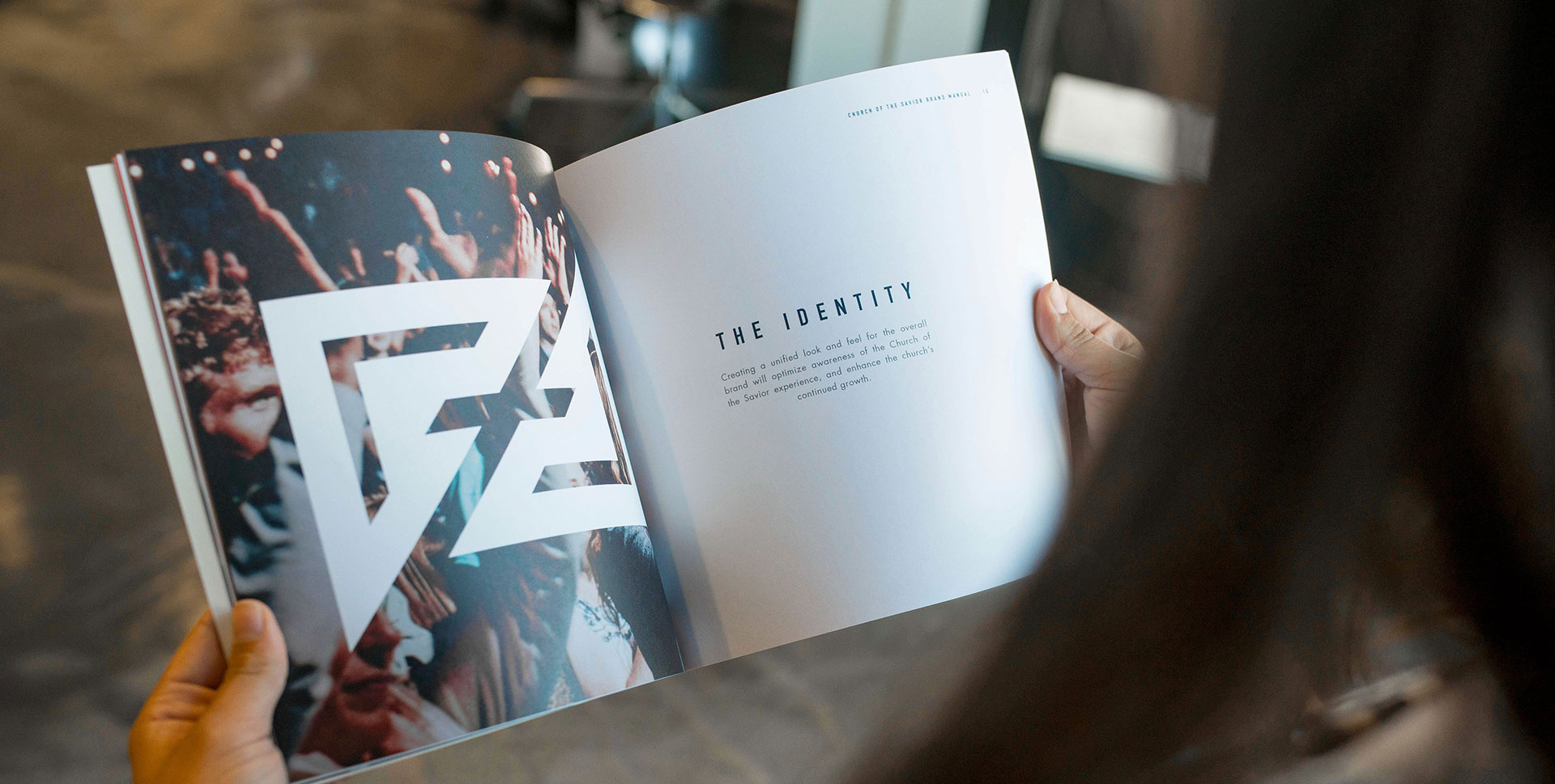
The updated logo uses prayer and outreach, two of the central themes they wanted to focus on, as the main inspiration. To accomplish this, Oculus utilized triangular arrow shapes that come together to create a cross within the negative space. This represents not only the idea of evangelizing, but also of people coming together in worship. The mark strays away from what would be considered a “typical” depiction of a cross with its bold, diagonal lines and strong edges.
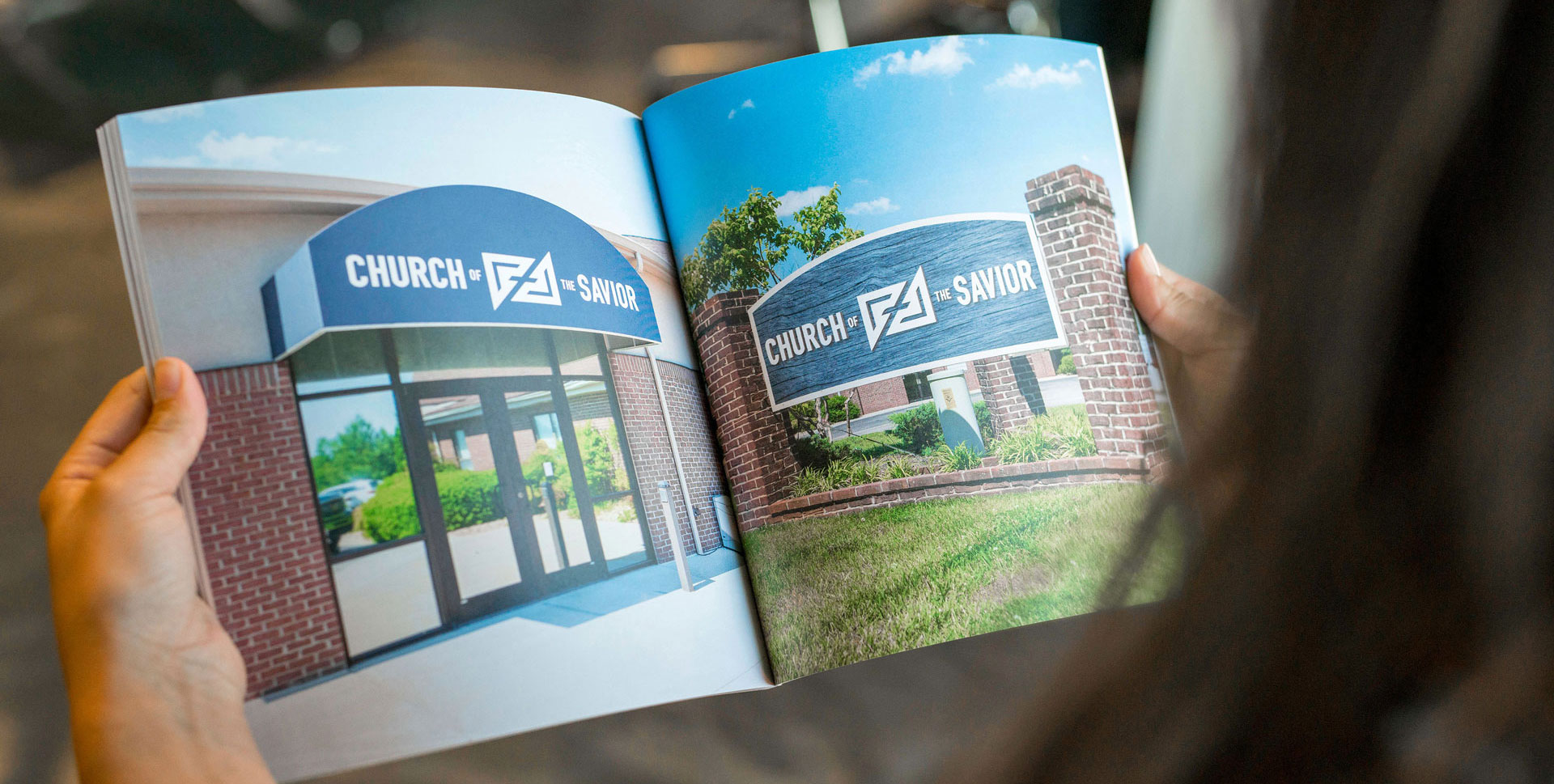
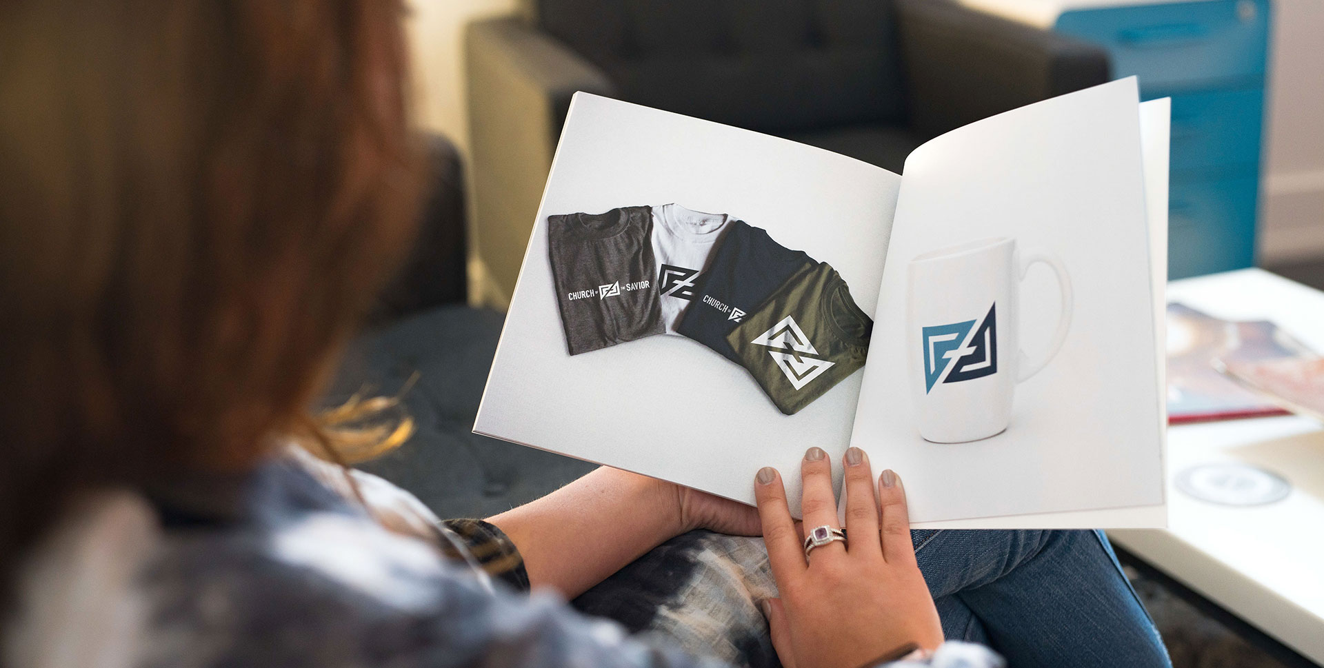
The colors, a combination of a calm, more subdued blue in a light and dark shade, carries a classic feel while still managing to be modern, appealing to both the older and younger generations of the church. This ensures that the color scheme can be integrated into its predetermined environment seamlessly.
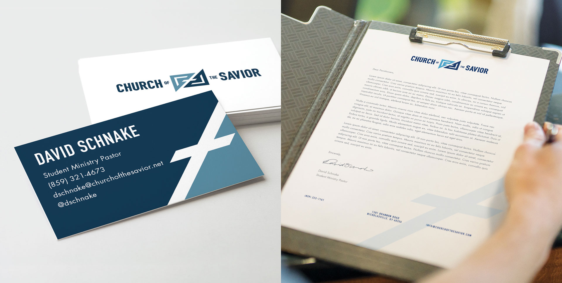
Overall, the brand became more iconic in hopes that it would establish not only an internal identity, but an identity throughout the community as well.