The Prophecy Book Trailer
[su_workflank client=”Zondervan” disciplines=”Motion Graphics Sound Design” creationdate=”November 2010″]Buy On Amazon[/su_workflank]Oculus Studios was hired to develop and create a custom book trailer for Zondervan’s “The Prophecy.” Having been sent only the book cover to work with, the biggest challenge involved creating animated wings from a still image. Capturing the tone and emotion of Dawn Miller’s book was an exciting project that produced a compelling trailer for this intense, emotionally charged supernatural thriller.
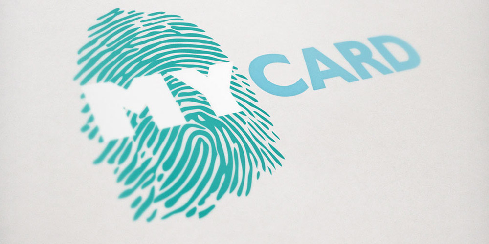
My Card Branding & Tv Commercials
[su_workflank client=”Commonwealth Credit Union” disciplines=”Custom Logo Design Video Production Original Copy Writing Radio Production” creationdate=”November 2012″]CCUKY.org[/su_workflank]
Campaign Branding
Oculus was tasked with branding and creating a marketing campaign for the of launch Commonwealth Credit Union’s new “My Card.” With a target audience of women 30-60, an emotionally centered radio and tv commercial were produced resulting in the campaign being a huge success. Near the end of the process, Oculus created a new logo for a follow up campaign to launch in 2014.
TV Commercials
Radio Ads
[su_sound_cloud_audio]86110685[/su_sound_cloud_audio]Tinker’s Branding and Mobile Website
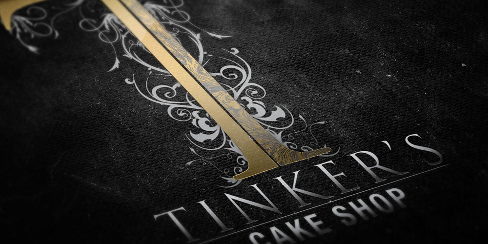
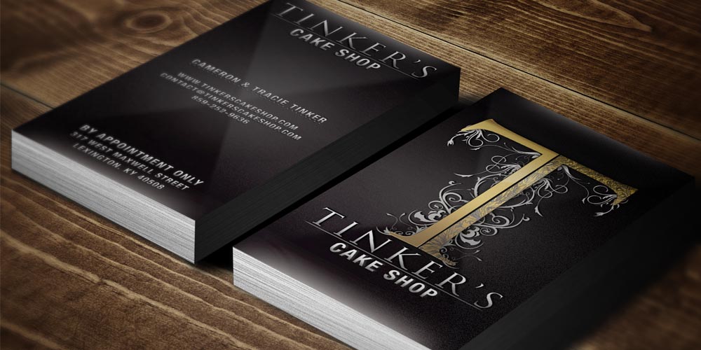
[su_workflank client=”Tinker’s Cake Shop” disciplines=”Custom Logo Design Brand Development Web Design” creationdate=”2011″]TinkersCakeShop.com[/su_workflank]Cameron and Tracie Tinker wanted business cards that put their personality on paper. By creating a custom logo and utilizing complimentary fonts and colors, the cards quickly came to life. A large part of establishing Tinker’s brand identity was finding a font that could carry the brand. By presenting them with similar but unique font choices, they were quickly able to choose their favorite. To bring the font from simply being a letter and transform it into a logo, extensive customization brought it to life. To make the site cost-effective, existing photos were altered to give the same uniform look and feel that can be achieved by a professional photographer in a closed studio. The dramatic difference between the before and after photos truly shows the possibilities that are still available even when budgets are tight.
The Power Of Branding
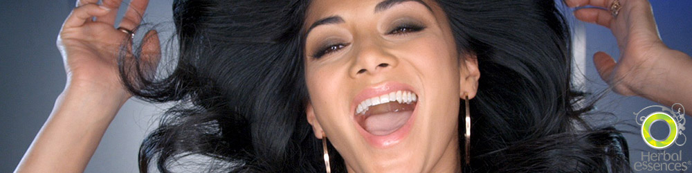
In 1994, Bristol-Myers Squibb had a failing brand in their Herbal Essences haircare line. In one of the greatest turnaround campaigns in history, they took their failing brand and created an overnight sensation. Not by changing the product, but by re-branding the packaging and launching their now famous commercial series. The “Say Yes” campaign featured women getting, well, a LOT of pleasure from using their shampoo. Screaming out, “Yes, yes!” as they used the product along with their tagline, “Totally Organic,” helped cause one of the greatest brand transformations in America. The product was flying off the shelves and propelled the company forward.
So how is it that by 2001 the product was once again failing? Procter & Gamble purchased the brand when buying Clairol, and considered stopping production because inventory was sitting in stores for such long periods of time.
How does a brand go from being a national talking point and favorite product, to almost being discontinued? Standing still. What appealed to the masses in 1994 was tired and old only six years later. Many companies think that branding their business and their advertising is the same as picking the company name: a one time thing. Branding isn’t a one time thing, because the people you’re marketing to are constantly changing in age, taste, and opinion. If you’re targeting women in their 20’s, they aren’t going to stay in their 20’s (although I’m sure they’d love to). After 10 years, they’ve changed. They may have gone from being fresh out of high school, to putting their children in daycare. What matters to them then won’t necessarily matter to them forever. And although there are new people growing into their 20’s, they grew in a different time, with different tastes, styles, and marketing techniques. Since 2008, P&G has completely changed the branding yet again to try and save the label for the second time. With new slogans, bottle design and a popular new face for the brand.
Staying relevant is a game of constant change. You have to look at the generation that is growing up to become your target demographic and change by the time they get there. Coca-Cola was founded in 1886 and since that time, their logo has gone through one revision…one; however the massive marketing machine pushing that logo seems to change with every season. Their materials are ever changing and the identity of the brand is constantly evolving to capture new customers. People will often say, “Why does Coke even advertise?” which is a valid question. Why does this company not just enjoy the fact that they’ve won. When people in the south order a Sprite, they often say, “Can I have a Coke?” as though it’s the official name for any soft drink. The reason they advertise is because all the companies that rest in their share of the market, find themselves questioning why they don’t have any customers just a few, short years later.
Oculus Studios is a very young brand, but even in that time, the company has gone through several iterations of the logo, several changes in the look and feel of the company going out to customers. As you’re reading this now, you’re on a brand new website. The company was founded and launched with a website that lasted only a year, at which time it was completely rebuilt. The iPhone was only a year old and so the target of the site was computers. Five years later, mobile site traffic accounts for 50% of our total site traffic. So rather than resting and standing still, we adapted, we’ve evolved. Rebuilt, and reborn. The site has seen a top to bottom rebuild, as well as our entire company branding.
![]() When it comes to logos in Lexington, Kentucky, standing still is almost common place. But if you ask companies like Hollywood Video or Blockbuster how standing still has worked for them, you can’t. They’re all closed. Branding in Kentucky is as important as anywhere in the nation because people are people. Fresh, new, and modern, given time, become stale, old, and passé. Innovating your company’s identity, finding the look for the next chapter of your business, is what sets you apart. Experience success in the marketplace with your branding doesn’t mean you’re done, it means you take what worked, and keep moving forward. Approach your brand like you do your work, constantly refining and improving.
When it comes to logos in Lexington, Kentucky, standing still is almost common place. But if you ask companies like Hollywood Video or Blockbuster how standing still has worked for them, you can’t. They’re all closed. Branding in Kentucky is as important as anywhere in the nation because people are people. Fresh, new, and modern, given time, become stale, old, and passé. Innovating your company’s identity, finding the look for the next chapter of your business, is what sets you apart. Experience success in the marketplace with your branding doesn’t mean you’re done, it means you take what worked, and keep moving forward. Approach your brand like you do your work, constantly refining and improving.
So many companies are afraid to touch their branding, afraid to change their logo or even their colors. They tell us, “This is what people know, if we change it, how will people recognize us?” This always seems like any oddity to us. If people “recognize” you, but don’t do business with you already, what good is your identity? Will changing your brand cause you to lose your entire existing customer base? You still drink Starbucks don’t you? They have gone through major branding changes from their founding to today. What people should be more concerned about is not being noticed; Being bland, stale, invisible. Don’t let your old branding prevent you from capturing the next generation.
The most important element of your brand is determining how effective it is vs. how harmful it is. If you feel like the logo is outdated, misrepresents your company, or pales when compared to your competition, don’t be afraid of progress. With caution, careful planning, and quality creative, launching the next phase of your brand can help you reach new customers and new heights. If you read “Herbal Essences” and think of their 1994 commercial and not that shampoo currently in your shower, you’ll see how dangerous standing still can truly be.
The Anatomy Of An Ad: A Case Study Of “Stop. $ave.”
Last summer, Commonwealth Credit Union reached out to Oculus and asked us to take a look at a service they offered called “Stop ‘n Save.” They wanted to start their quarter with a TV campaign to bring some much needed awareness to it. So we sat down to get a sense of what it was and how it was beneficial to their members and customers. Basically, their team will analyze all of your current financial responsibilities and put together a financial package which utilizes their various offerings to create a debt and bill consolidation plan to save you money.
First and foremost, we had to work on their existing branding. There were quite a few of red flags in its current phase: The name sounded too much like a gas station, the graphics were rasterized stock images at low resolutions, the fonts weren’t cohesive or appropriate etc. We quickly steered away from it and pitched simply “Stop. $ave.” Short, simple concise.

With a warm reception, we moved on to the main event: A broadcast television ad. The word “stop” really resonated with us, and we explored the exhausting feelings of daily business. Ultra-fast paced, loud, and just generally too busy, nobody has time to take off and re-examine bill pay. And if they do have time, that ain’t what they are going to want to do with it. So we wanted to explore the notion of freezing everything, and moving from cramped cities to wide open, relaxing country. We needed to attach serenity, kindness, and a real sense of genuineness to the image of Commonwealth Credit Union and their employees, as that’s what we had noticed when visiting their branches.
With this concept locked, we proceeded to draw up storyboards and bounce ideas of camera shots back and forth. In conjunction, musical cues were being developed to help push home the feeling and mood we were aiming for. Once locked shots were approved, we developed a rough animation of each frame to further explore camera movement and mood. This process also helps in knowing how much is going to be practical, in camera elements, and which ones will be modified or created digitally in post.
Commonwealth CU delightfully approved of the storyboards, and Oculus jumped straight into production. We had found a perfect street in beautiful downtown Lexington, Kentucky right at the corner of Short and Lime. We knew that the transition from the city to the field was key, so we used an intersection in which no streetlights currently were, so that we could have complete flexibility in post production. This allowed us to take multiple pictures of a streetlight and stitch them all together in Photoshop. With a touch of motion blur and a splash of color correction, the compositing came together without a hitch. Careful planning and execution with some luck from the weather gods paid off and we were able to do quite a bit of touch-up in post.
Commonwealth Credit Union was thrilled with the results and the campaign helped propel the service beyond their competition, as well as CCU’s brand image as a whole. This campaign provided a strong first foot forward for brand uniformity, and a clear idea of what the service represented.
And here is the final ad:
Lexington advertising & marketing agency, Oculus Studios is the most Awarded ad Firm at Addys For 2nd Year Straight
Lexington advertising agency, Oculus Studios, swept The American Advertising Federation (AAF) ADDY® awards with an unmatched 35 awards in all, including an amazing 14 GOLD ADDY® awards, including the Prestigious Ralph Gabbard Television Excellence Award! The awards are attributed to a range of services, including web design, commercials, motion graphics, radio and print. This is the second year Oculus has been the most awarded company in the show, last year winning 37 ADDY awards overall, including regional and even national ADDYs.
As the “Unifying Voice for Advertising,” AAF is the oldest national advertising trade association representing all segments of the industry.
Oculus Studios is honored and thankful for the recognition by the AAF. We work very hard for our clients to create lasting messages and memorable brands.
Lexington Advertising & Marketing Agency, Oculus Studios, Racks Up 37 Addy Awards
Although Adele dominated the Grammy Awards this week, Lexington Advertising Agency, Oculus Studios, swept The American Advertising Federation (AAF) ADDY® awards with an unmatched 37 awards in all, including an amazing 11 GOLD ADDY® awards, 4 of which were District and even 1 National ADDY®! On top of that, Oculus Studios won the Prestigious Ralph Gabbard Television Excellence Award!
As the “Unifying Voice for Advertising,” AAF is the oldest national advertising trade association representing all segments of the industry. This years ADDY® awards were judged by design professionals from Indiana and Tennessee.
Oculus Studios is honored and thankful for the recognition by the AAF both locally and regionally. We work very hard for our clients to create lasting messages and memorable brands.
Oculus Studios won the following ADDY® awards at the 2012 awards banquette:
RALPH GABBARD TELEVISION EXCELLENCE AWARD – DoubleStar “Aim Higher” Television Ad
NATIONAL ADDYS
- Silver National ADDY – Unlimited Teaser Trailer
DISTRICT ADDYS
- Gold ADDY – Redemption Teaser Trailer
- District Gold ADDY – Redemption Teaser Trailer
- District Silver ADDY – Unlimited Teaser Trailer
- District Silver ADDY – Oculus Studios “Raising The Bar” Television Ad
LOCAL GOLD ADDYS
- Gold ADDY – Unlimited Teaser Trailer
- Gold ADDY – Unlimited Teaser Trailer
- Gold ADDY – Redemption Teaser Trailer
- Gold ADDY – DoubleStar “Aim Higher” Television Ad
- Gold ADDY – DoubleStar “Aim Higher” Television Ad
- Gold ADDY – DoubleStar “Aim Higher” Television Ad
- Gold ADDY – DoubleStar “Built For When It Counts” Television Ad
- Gold ADDY – DoubleStar “Built For When It Counts” Television Ad
- Gold ADDY – DoubleStar “Built For When It Counts” Television Ad
LOCAL SILVER ADDYS
- Silver ADDY – Oculus Studios Business Card
- Silver ADDY – Oculus Studios Website
- Silver ADDY – Oculus Studios “Raising The Bar” Television Ad
- Silver ADDY – Raising Canes Mobile Website
- Silver ADDY – Redemption Teaser Trailer
- Silver ADDY – DoubleStar “Built For When It Counts” Television Ad
LOCAL BRONZE ADDYS
- Bronze ADDY – Oculus Studios Business Card
- Bronze ADDY – Oculus Studios Website
- Bronze ADDY – Redemption Teaser Poster
- Bronze ADDY – Unlimited Teaser Trailer
- Bronze ADDY – Jake’s Cigar Bar “Let No Man Put Asunder” Magazine Ad
- Bronze ADDY – Jake’s Cigar Bar “Mix” Magazine Ad
- Bronze ADDY – Jake’s Cigar Bar Website
- Bronze ADDY – Jake’s Cigar Bar Website
- Bronze ADDY – O’donnell Family Dentistry Website
- Bronze ADDY – Oculus Studios “Raising The Bar” Television Ad
- Bronze ADDY – Oculus Studios “Business As Usual” Television Ad
- Bronze ADDY – Oculus Studios “Business As Usual” Television Ad
- Bronze ADDY – Oculus Studios “Business As Usual” Television Ad
- Bronze ADDY – Oculus Studios “Business As Usual” Music
- Bronze ADDY – Oculus Studios “Raising The Bar” Music
- Bronze ADDY – DoughDADDY’s Doughnuts Theme Music
Lexington advertising and marketing: “Your Business. Out Loud.”
We love Kentucky, with Lexington in particular holding a special place in our hearts. We were born here, both personally and as a business. We love the rainy springs, warm and humid summers, beautiful orange falls, and snowy winters. It feels as if on most levels that Lexington has the perfect balance of meaningful and lasting tradition, fused with modern technology and culture. And in a way, that reflects Oculus Studios’ approach to business: We strive to remain on the cutting edge, but embrace traditional ways of client relationships, with an emphasis on custom, unique work that reflects our clientele’s needs more fully than their competitors.
For us, the landscape of Lexington advertising is divided into two categories; free and paid. Of course “free” is never really free, but is perceived by many as the best deal in town. Basically, local TV stations and radio stations will offer to produce a free commercial in exchange for airing it on their station (i.e. buying ad time). Obviously buying ad time has to be done anyway, so why pile on more cost producing the ad? Simple answer…quality.
The television ads, in particular, are shot over the course of a few hours, rushed through the editing process, and put together by people that will openly tell you it’s not their specialty!
A similar experience is taking place in the web design world, except worse: the client doesn’t actually know they are being had. Unfortunately, Lexington is filled with companies claiming “custom” when it is in fact, nothing of the sort. When we talk with clients about these experiences, we’ve never encountered someone who enjoyed it. Even worse, many times much of the creative burden is put on the client to come up with how to market their business. And in the end, the final product looks like every other local commercial or website. Which brings us back to our question: Why pay for an ad? Again, simple answer…quality!
The process of creating an advertising campaign or even just a single ad, is very delicate. Reaching people in Lexington or Kentucky as a whole with your advertisement requires more than just shots of your store, with punchline text. It requires being heard. Someone seeing your commercial or hearing your ad but not truly listening to it is actually losing you money. You’ve paid for advertising time but haven’t received a return on your investment. So was the ad really free?
When we meet with clients, one of the main questions we want to know is “What is the best part about your company?” The response is usually a few simple notions all hinged on the idea that their company is the best. Their product is the best. Their service is the best. Their customization is the best. Their honesty with their clients makes them better than their competition. But that’s not what their ads say. Their ads say, “SALE! SALE! SALE!” or “We are the cheapest in town!” When it comes time to make advertisements, why not send a stronger, more meaningful message?
Lexington is a vibrant, wonderful city that we here at Oculus Studios are proud to be apart of. When we look at Lexington advertising, we don’t simply want to put “something” on the air, in a magazine or on the web. We want the best. The best message, the best content, the best custom work that will stand out to your customers and end users. We want to send a message of commitment to quality in all aspects of your business. We often say to our clients, that getting seen isn’t enough, you have to be truly heard.
What does “Your business. Out loud.” really mean? What it means to us, is a partnership. Oculus Studios doesn’t make your ads for our own sake, we make ads for you. Our job is to be invisible to the point that people can only see and hear your company. You built a business, but our job is to turn it into a brand. Excellence doesn’t come easy, but having happy customers means raising the bar at every turn.
We want to craft advertisements and branding, not just get paid to throw something together. This requires commitment on both our part and that of our clients. The process takes longer, and costs a bit more, but the returns are easy to see. You hear people talking about your commercials. You see the visitor statistics of your website start to climb. People hear you. People see you.
We think that if reaching customers is worth doing, it’s worth doing right. So it’s time to change the way we shout from the rooftops. It’s time to advertise, better than ever before. It’s your business. Out loud.
Classically “Modern” – An Editorial On Design
The definition of “design” is one of those obscure nomenclatures that has been recycled just about every century since the beginning of time. Generally reflecting the philosophical state of society at that particular moment, it’s as if the subject is forced because of some impending identity crises. But let’s take a moment to strip away all the rubbish; all the superficial definitions added over the years and look at its true intrinsic core. I for one, think it can be reduced to nothing more than simply: anything altered by man.It would be foolish to argue anything other than, as human beings, it is in our very nature to create. Think about it, it’s utterly impossible for me not to express myself whether purposefully or inadvertently in everything I do. This is true even in my body language (again, unintended or otherwise). And make no mistake, expression through creation is an extremely powerful force.

Calculated design with true meaning is something so powerful in fact, it practically defined the Renaissance. Designers like Leonardo da Vinci, Michelangelo, Raphael, Bellini and Giotto dedicated their lives to understanding the nuances of human nature through studying, creating and reacting to it through their work. A “profession of expression” (Trademarked!) if you will. All designers, from the ancient Imhotep of the pyramids, to automobile pioneer Jozef Kabaň of Bugatti, share this expression through creation.
And while most people live by the guise of “beauty is in the eye of the beholder,” I tend to argue that great design is beautiful because of both form and function; a crystal clear idea expressed in a physical representation. Consequently, for me, nothing is more timeless or pure than modern, minimalistic design ideas. Ideas based on basic principles that the human eye reacts positively and comfortably towards. For example, everything that isn’t necessary to make an object function, is nothing more than a distraction resulting in unnecessary complexity, and confusion. What differentiates a good designer from a great one though, is how one can meld the entire “function” as if it were only created to be admired as “form.” The point where every “part” has an absolute purpose, hidden behind beautiful, artistic craftsmanship. And I would argue what we currently refer to as “Modern,” is simply an approach that closely follows and sometimes pushes these minimal principles to their limit.

Allow me to explain… I have recently begun watching Mad Men on Netflix in my free time. The show is extraordinary; from its cinematography to casting, to the careful music selection, it tricks me into “reminiscing” about an era I’ll never see. But what I was most struck by over everything else, was the amount of eye-catching design in the set dressing. I was even more surprised by how much of it I still see being used by todays “modern” architecture and interior designers! The curved couches, pinstriped suits, shag rugs, tufted pillows, thick-framed glasses, script fonts; the list goes on and on. Even modern cars are starting to harken back to the 60’s with vintage nuances. How can this be? I was told by Ford, Chevy, Herman-Miller, Versace, Armani and Ikea that they were coming out with “brand new, cutting edge, never-before-seen” designs? Maybe it’s because some of their “borrowed” design influences were beautiful expressions of both form and function?
Take another example of Don Draper’s “roly-poly” whiskey glasses designed by Dorothy Thorpe (1904-1989), which made such a memorable impression that they graced the cover of the third season packaging. With their gently curved shape, smooth puntless bottom, horizontal forging marks, all topped with a minimalistic but bold silver rim, they really leave an impression of style with a flare of resplendence. Now Google “modern whisky glasses” and it’s littered with her influence.
Many other beautiful examples can be found throughout the show too, with Charles Eames’ fingerprint in particular, sprinkled among many of the furniture pieces. Sleek, sophisticated, and above all else: simple; this was the quintessential “Eames” era. It was this period when he built the world’s most recognizable chair: The Eames Lounge Chair. Herman Miller absorbed the rights after his passing and continues to produce them. Still handcrafted to this day, and weighing in at $5,000, it is the envy of any design enthusiast.

But I digress… You see, ultimately I have taken to the thought that “modern” design isn’t modern; it’s old. It’s a new name using the same basic set of principles of expression through form and function without distraction, pushed to its absolute limit. It’s just that now, most of our basic everyday objects of interaction are being re-imagined thanks to the prevalence of education and easy access to this new digital information age.
I by no means am a master designer, and although I do design professionally, I am partly unworthy and deeply humbled to use a term that has been carried by some of the world’s most remarkable aesthetic pioneers. I am truly thankful for such a proliferation of new ideas and theories on design, and eagerly look toward the future of my own (and the design community’s as a whole) continued creation and education. But as a practical suggestion, next time you’re tempted to shell out $200 for the newest fashion statement, try raiding grandma’s house first. You might be surprised by what you find.