-
Divine Design
Design, Logo, Photography, Print, Brand Development
-
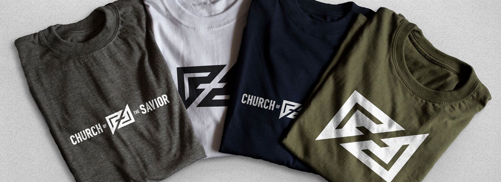
Oculus Studios was honored to assist Church of the Savior with their rebranding, updating their mark as well as grounding them in a timeless design that could serve new and returning members of the church alike.
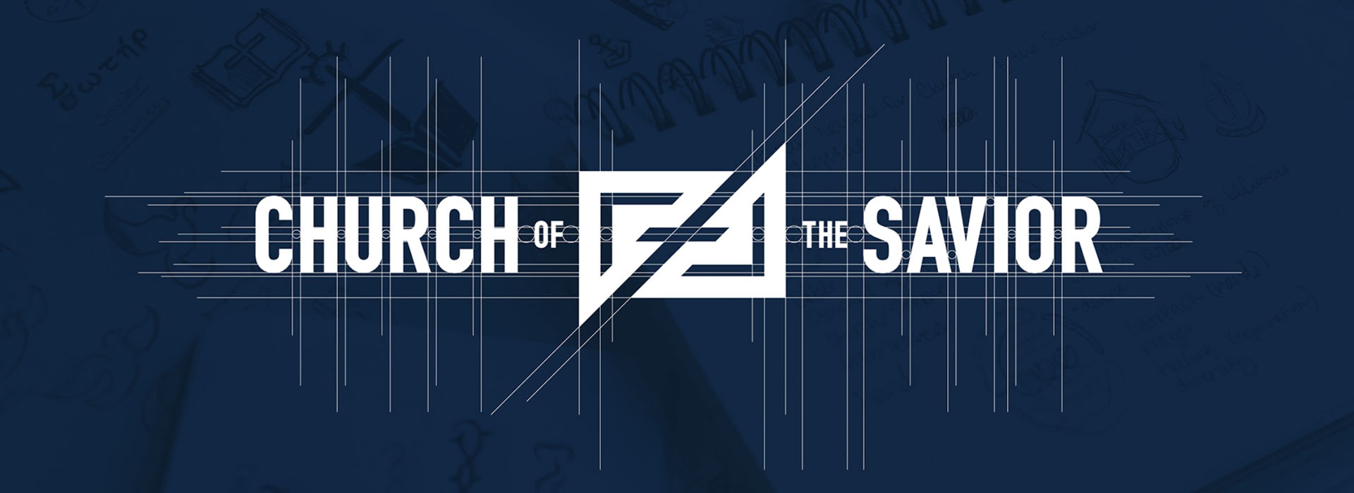
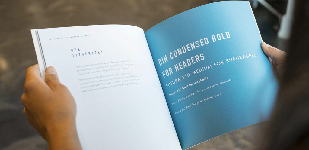
Our rebranding of the Church of the Savior logo and other materials was focused around ideals and values of the church as they were given to us.

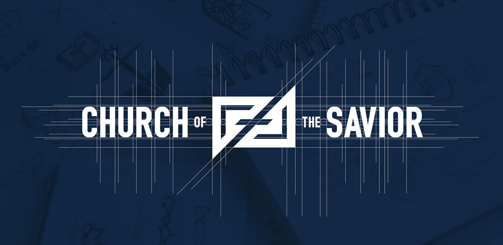
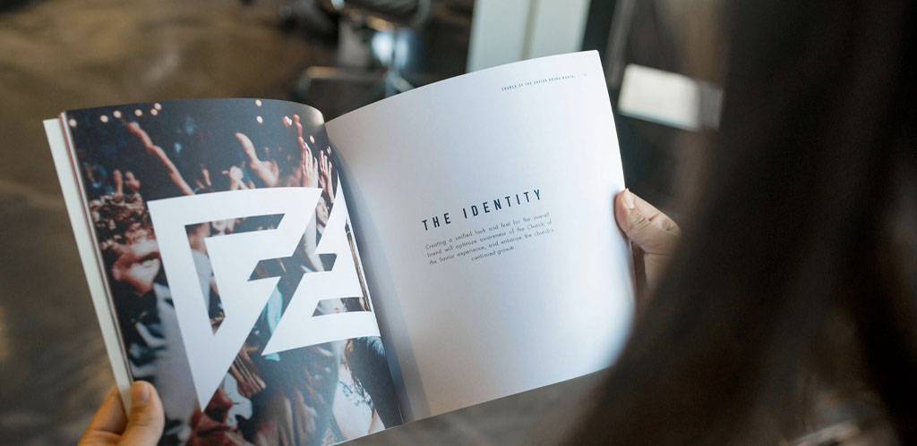
The updated logo uses prayer and outreach, two of the central themes they wanted to focus on, as the main inspiration. To accomplish this, Oculus utilized triangular arrow shapes that come together to create a cross in the negative space, essentially transforming that negative space into a positive shape. This represents not only the idea of evangelizing, but also of people coming together in worship, and how every person, every aspect, is important in the church environment. The mark strays away from what would be considered a “typical” or “expected” depiction of a cross with its bold, diagonal lines and strong edges.

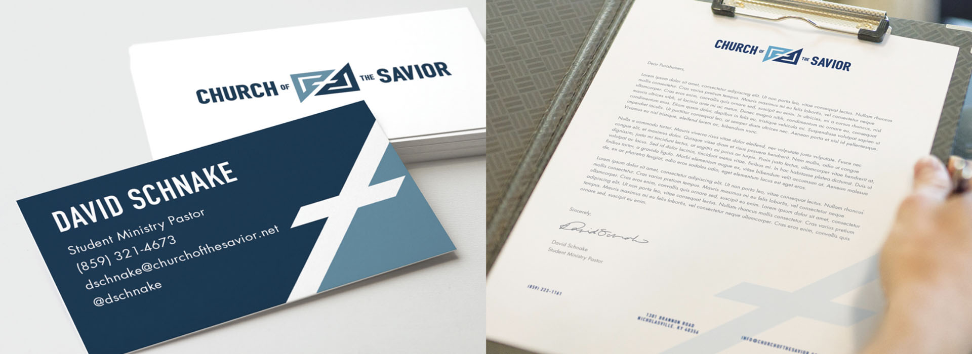
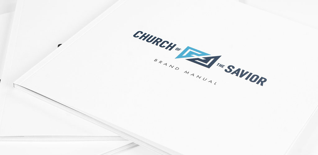
We picked two colors to represent this client: a combination of a calm, more subdued blue in a light and dark shade that work together for a cohesive feel. This color combination carries a classic connotation while still managing to be modern, appealing to both the older and younger generations of the church. This ensures that the color scheme can be integrated into its predetermined environment seamlessly without disruption.

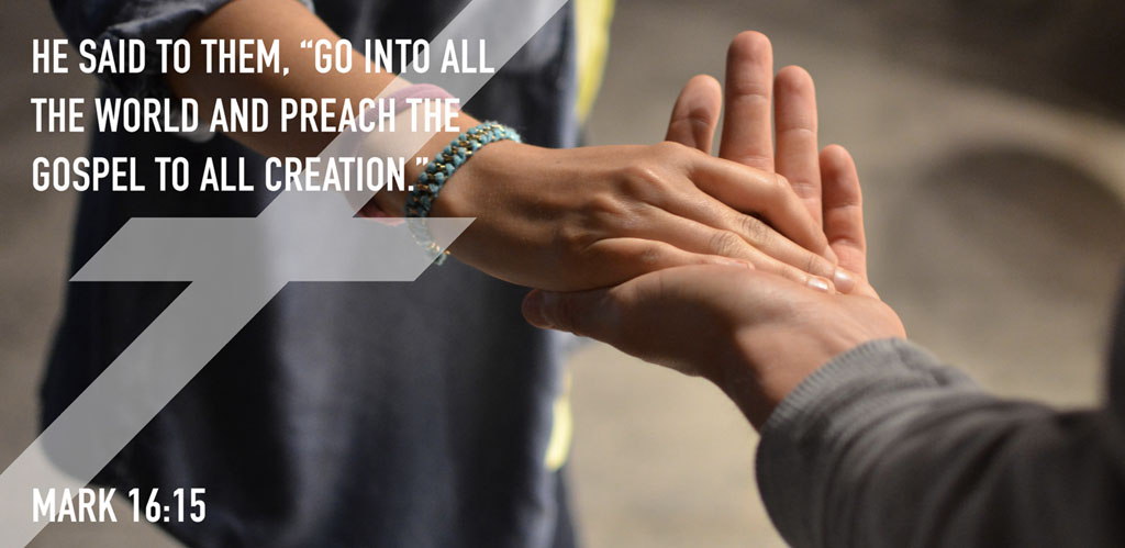
Oculus Studios developed an updated, fresh look for Church of the Savior that appeals to multiple age groups, stands out from the crowd, and employs striking, inviting imagery.

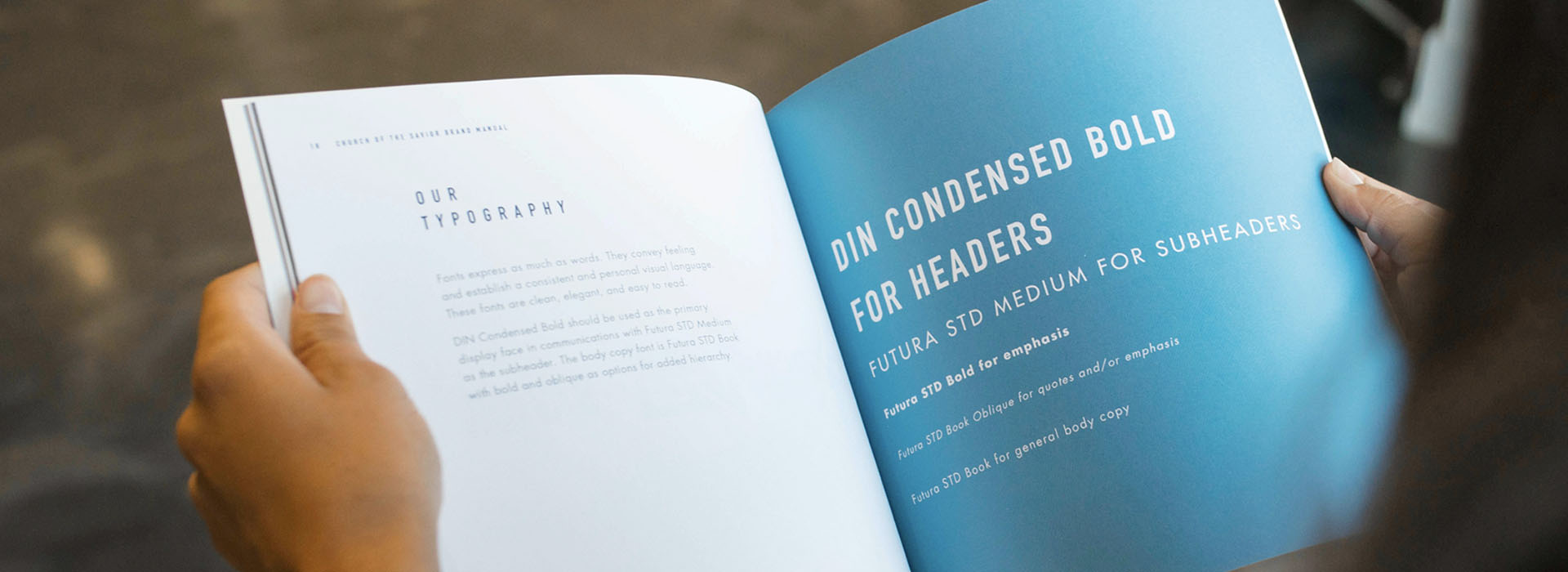
Overall, the brand became more iconic in hopes that it would establish not only an internal identity that could be applied to multiple pieces of design collateral for promotion of the church, but an identity throughout the community as well.
