-
On a mission to serve everyone
Brand Management, Graphic Design, Print
-
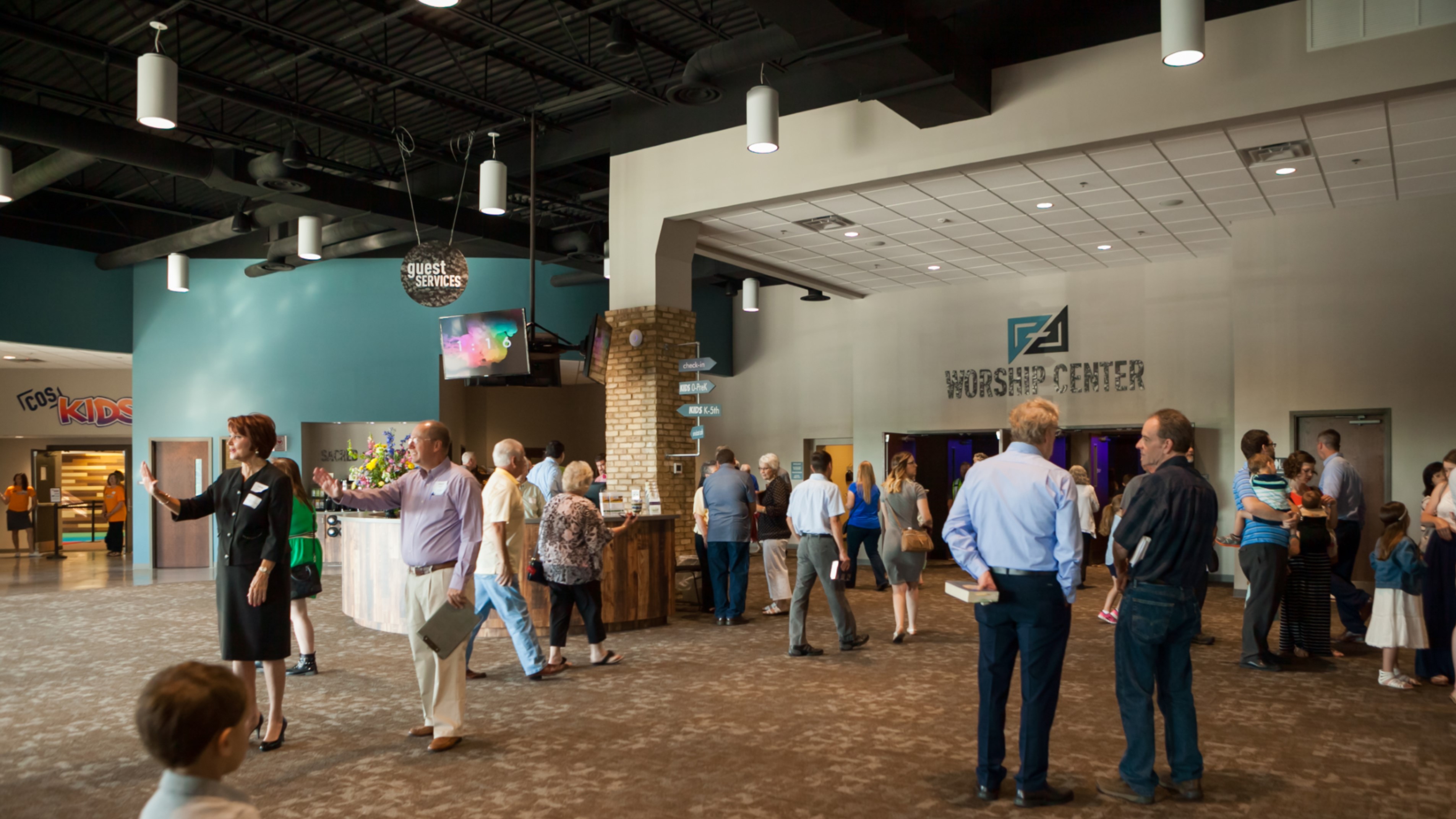
Not every logo has implications that span this world and the next, but that was the goal Oculus set when working with Church of the Savior. The brand is built on the message of Acts 13:47... For this is what the Lord has commanded us: I have made you a light for the Gentiles, that you may bring salvation to the ends of the earth.
By focusing on reaching everyone, all over the world, this brand took on a new level of care and inclusiveness.

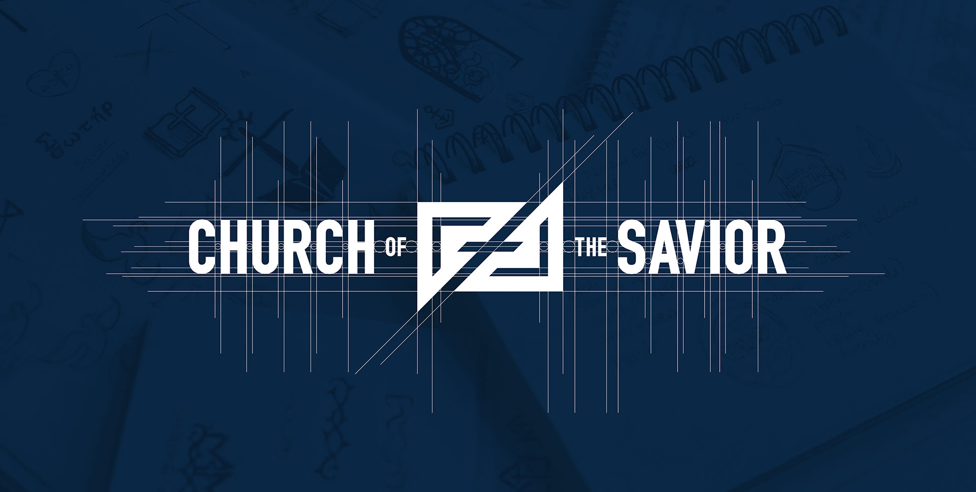
The updated logo uses prayer and outreach, two of the central themes they wanted to focus on, as the main inspiration. To accomplish this, Oculus utilized triangular arrow shapes that come together to create a cross within the negative space. This represents not only the idea of evangelizing, but also of people coming together in worship. The mark strays away from what would be considered a “typical” depiction of a cross with its bold, diagonal lines and strong edges.
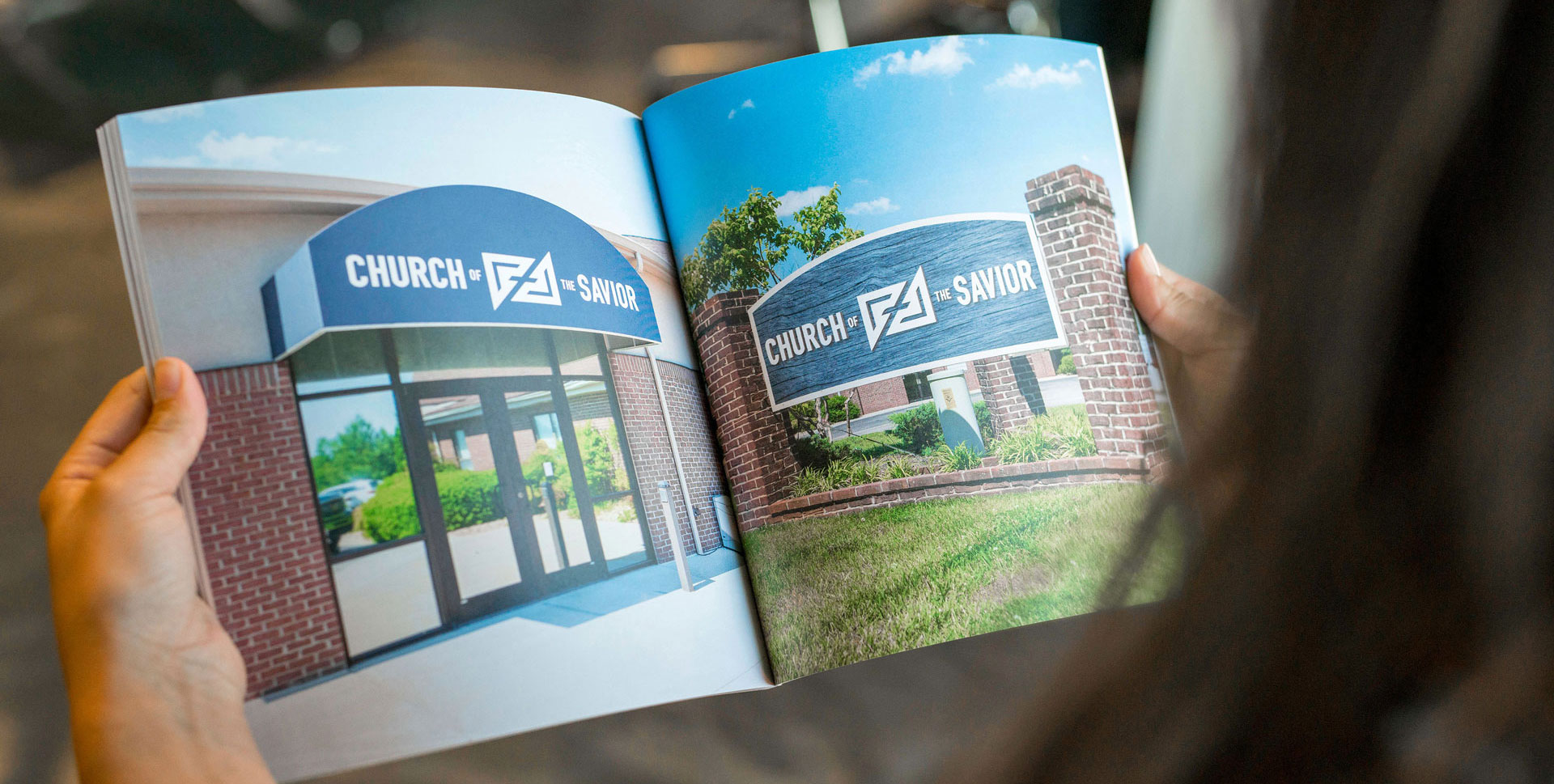
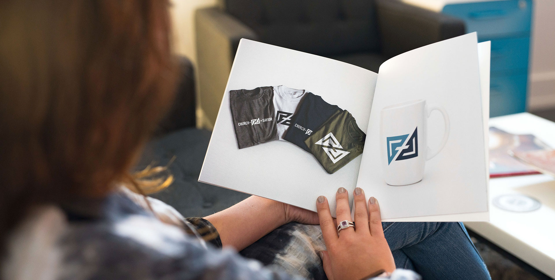
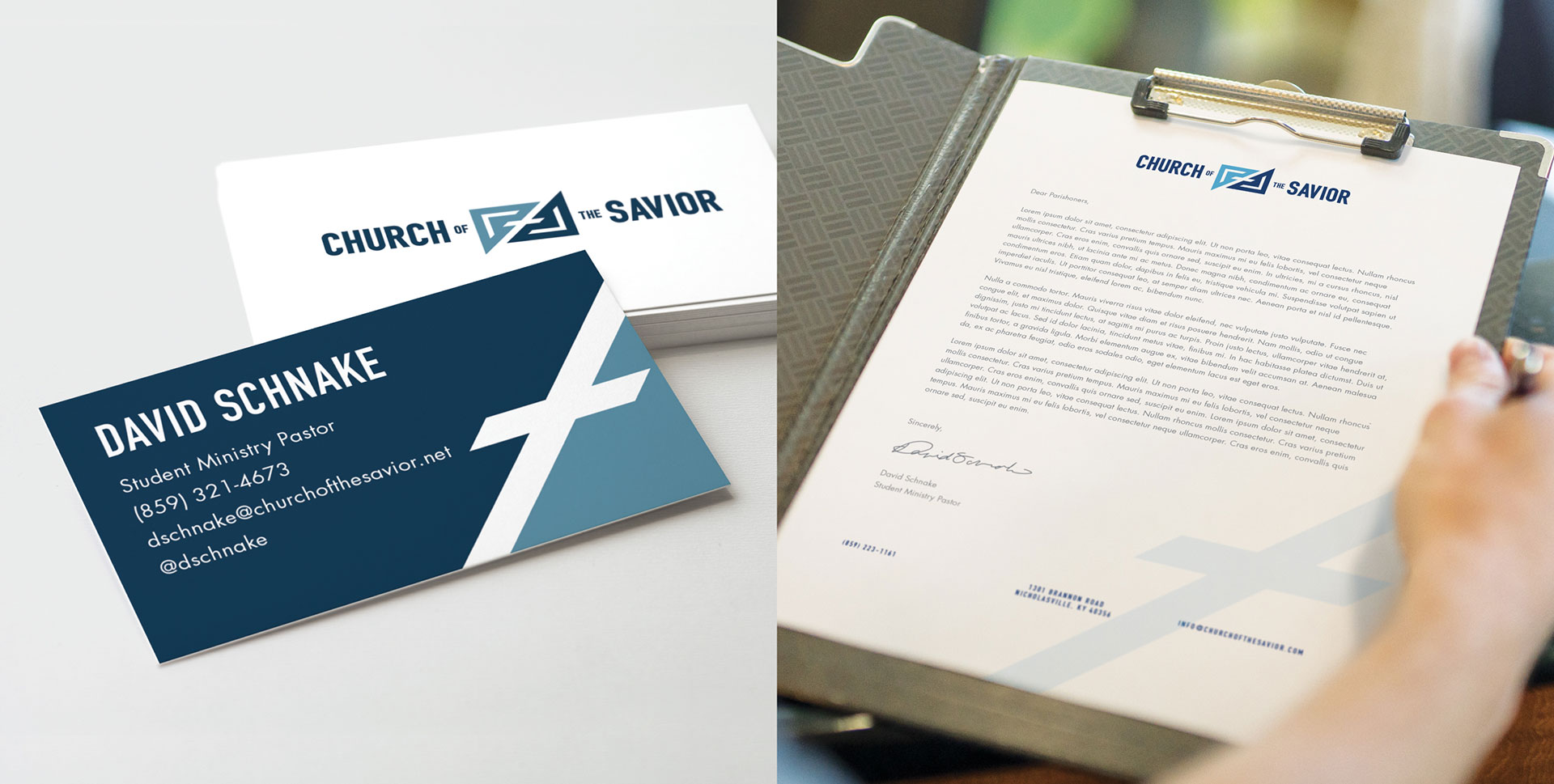
The colors, a combination of a calm, more subdued blue in a light and dark shade, carries a classic feel while still managing to be modern, appealing to both the older and younger generations of the church. This ensures that the color scheme can be integrated into its predetermined environment seamlessly.

Overall, the brand became more iconic in hopes that it would establish not only an internal identity, but an identity throughout the community as well.

"From patiently listening to all our needs to the final production of our new brand, we were very impressed with all the hard work they did for us. I highly recommend Oculus Studios to anyone and I look forward to working with them again in the future!"
-David Schnake, Pastoral Staff | COS
