The Kentucky Experience
-
The Bluegrass kicks... well, you know
Design, Logo, Photography, Print
-
Lexington Brewing & Distilling Company set out to launch a campaign that expresses the spirit of what Kentucky is through the story of their beers, and share that with both the world and Bluegrass natives alike.
The idea was simple: to encompass a collection of Lexington Brewing & Distilling Company's most notable craft beers, show the customers what kind of journey they had in store, and call it 'The Kentucky Experience.'

We started with a blank slate but remained single-minded in our to vision to achieve something that was instantly recognizable, invoking the feeling of both Kentucky and home. We set out to re-introduce the rest of the world to Lexington Brewing & Distilling Company, and with that, create an unforgettable first (or second) impression.
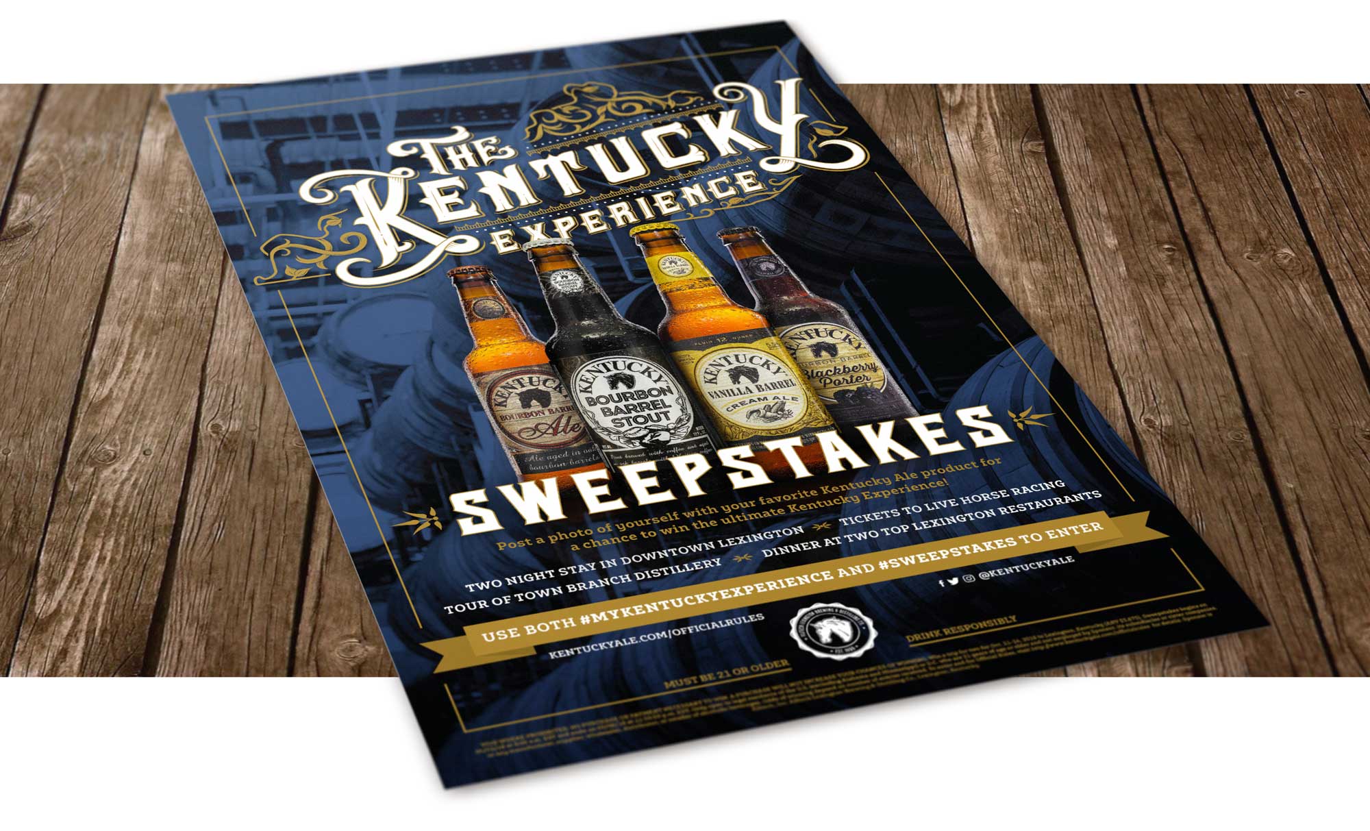
During the sweepstakes, we executed all of the staples of a modern brand awareness campaign and giveaway, utilizing posters, flyers, table tents, magazine ads, coasters, social media ads, digital ads, etc. Each of these pieces of collateral was customized for maximum response within their specific avenues of interaction.

There’s no mistaking the southern aesthetic, Bluegrass inspired color palette, and bourbon-centered heritage of Kentucky Ale’s endeavor. These materials represent the culmination of careful design and preparation, unwavering dedication to perfection in both style and taste, and the most ambitious leap we’ve made in establishing Kentucky ale as the ‘Beer of Kentucky.’


Commonwealth Credit Union Branding
-
We Better Design
Design, Logo, Web Design
-
Commonwealth Credit Union, a longtime client of Oculus Studios, is a cooperative, not-for-profit financial institution owned and operated by its members exclusively to meet their financial needs.
Commonwealth CU sets out to better the lives in their communities every single day, so when they reached out for some branding updates, we were excited to dive in.

When you’re part of the Commonwealth CU family, you’re not just a number – you’re an owner. Even better? You’re treated like one. The community impact and outreach that Commonwealth CU carries out is unlike any other, thanks to their numerous contributions to bettering lives. Even their logo subtly reflects this, wherein the bold C shape ripples out into the surrounding areas, mirroring the positive impact that the credit union has on its communities.

Oculus Studios creates collateral that not only represents but also embodies the credit union’s community-forward philosophy. With bright, striking colors such as teal, yellow, and red, we draw the eye around both digital and printed collateral, livening up and brightening information about loans, savings accounts, membership benefits, and more.

Commonwealth Credit Union’s commitment is to bettering lives, and Oculus Studios strives for each piece of marketing collateral to reflect this goal. Clearly outlining benefits with people-first imagery and easy to both read and understand materials not only cements that this credit union ain’t a bank, it’s also led by the very people who use and depend on its services.


Church of the Savior
-
Divine Design
Design, Logo, Photography, Print, Brand Development
-
Oculus Studios was honored to assist Church of the Savior with their rebranding, updating their mark as well as grounding them in a timeless design that could serve new and returning members of the church alike.
Our rebranding of the Church of the Savior logo and other materials was focused around ideals and values of the church as they were given to us.

The updated logo uses prayer and outreach, two of the central themes they wanted to focus on, as the main inspiration. To accomplish this, Oculus utilized triangular arrow shapes that come together to create a cross in the negative space, essentially transforming that negative space into a positive shape. This represents not only the idea of evangelizing, but also of people coming together in worship, and how every person, every aspect, is important in the church environment. The mark strays away from what would be considered a “typical” or “expected” depiction of a cross with its bold, diagonal lines and strong edges.

We picked two colors to represent this client: a combination of a calm, more subdued blue in a light and dark shade that work together for a cohesive feel. This color combination carries a classic connotation while still managing to be modern, appealing to both the older and younger generations of the church. This ensures that the color scheme can be integrated into its predetermined environment seamlessly without disruption.

Oculus Studios developed an updated, fresh look for Church of the Savior that appeals to multiple age groups, stands out from the crowd, and employs striking, inviting imagery.

Overall, the brand became more iconic in hopes that it would establish not only an internal identity that could be applied to multiple pieces of design collateral for promotion of the church, but an identity throughout the community as well.


Lexington Distilling Co. Town Branch Relaunch
-
Taking a shot at a relaunch
Design, Logo, Photography, 3D imaging
-
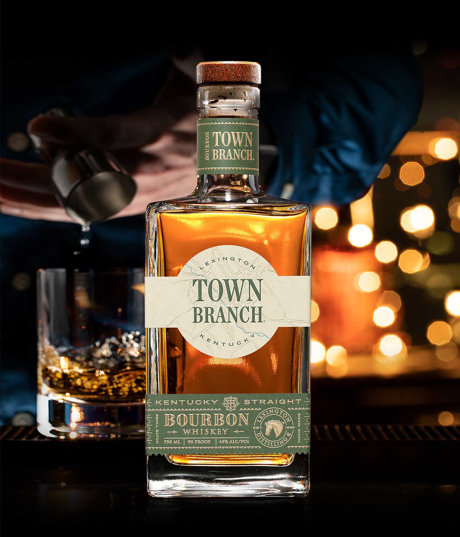
The lineup of spirits offered by Town Branch are revered for their quality and taste. With a name born from the river that runs through its (and our) hometown of Lexington, Kentucky, we were beyond excited to have a chance to assist in their relaunch campaign.
For this relaunch, we needed to celebrate both the familiar and the extraordinary. Through custom 3D imaging and in-house composite photography, this relaunch brings Town Branch's robust and tasty Kentucky staples full circle: from the water, to the barrel, to filling up your glass with 'My usual,' whether you take yours neat or on the rocks.

The imagery compiled in the series of ads we created proved to be a challenge – but we always love a challenge. To complete these images, we worked with 3D artists to create a detailed bottle that interacts with the surroundings in a way that couldn’t be as easily captured with traditional photography. The flexibility of a 3D render allowed us to control such factors as weather, lighting, and maintaining the quality of the materials and labels on the product.


We created composite photos of a completed background using a rendered bottle, along with in-house photographed elements such as river rocks or a fully-stocked picnic table. A render allowed us to work with a bottle that was perfect. Every element was controlled and carefully planned, down to the clarity of the glass, the texture of the paper, and even the contrast of the metallic emboss. The final images we produced for this relaunch were created thanks to careful consideration of all elements: the background, product, labels, legibility, foreground, contrast, and depth of field. To create the ideal image, we composed each element separately, then pieced them together so that the final composition, and in turn the finished product, is seamless.


Thanks to this process, the spirits can be seen haunting their natural habitat – connected either physically, visibly, or conceptually. Each ad created for the campaign puts the Town Branch product front and center, eye-catching and unapologetic. Loud and proud, but only because of the meticulous efforts that built the scene for each of them. Across print and digital materials, social media, posters, magazine ads, and more, the Town Branch name takes root and blossoms across any promotional material it touches.
Doughdaddy’s Doughnuts
-
A rebrand? We'll bite
Design, Logo, Photography
-
When a local company that stands as a favorite in the community trusts you enough to come to you for a rebrand, it's both a humbling and energizing experience. When that company just so happens to create some of the tastiest doughnuts around? Well, then it's a no-brainer.
As with any rebrand, we're presented with what can sometimes be a uniquely challenging task: update and modernize without sacrificing the soul of the original design. The goal is to entice new customers to check out the brand without alienating the loyal fanbase that has developed throughout the years.

With Doughdaddy’s, we wanted to stay as true as possible to their current visual language by updating the parts that speak the loudest: their doughnut mascot. This friendly little personified doughnut received a subtle, but ultimately impactful makeover. With bolder lines, a stronger and more contrasting color palette, and a little bit more personality and life added to its eyes, we boosted the visibility of the mascot without taking away from any of the previous charm. We swapped out the previous iteration’s coffee cup for a darker color and arranged it at a more visually-believable angle.

This rebrand brought about other opportunities for updates as well. With the new mascot standing tall, we were able to design and create new collateral for digital signage, printed items available at gas pumps, a brand new canopy wrap for the gas station, employee t-shirts, and more.


This project stands as a delicious example of how a rebrand doesn’t necessarily mean a complete overhaul. An update to branding could be as simple as taking existing materials and updating them for newer clientele. Sometimes, all we need is an update by way of a little bit of polish, a bolder line, and a fresh doughnut (or two).
University of Louisville: Cardinal Cupboard
-
Bettering lives, nourishing minds
Brand Development, Design, Photography
-
The Cardinal Cupboard food pantry program is a student-run food pantry located on UofL’s Belknap Campus. The goal of this program is to give access to both food and health products in the Cardinal community at the University of Louisville in a combined effort to reduce their overall financial burdens students and faculty may face. The Cardinal Cupboard program was sponsored by Commonwealth Credit Union, in partnership with Dare to Care food bank and Kroger.
To celebrate the opening of the pantry, we were asked by Commonwealth Credit Union to design a look and feel that would be specifically tailored to the Cardinal Cupboard. By combining the colors of both UofL and Commonwealth CU’s branding, we created promotional materials and collateral that united both brands for this phenomenal cause.

We designed custom wraps and signage for directional purposes to work within the existing architecture. This allowed us to both catch the eye and direct faculty and students to the correct area without cluttering up heavy-traffic areas like hallways, stairwells, etc. Integrating this design into pre-existing architecture streamlines the process while also getting the word out with a vibrant and informational design.


The result of this collaboration of colors was a focus on Commonwealth CU’s bright and inviting teal color, with the bold and commanding University of Louisville red as an accent. By blending these colors for the printed and digital promotional and on-campus directional items, the message was clear: We’re all in this together.


Mixing Commonwealth Credit Union’s tireless work within their surrounding communities with UofL’s on-campus pantry to provide assistance for those who are in need resulted in a successful and eye-catching opening.
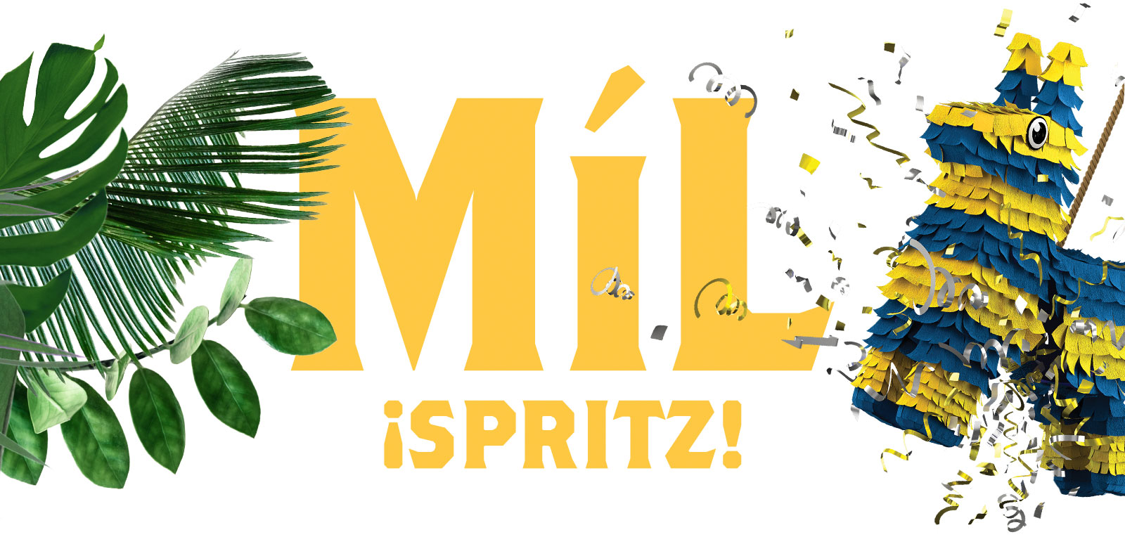
Míl ¡Spritz! Launch Campaign
-
A WINNING MAR-GIN
Brand Management, Photography, Graphic Design, Print, 3D Modeling
-
The best gin money can offer...in a can.
And really, who doesn't love a can-do attitude when it comes to delightfully fragrant alcoholic beverages? Míl gin is described on their website as an Irish pot still gin, lovingly distilled with botanicals from the Mediterranean and drenched in glorious southern sunshine.
With notes of almond, rosemary, thyme, and basil (to name a few), it’s easy to see how this gin was inspired by warm, golden light. Spearheaded by a team of adventurous gin drinkers from the Pearse Lyons Distillery, this canned version of the spirit combined into something bright, summery, and perfect for enjoying in the southern sunshine. When Oculus Studios was tasked to create advertising collateral for this beverage, we knew two things most of all: it needed to be bright, and it needed to be fun.
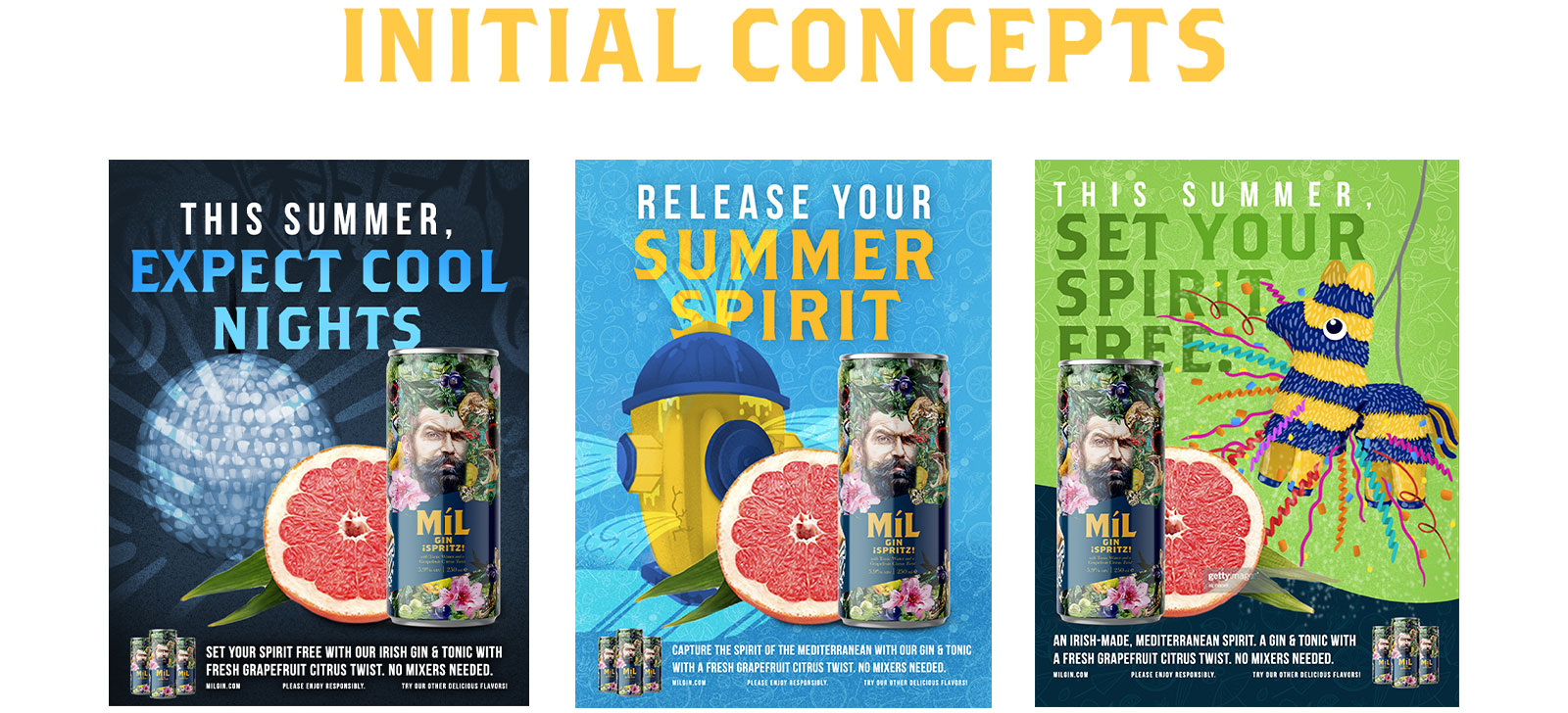
Our initial concepts employed colors and imagery reminiscent of hot summer days and cool nights, of excitement and joy, of parties and outdoor gatherings with friends. We wanted to invoke a sense of celebration and satisfaction to work alongside the bright and botanical can. With the brightness of the grapefruit pulling the eye to the product, we guaranteed that our concepts put the can first and foremost.
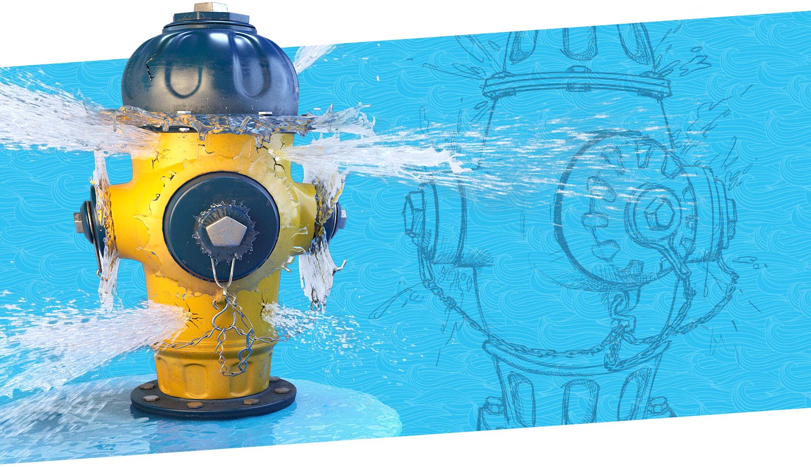
With the help of our talented team of designers and 3D artists, we brought to life a hybrid of both realistic but cartoony fire hydrant for use on our print and digital materials. From initial sketches to the finished product, our team worked diligently to achieve that “about to bust” look, a refreshing addition to pair with our summery scenes.


Our finalized concepts didn’t stray far from what we had envisioned: something fun, bright, and engaging with the viewer. By utilizing a lighter-weight font as a header and letting the heavier font serve as the grounding force of the message, we created collateral that was inviting the viewer to engage with the work and therefore the product, while also encouraging lighthearted celebration.
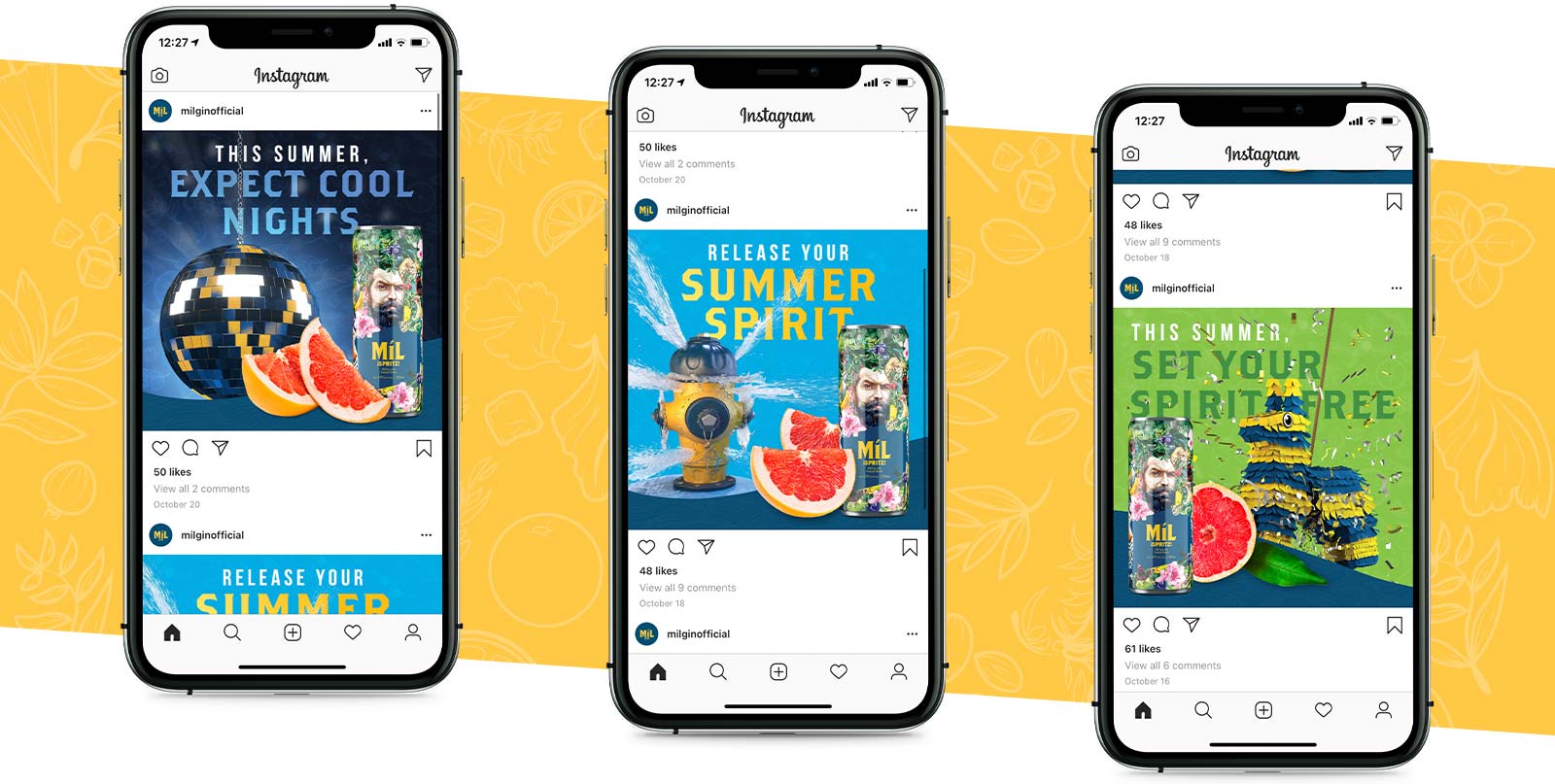
We echoed this concept across social media as well, the imagery and color choice drawing the eye immediately and commanding attention in the ever-scrolling world of blink-and-you’ll-miss-it marketing. The repeated blue colors of the can used throughout the ads, as well as the complementary color of the grapefruit, proved to effortlessly carry the messaging through each individual ad. This guaranteed that as standalone pieces, the works were eye-catching, but together as a group they were similarly visually pleasing.

Designing engaging, successful, and eye-catching marketing around an already-established brand and product is one of the many skillsets we have proudly tucked away into our repertoire. From concept sketches, to rough drafts, to a final composition worthy of a round of cheers, we carry out each step of our work with pride.


KY State Police: Gold For Gray Gala
-
A GOLDEN EVENT
Brand Management, Graphic Design, Print
-
The Kentucky State Police Foundation supports the Kentucky State Police and its employees through public and corporate partnerships and community outreach to serve the interests of the agency in service to citizens of the Commonwealth. As a local, Frankfort-based 501(c)3 non-profit organization, the KSP Foundation promotes public confidence, the understanding of police activities, and community outreach through programs and events.
Oculus was pleased to sit down with members of the KSPF board to help them prepare for what would become their signature fundraising event. At the time of our meeting, the event needed a logo, a name, and a cohesive look. Considering that the event was going to be a high-end and classy experience to raise money for the Kentucky State police, Oculus set to work developing a unique visual identity for what was tentatively (and temporarily) referred to as the Red & Gray Gala.
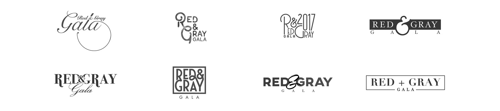
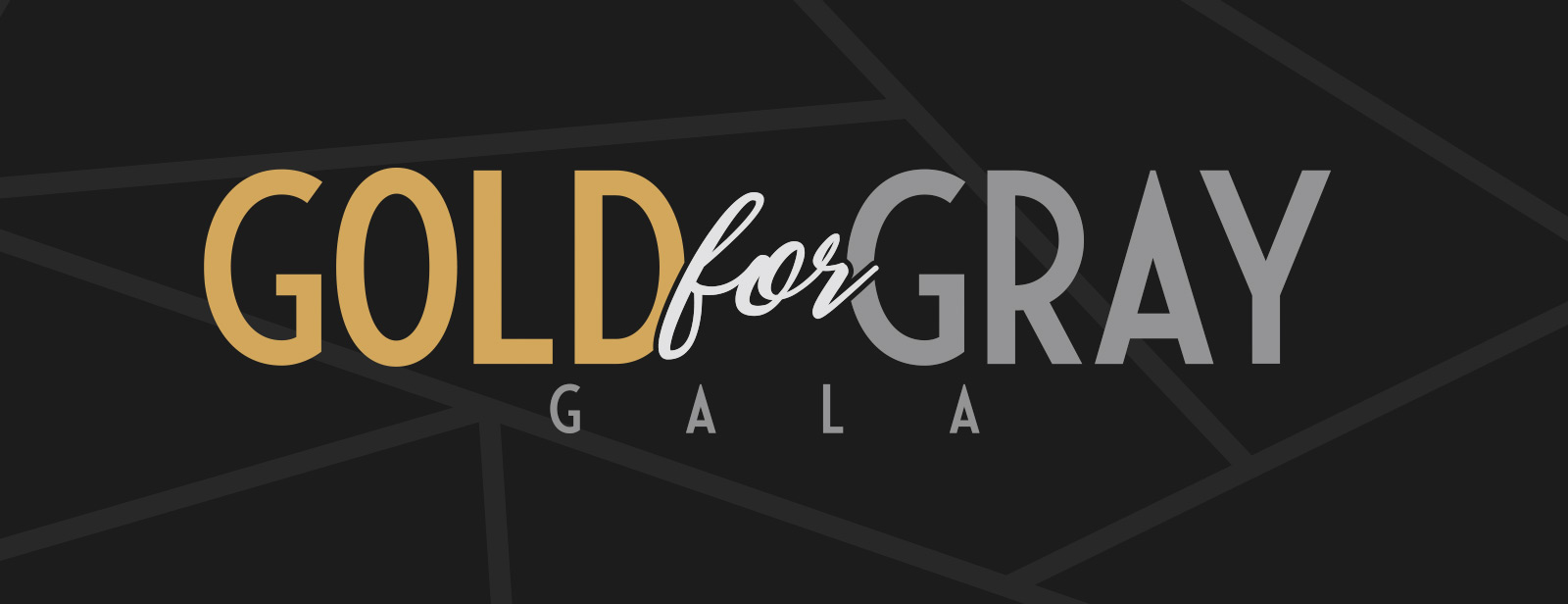
As we developed an elegant style to represent the gala, the board determined a name based on a provided list of possible options from Oculus: the Gold for Gray Gala. Based on this new information, Oculus altered some of our existing designs to suit the name and ultimately provided our finalized design – one that represented strength and class with a dash of flair.
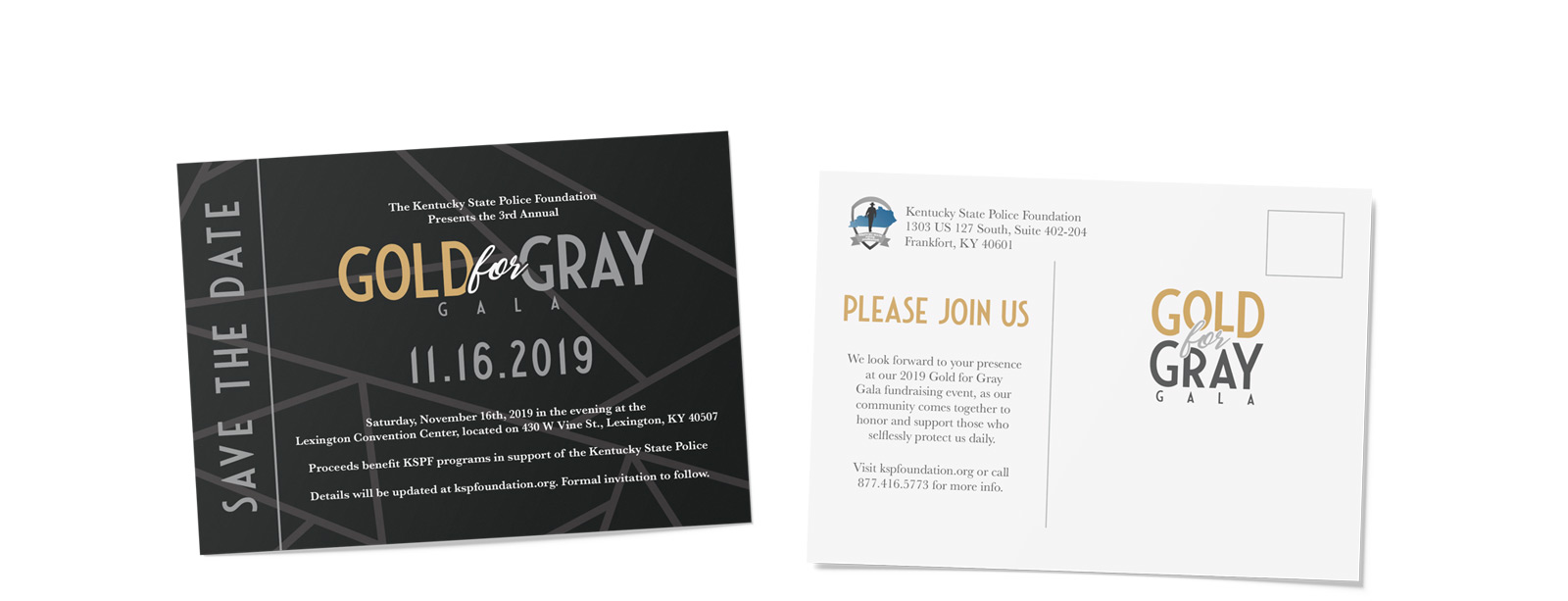
With the new design set in stone, Oculus began implementing the look across various pieces of collateral, including menu cards, signs, and printed items such as post cards alerting gala attendees to the event and urging them to save the date.
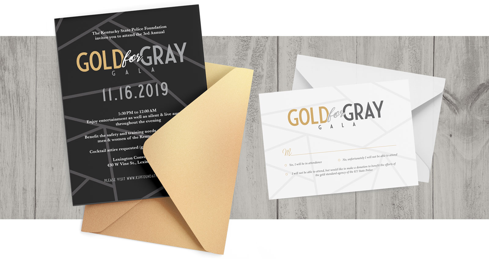
Shortly after, an official invitation was sent out – an informational card about the event as well as an RSVP card.
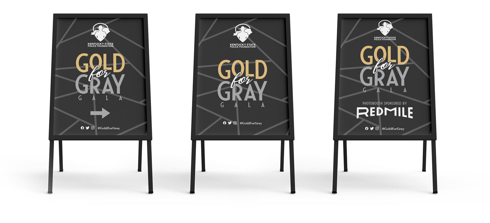
To prepare for the event, the KSPF requested directional signs to assist the flow of traffic throughout the event. Oculus designed signs that were direct, informational, and still fitting with the classy style the KSPF requested.

During the Gold for Gray Gala, attendees could participate in an auction wherein their program booklet doubled as their auction number. This combined design allowed gala-goers to keep track of both their program booklet and their auction number without worry of losing one or the other before the auction took place.

Table tents needed to be striking, clear, and highly visible for those in attendance. Thanks to the high contrast of the white print on the dark background, these table tents were easy to spot and aided in making sure groups found their appropriate table in a timely manner.

With A Sincere Thank You To The Kentucky State Police

Town Branch Bourbon Branding Relaunch
-
BRANCHING OUT THE BRAND
Brand Management, Photography, Graphic Design, Print, CG Modeling
-
The lineup of spirits offered by Town Branch are revered for their quality and taste. It gets its name after a river that runs through our hometown of Lexington, Kentucky, and this campaign called upon our ability to celebrate both the familiar and the extraordinary of the product as it stands on its own and the heritage from which it was birthed.
Included in this impressive array is “The Oldest Single Malt in the USA,” a national accolade which also ties itself to the very water source from which this product is developed. Through custom CG imaging, extensive in-house photography and digital compositing/photo manipulation, and good 'ole poignant storytelling, this relaunch brings these Kentucky staples full circle: from the water, to the barrel, to “my usual,” whether you take yours neat or on the rocks.
Lexington Brewing Co. came to us with the desire to launch this product to a national audience and to elevate the branding to compete with larger or more well known brands. To reach the goal of launching the marketing materials at the same time as the product hit the shelves, we had to do a balancing act with the production schedule as bottles has been made but labels were still coming in and getting applied. Armed with a few test proofs from the printer, we utilized CG labels to seamlessly bring these campaigns to life.
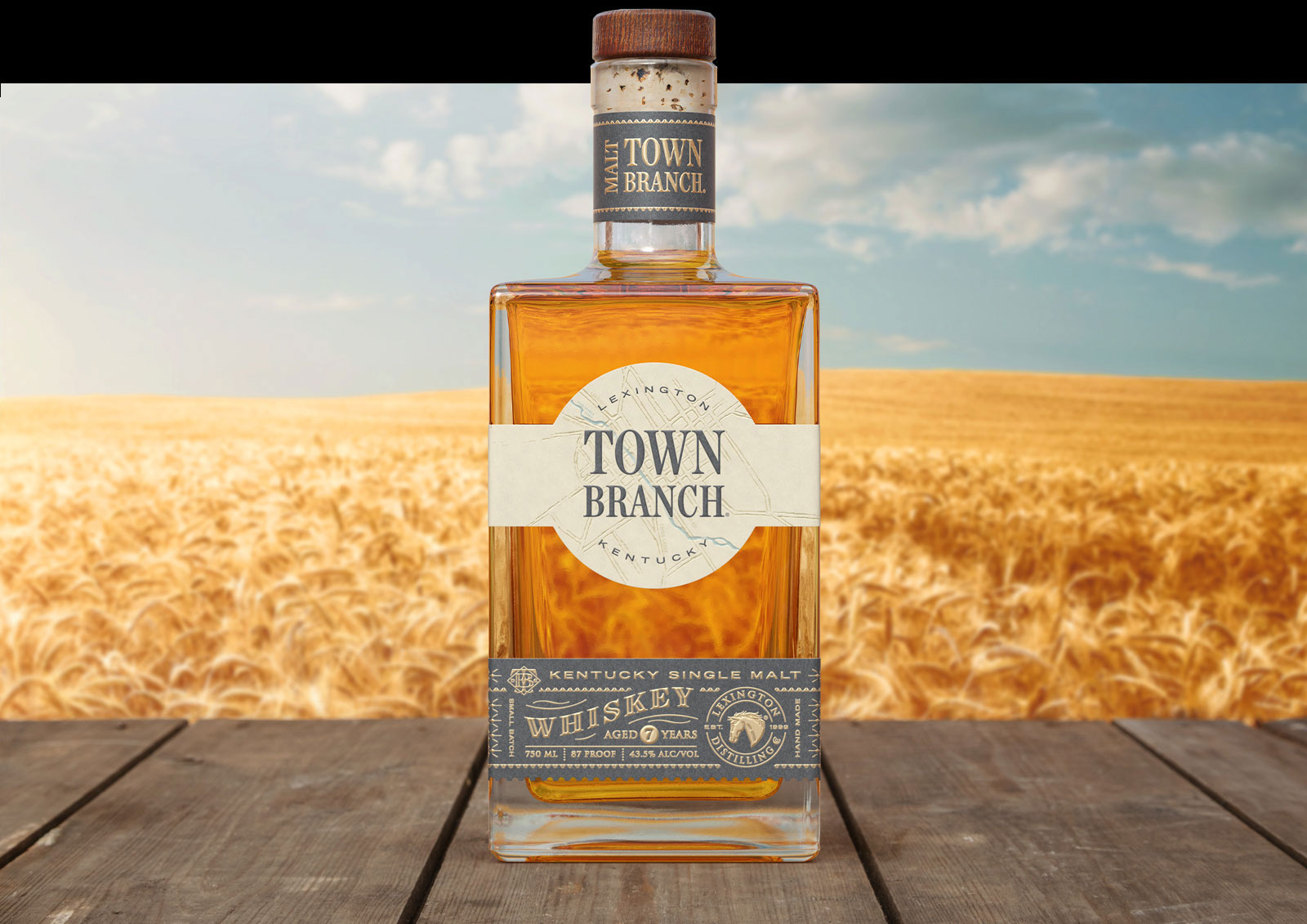


The final images were created by taking our location photography of Lexington’s beautiful waterways, studio photography, and CG labels, and carefully piecing them together for a seamless composite.


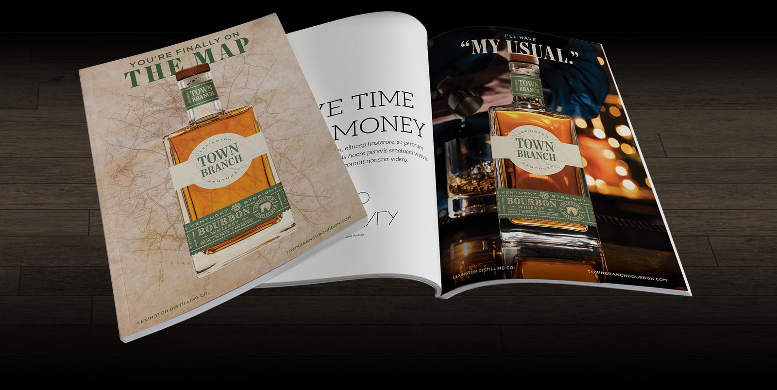
From ad to ad, the spirits can be seen haunting their natural habitat – connected either physically, visibly, or conceptually. Each ad created for the campaign puts the Town Branch product front and center. Loud and proud, to let the world know a new breed of bourbon has arrived. The final pieces were used in digital materials, social media, promotional posters, and magazine ads.

With A Sincere Thank You To Lexington Brewing & Distilling’s Parent Company, Alltech.

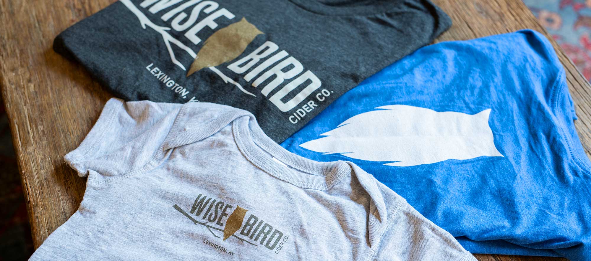
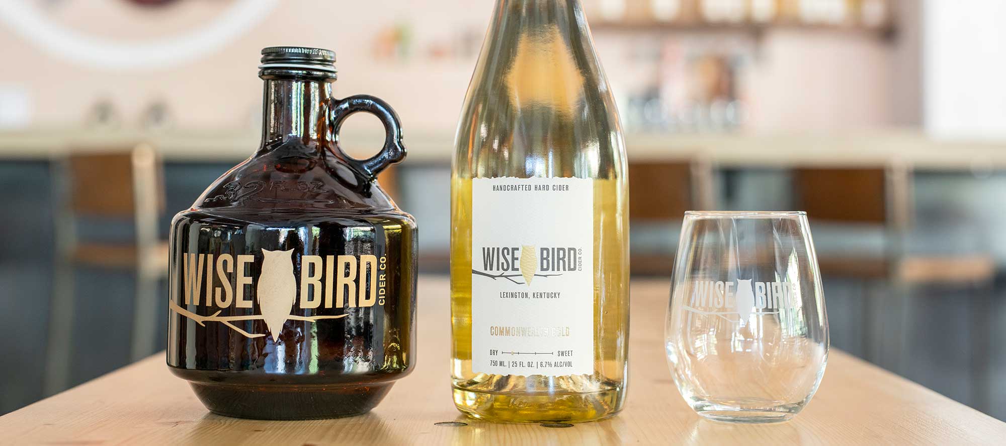
Wise Bird Branding
-
ANOTHER FEATHER IN OUR 'CAP'
Brand Management, Photography, Graphic Design, Print
-
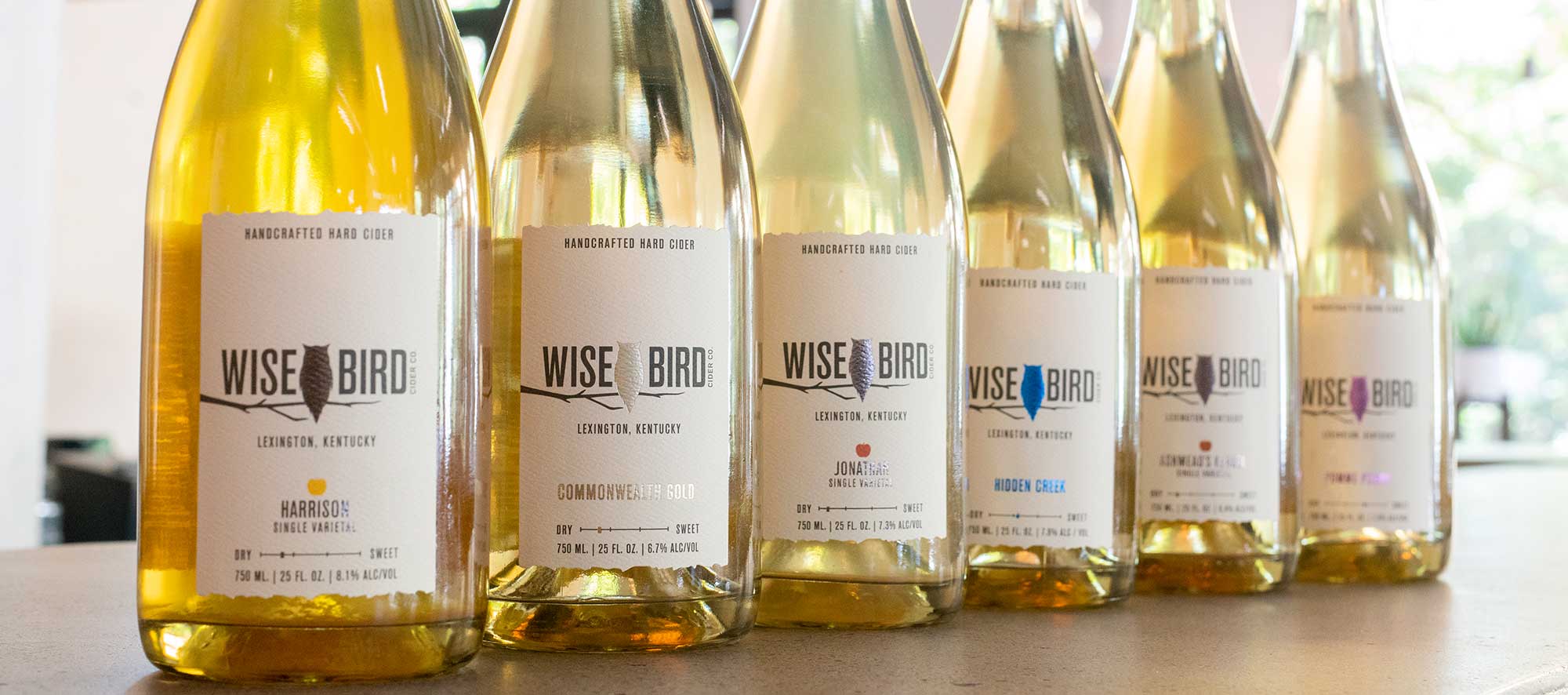
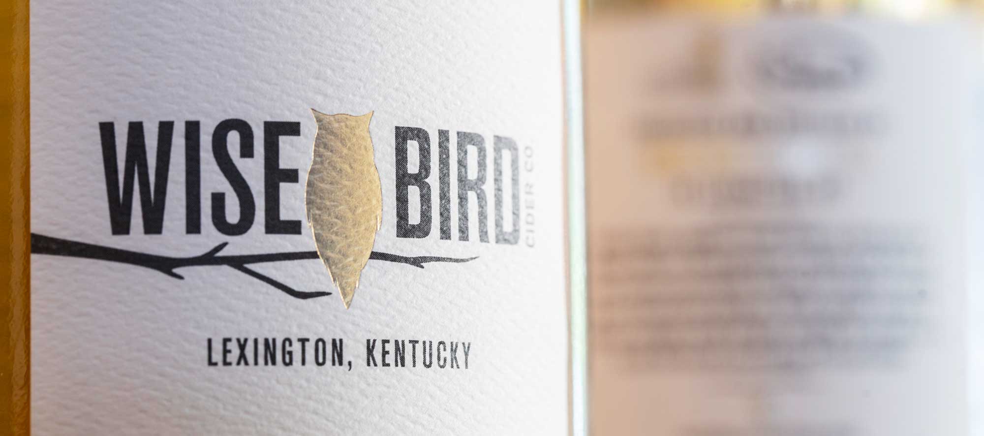
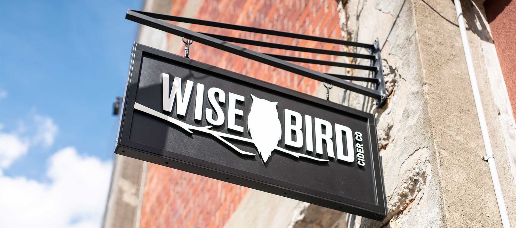
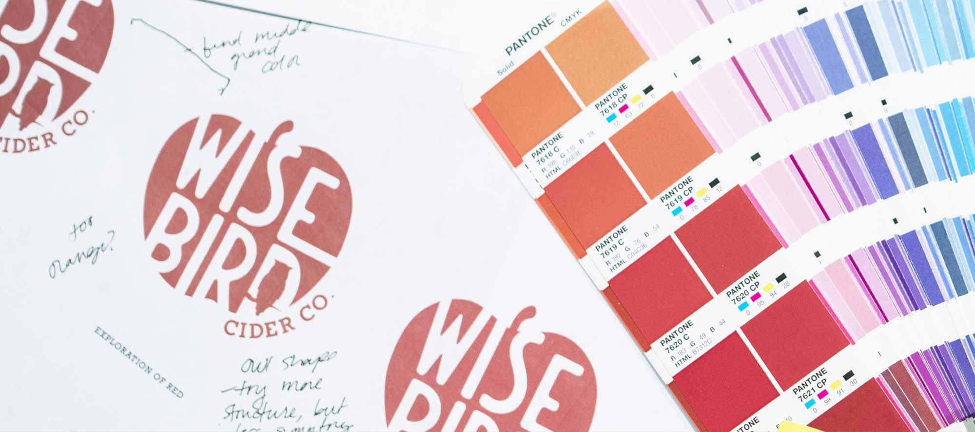
It’s no secret that we like our breweries and distilleries, so when Wise Bird Cider Company, a new cidery, announced that they were opening up in our district, we were thrilled to take on the challenge of creating their logo and branding. They had pulled together some mood boards and inspiration pieces based off of what they were seeing in the cider brewing industry and with that, we were able to get a feel for the overall aesthetic that they wanted to go for.
They were in search of a brand that fit into their price point while keeping their eclectic tastes and rustic-meets-industrial space in mind. At the end of the day, we were aiming to land somewhere between, 'young and fresh' and 'high-end cidery.'


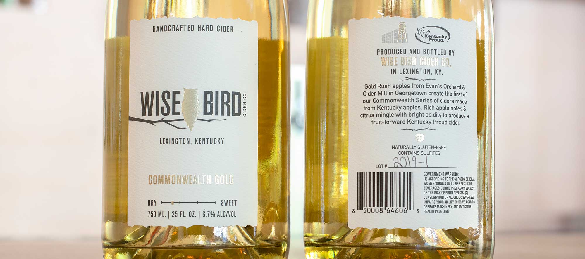
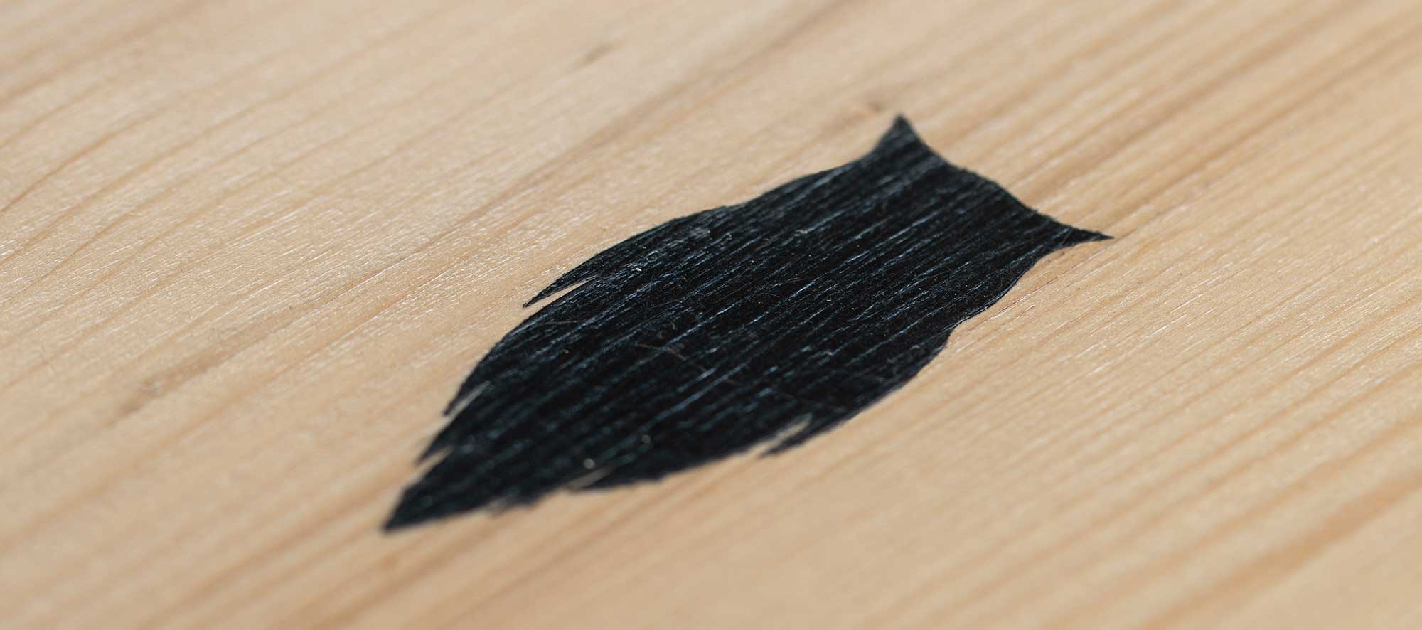
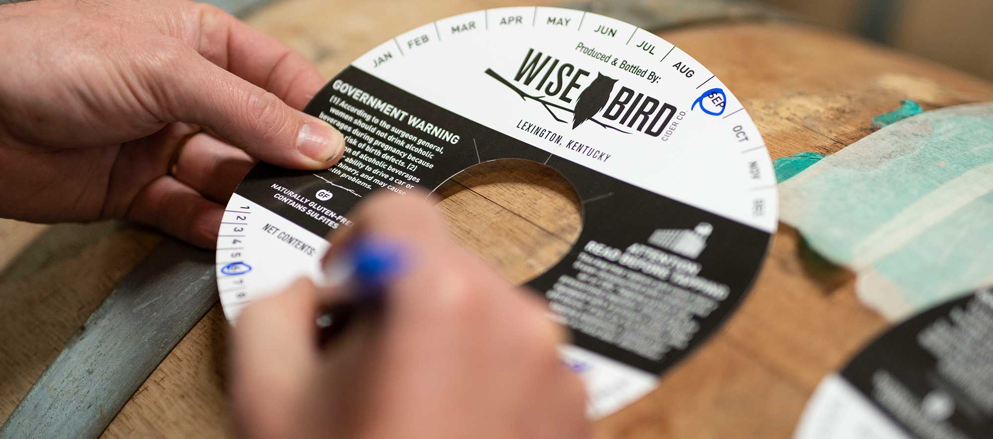
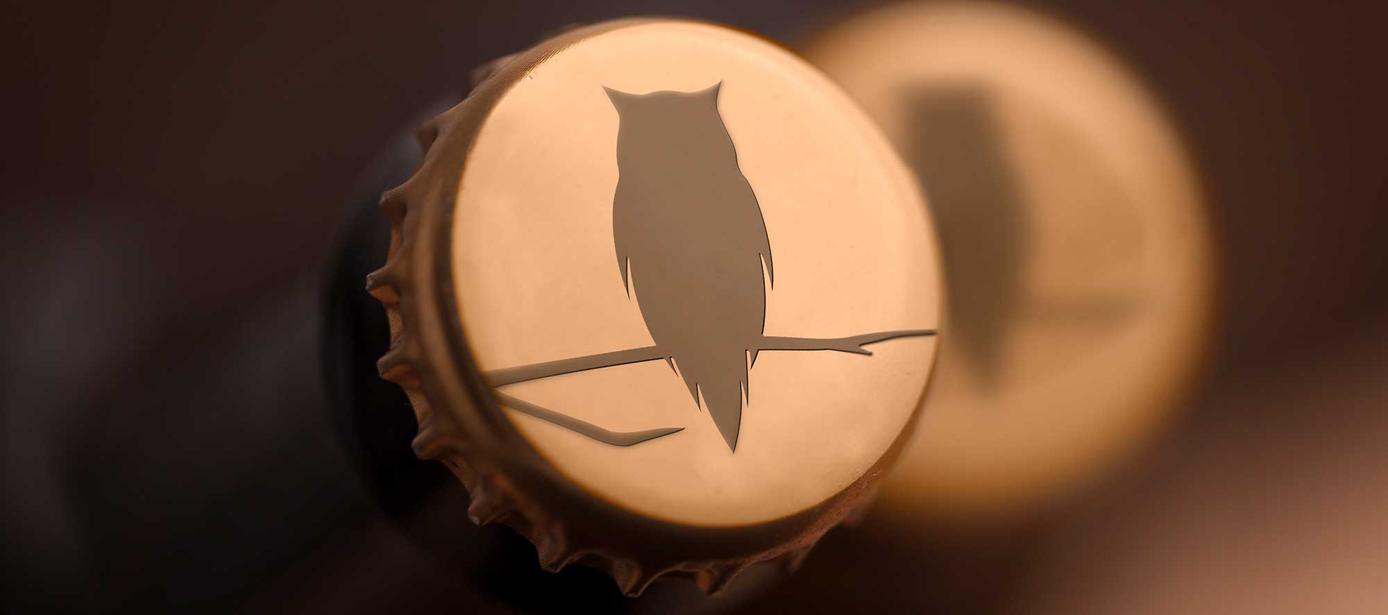
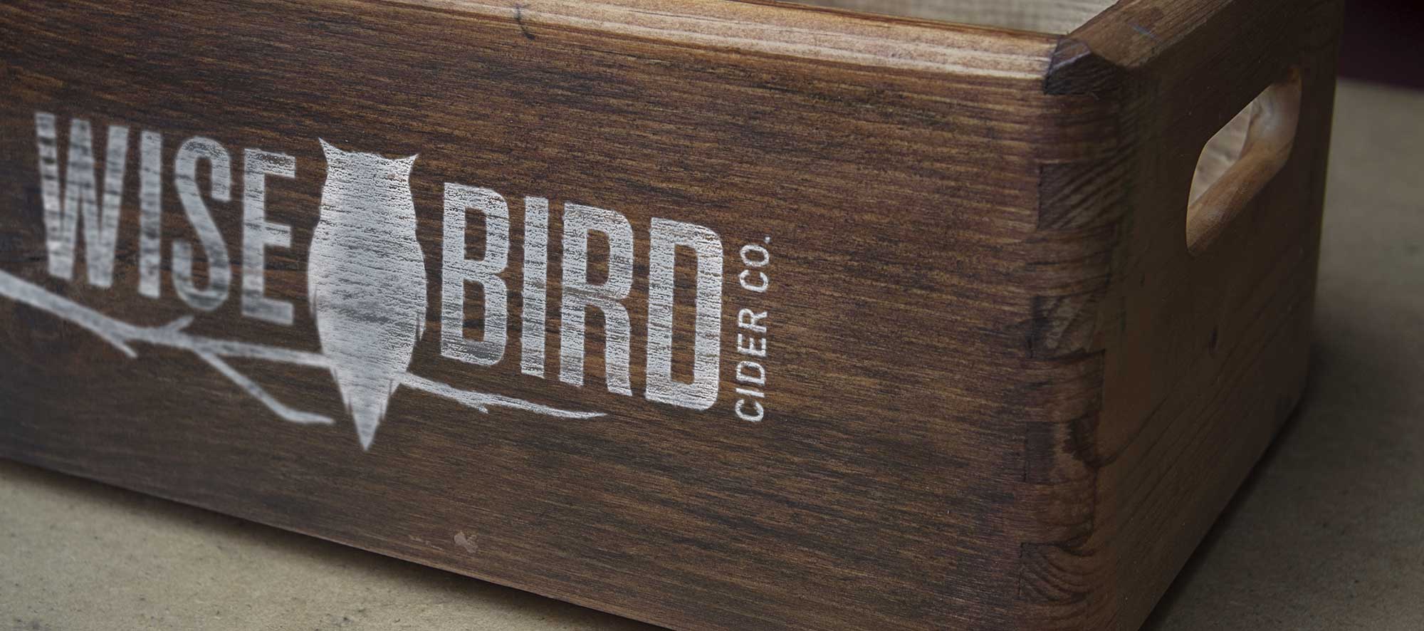
In keeping with the simplicity of the label, the finalized logo features a large owl in the center, with a modern sans serif font that’s equally tall and thin on both sides to balance out the overall design. We worked hand-in-hand with the label printer creating in-house physical mockups to ensure legibility for every element. The label itself is skinnier than the average cider or wine label, with the intention of this design choice being that the size would stand out on the shelves while also feeling at home in the Distillery District location.

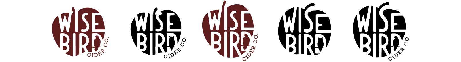
We eventually had something that seemed to really grab the clients’ attention; a simple apple icon with “Wise Bird” cut out and a hawk in the negative space of the D. The refining process began with the request of an owl option and specific apple shapes based on what they would be using in their cider lineup.


As we wrapped up the logo designs and transitioned into the label design, we were met with a change in vision from the client proposing a new challenge for our team. We decided the only way to address the next round of options would be to work backwards: design our ideal label and find a logo that fits the design with the cidery aesthetic in mind. They ended up choosing a label design that showcased simplicity while still being modern and easily recognizable for a new brand, and we kept that in mind when designing the new logo concepts.