Lexington Brewing Relaunch
-
PITCHER PERFECT BRANDING
Brand Management, Photography, Graphic Design, Print, 3D Modeling
-
When it comes to working local, nothing beats the added bonus of booze… so when Lexington Brewing & Distilling Co. reached out to us to create a campaign to launch their new branding, we jumped at the chance. Lexington Brewing & Distilling Co. is the producer of award-winning beer and spirits and one of the few joint brewing and distilling operations in the world.
We were tasked to create a campaign that would cover the creative gamut for their new labels: custom photography, graphic design, and taglines that would take center stage alongside the beers in banners, posters, table tents, and other marketing materials. With this campaign, we set out to flex our creative muscles.
To create this campaign for Kentucky Ale, Oculus had to craft unique messages for each target audience across seven states. Touching on many different demographics and locations, each campaign had to work across all spectrums of media placement from print to digital. The campaign would reach millions of people across the United States, pushing the new look and feel into the hearts and minds of not only their loyal customers, but hopefully also introducing their handcrafted passion to millions of new customers.


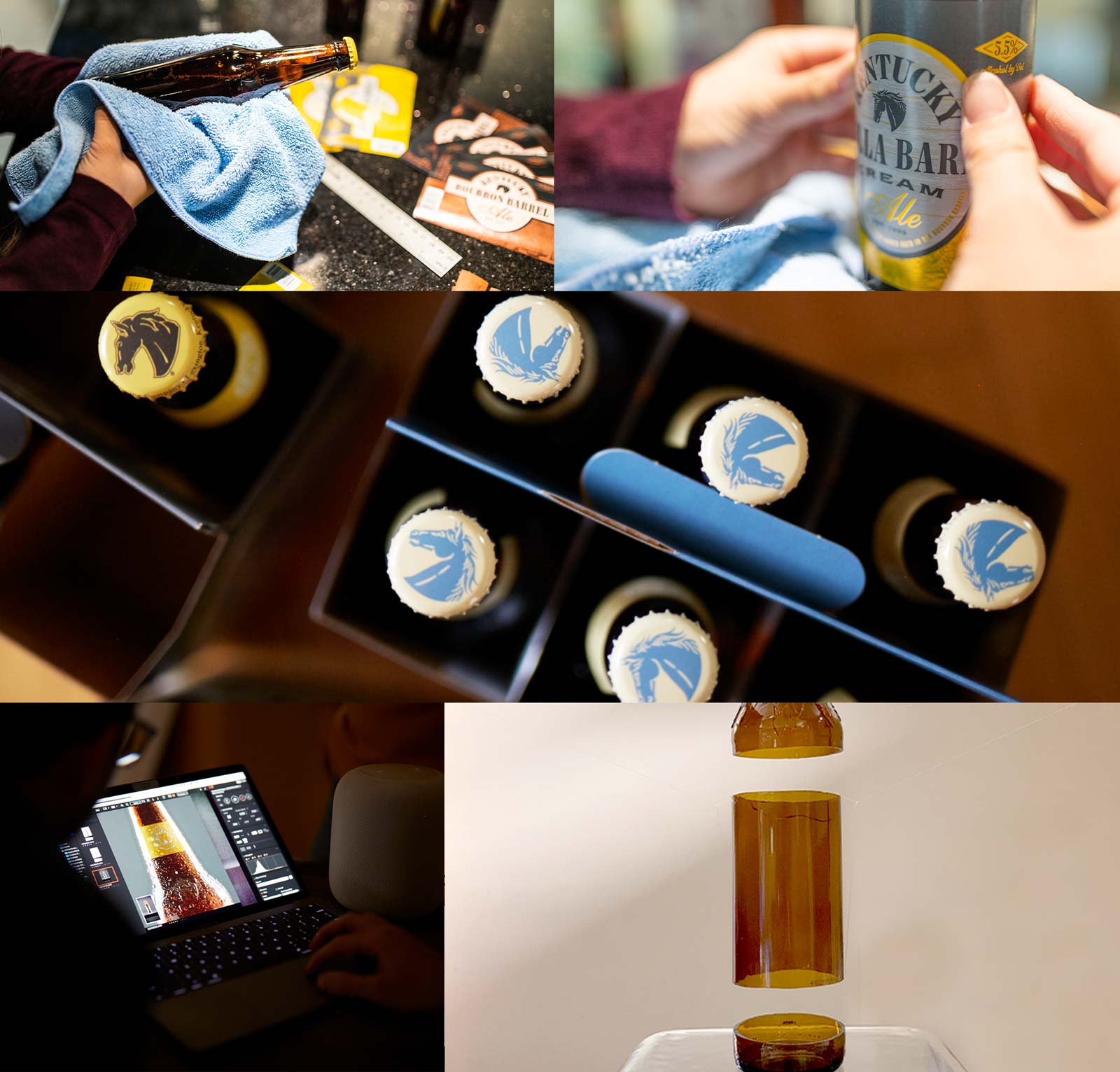
To achieve the vision we had in mind, we used a combination of photography of the bottles, label scans, projection mapping, 3D modeling, advanced rendering, and digital photo manipulation/compositing to create an eye-catching photo by bringing all of the elements seamlessly together. We researched vanilla flowers, coffee (including the process of brewing more than a few late night cups), cut beer bottles with a specialized glass cutter, and even sawed a bourbon barrel in half; basically doing whatever it took to get the perfect shot.

The work is tedious, and almost always turns out to be more difficult and complex than originally planned. Some shots you think are going to be accomplished a certain way practically, while others a completely different way digitally. But it never fails: there’s always one or two that turn out to be finalized by the complete opposite toolset than previously intended due to a complex issue with reflections, lighting, self illumination, shadow placement, and/or label text obscurity. The only thing certain about the process is that we continue to iterate until it’s perfect, showcasing the client and their brand in the best way on a national level.
-

-
We thrive on these types of projects. In all, this campaign was an opportunity to push our skills to create artwork that focuses on each detail, down to every droplet, to ensure that the relaunch of this bluegrass staple is as strong as their bourbon barrel ale. For this project in particular, we also did full bottle scanning for 3D compositing and rendering. The end result was a local brewery competing creatively on a national scale. We challenge ourselves constantly to put as much effort into each product as this client put into the nuanced flavors in theirs.

With this unique campaign, Kentucky Ale stepped out with their new name, Lexington Brewing & Distilling with brand new, eye catching ads that expand brand mindshare and inform the customer of the variety of flavors and unique approach of a craft brewery care with high quality processes and ingredients. Each ad was approached unapologetically bold, and we wouldn’t have it any other way. Together, the ads appear unified in theme with their rugged Kentucky roots at the forefront, but with no lack of reference to their signature bourbon aging process.

With A Sincere Thank You To Lexington Brewing & Distilling’s Parent Company, Alltech.

Doing Logo Design Justice
-
Creating a Brand to smile about
Brand Development, Design, Photography
-
Every company will reach a crossroads at some point with their brand. For Justice Dental, that came with the exit of one of their partners. Their existing brand was entirely built on those two partners, so logos, signs, website, and all branding materials had their old name. They suddenly had to handle what so many companies dread…complete brand restart.
To handle the task of protecting the business during this process, Justice Dental turned to Oculus Studios to create their new logo design in Lexington. This was a complete reboot from logo to name. Our team came on to design a brand new logo, produce printed materials, carry out photo and video sessions with our in-house photographers and videographers, and manage social media for Justice.

The Justice Dental team sought to upgrade their branding with a new logo, and the Oculus team set to work to encapsulate the entirety of the brand within a single mark. View some of our process below, as well as the finalized mark that we moved forward with for the updated branding.


With a new logo comes a bevy of new printed materials, graphics, and collateral. With that in mind, Oculus designed and developed a brand manual specifically for Justice Dental, which would guarantee that materials would be consistent and on-brand for this striking new look. By utilizing step-by-step instructions for how the logo and branding should be represented across a variety of media, we were able to create a comprehensive guide that could easily be followed.


By focusing on the warm interiors and inviting spaces within Justice Dental, we were able to show a side to cosmetic and general dentistry not often seen. Instead of the bland, sterile environment that many know (and some fear) of a typical dentist office, Oculus Studios captured the spa-like experience that Justice Dental cultivates.
Retail Marketing
-
AD-ING SOME SPARKLE
Brand Development, Design, Photography
-
Local Lexington, Kentucky store Sash and Bow, named after its owner Sasha Bowlby, is a high-end boutique that specializes in chic, sophisticated fashion and accessories for women. When it came time for creating marketing in Lexington, she turned to Oculus Studios to create in-store print materials, gift cards, product packaging and more to promote the boutique. We jumped at the chance to create something truly memorable that would stand out as a statement to reflect both Sasha’s shining personality and the items found in her store.
Since Sash & Bow had an already-established logo, Oculus Studios implemented it into a variety of printed materials that would not only help spread the word about the boutique, but would also represent it properly. By utilizing earring and clothing tags, as well as unique gift cards, we were able to create a more interactive way for the logo to be seen and distributed.

An unforgettable gift requires an equally unforgettable gift box. With this thought in mind, it was obvious to us that we would need to meticulously design and produce a custom-made box for Sash & Bow’s shimmery gift cards. Because we went this route, we were able to create a truly one-of-a-kind reversible gift box that would not only be unique, but would invite conversation and further inquiry into the Sash & Bow brand.


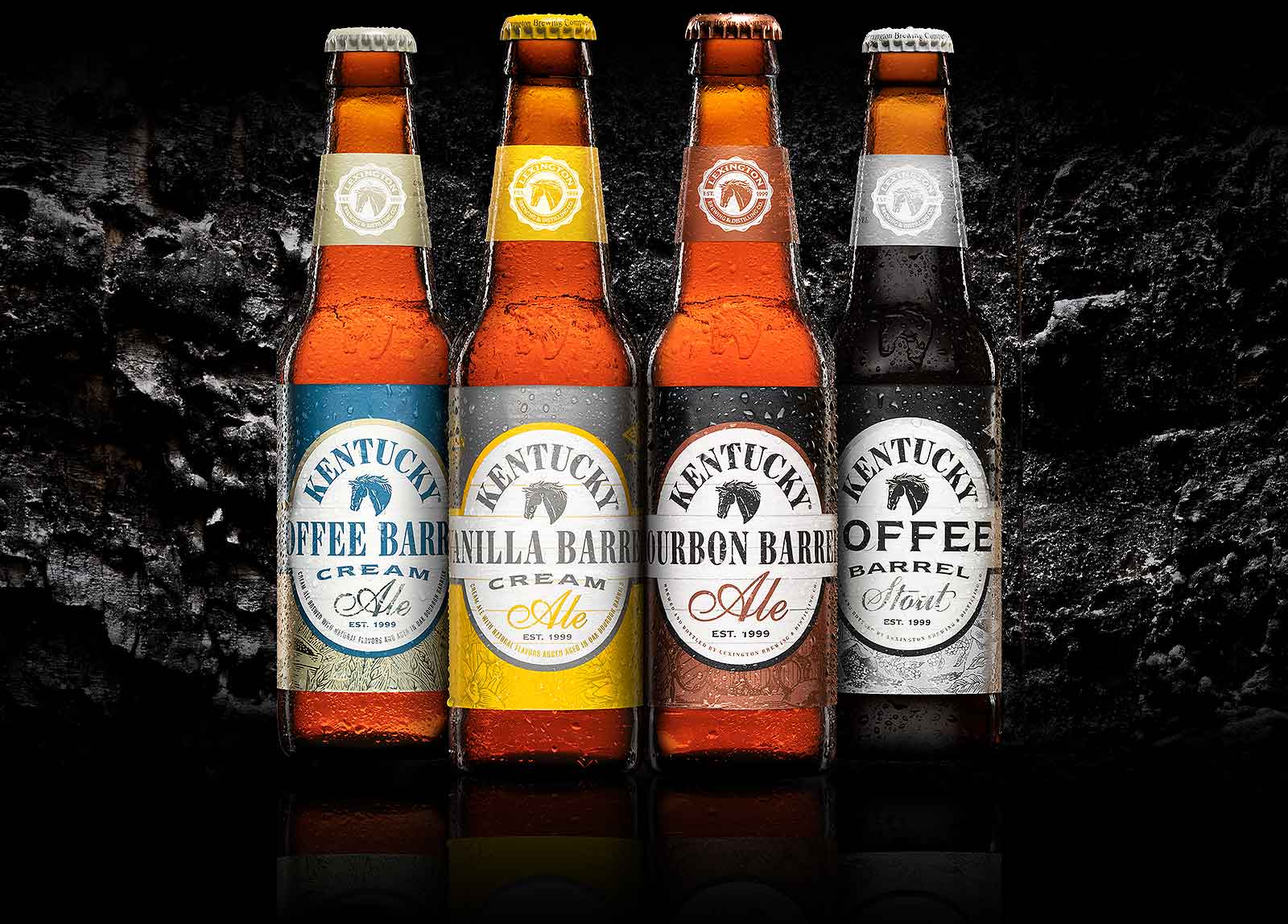
Kentucky Ale Marketing Campaign
-
SWEETER SIDE OF BOURBON COUNTRY
Brand Management, Commercial Production, Photography, Graphic Design, Print
-
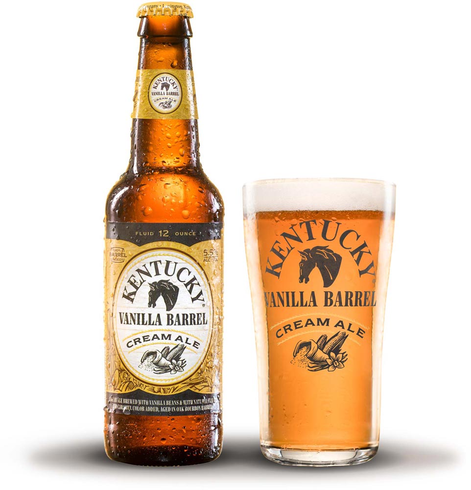
Alltech reached out to Oculus Studios to develop a campaign for their brand new Kentucky Vanilla Barrel Cream Ale beer release. Oculus jumped at the chance, and quickly set off to develop an entire campaign. Crafting a slogan, conceptualizing tone and message, to professional photography and radio/TV commercials. Additionally, we tackled multiple social media campaigns, print ads and hundreds of variations for a total digital ad blitzkrieg...
First and foremost, we set out to dismiss the idea that vanilla was boring, and instead branded it with a new identity using edgier imagery and vocabulary. Thus was born the 'Delicious' campaign. With extensive photography shoots in both Kentucky and Florida, we covered all of our primary target audiences in both mood and message.

In creating this campaign for Kentucky Ale, Oculus had to craft unique messages for each target audience across seven states. Touching on many different demographics and locations, each campaign had to work across print, video, and digital. The campaign lasted 3 months and reached tens of millions of people across the United States, pushing Kentucky Vanilla Barrel Cream Ale into their number one product by far – within its first quarter on the market.


-
We thrive on these types of projects, allowing each division of our in-house team to shine through their respective expertise. Our copywriters furiously scribbled down possible taglines for print and radio, our video production team took off to the brewery for interviews, and our photographer began dressing the product with fake water droplets and mood lighting for the most dramatic shots imaginable. The end result was a local brewery competing creatively on a national scale. We challenge ourselves constantly to put as much effort into each product as this client put into the nuanced flavors in theirs.
-


With A Sincere Thank You To Kentucky Ale’s Parent Company, Alltech.
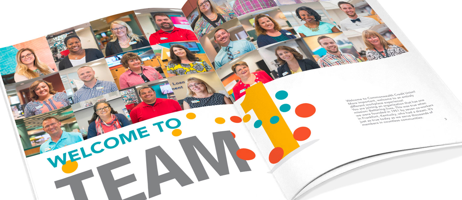
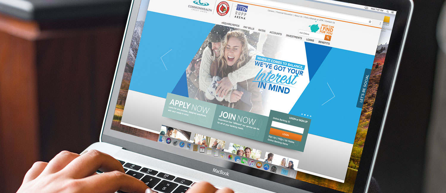
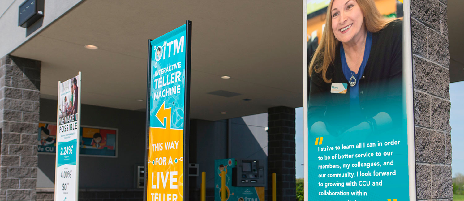
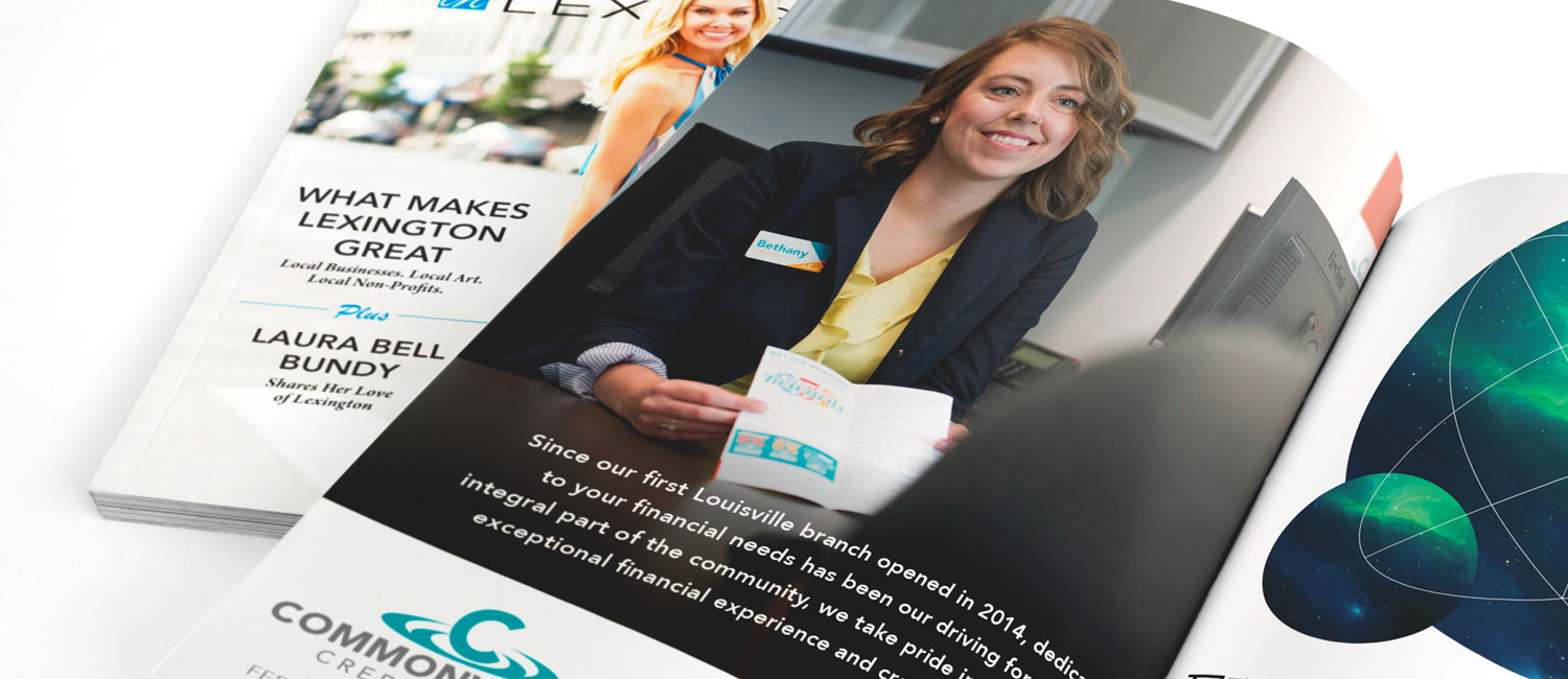
Commonwealth Credit Union
-
FINANCIAL 'MARKETING' INVESTMENTS
Brand Management, Website Design, TV, Radio, Print, Asset Creation
-
Since 2012, Oculus Studios has been partnering with Commonwealth CU to make powerful marketing content that will help them reach new members, as well as inform their existing member base. Commonwealth CU now stands proud at over 90,000+ members. Since working with Oculus, 'CCU' has grown by over 25% and crossed over into the billion dollar mark in total assets.
Since creating the slogan 'We CU Differently™, Oculus has continued to empower Commonwealth as they seek to better the lives of their communities.
The Kentucky Experience
-
Crafting One Ale Of An Experience
Print, Design, Branding, Social Media Management
-
With a name like 'Kentucky Ale' it's pretty much a given you need to make a big splash during the Kentucky Derby, and that's exactly what we did for Lexington Brewing & Distilling Company. Every year nearly 200,000 people gather to enjoy nearly a 150 year old tradition of the world's most iconic horse racing competition. Lexington Brewing & Distilling Company set out to launch a campaign that expresses the spirit of what Kentucky is through the story of their beers, and share that with both the world and Bluegrass natives alike.
The idea was simple: to encompass a collection of Lexington Brewing & Distilling Company's most notable craft beers, show the customers what kind of journey they had in store, and call it 'The Kentucky Experience.' In addition, we organized a social media giveaway of a VIP tour of the distillery, tickets to the Derby, and a two night stay in downtown Lexington. We set out to re-introduce the rest of the world to Lexington Brewing & Distilling Company, and with that, create an unforgettable first (or second) impression.
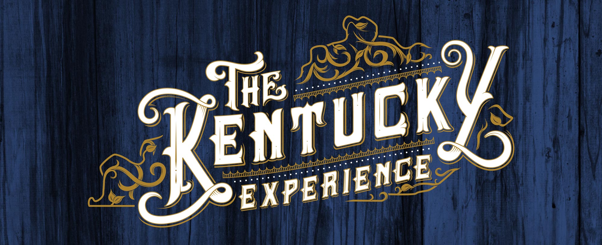
The very first thing we had to establish was a new brand, both for the sweepstakes and the continuation of future campaigns. It had to be unique, simple to understand, and most importantly it had to scream “Kentucky.” We set off playing with different types of fonts, weights, kerning and colors; drawing a lot of inspiration from beer and bourbon labels both old and new. As we progressed, we really were trying to find a path towards not only spelling out ‘Kentucky,’ but visually expressing it.
This led to experimenting with adding the state outline iconography in conjunction with the letters, but ultimately it wasn’t until we enveloped the entire word with it that we found the branding to stand out. We finished off the mark with custom, hand-drawn lettering and flourishes to ensure a unique flair when competing for customer’s attention in a storefront.
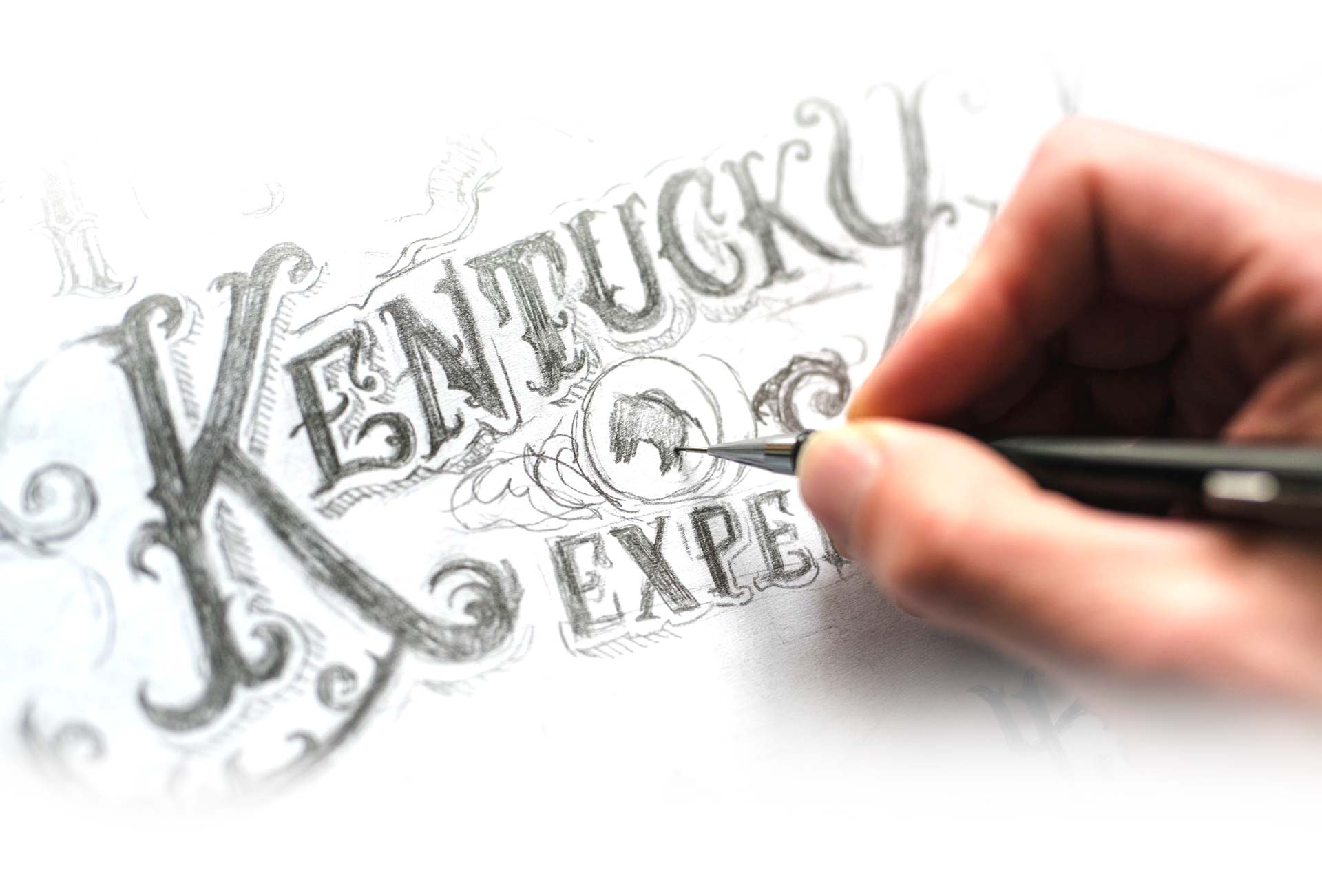
Regardless of the client, it’s paramount to try and create a sense of individuality that tells a story that sets them apart from the competition; simply put, we had to make The Kentucky Experience memorable. This materialized in a variety of ways through our research, prototyping and discovery phase we internally call “intrensic ideation.” This is where we explore potential avenues of exposure for the immediate needs and possibilities for future opportunities. Here’s a sneak peak into rough ideas that popped up but were set aside for time restraints, budgetary concerns or simply considered to be creatively weaker directions.
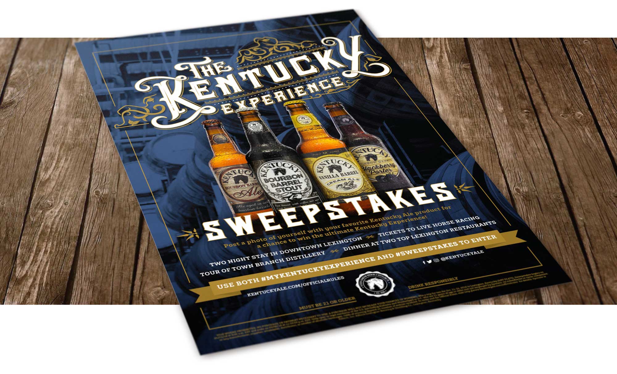
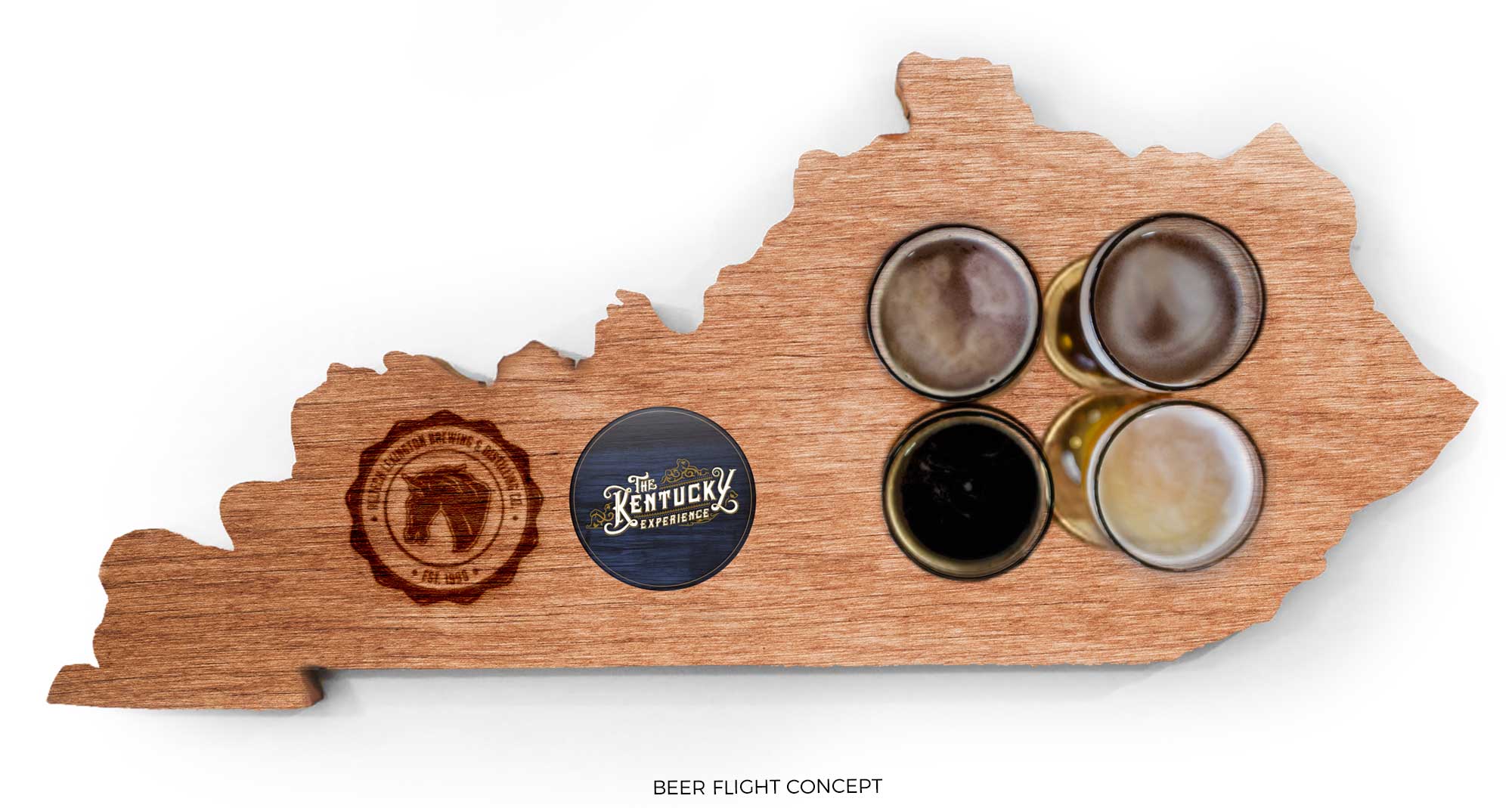
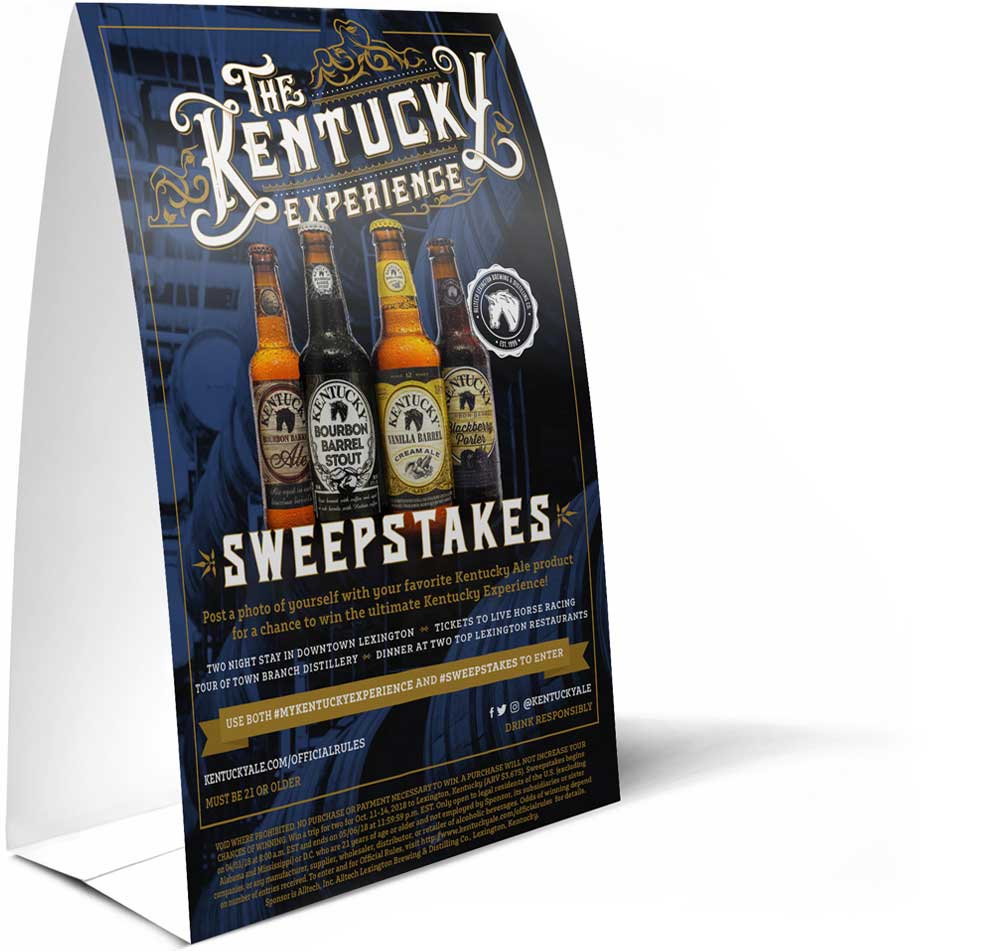
Naturally we executed all of the staples of a modern brand awareness campaign and sweepstakes giveaway, with posters, flyers, coasters, table tents, magazine ads, digital and social ads etc. Each customized for maximum response within their respective avenues of interaction.
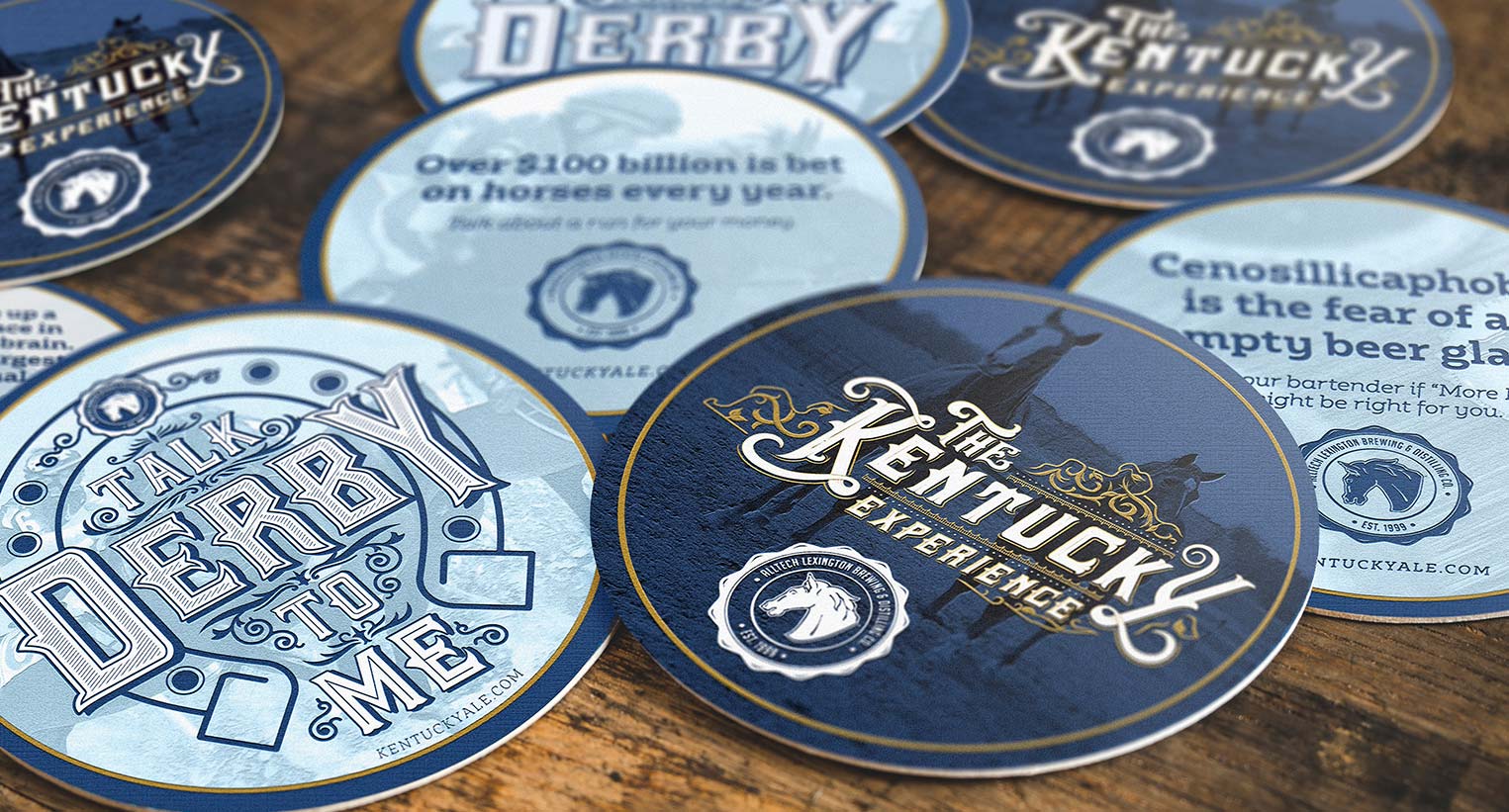
One of the concepts we knew we wanted to pursue were unique beer coasters that displayed considerable contrast against wood/earthy tones to allow them to “pop” against the majority of bartops. Additionally, we implemented another way for the audience to interact with the brand by writing fun facts about beer, horse racing and Kentucky Ale on the back. Again, just another way to connect and interact with customers to create memorable experiences.
-
Table tents are a must-have staple for the food and service industry and we knew going into the campaign small peripheral pieces like this is the difference between an average response, and carving out meaningful and memorable mindshare in consumers. Taken by itself, it might not be enough to call an individual to take action, but if it’s the second or third positive interaction with the brand, it could be all the difference in accomplishing that critical first sale.
-
-
-
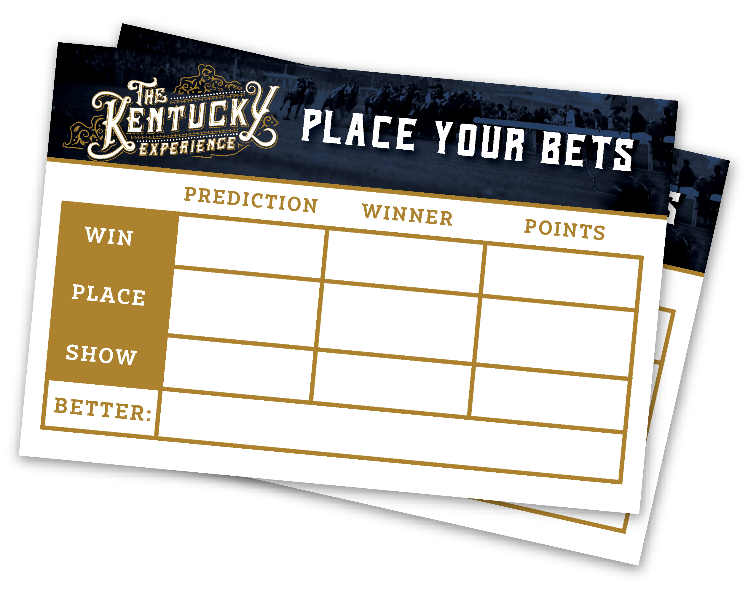
With horse racing being such a major industry around Kentucky, it was only natural we took advantage of the opportunity and created branded betting cards to supply to retail partners. Consistently supplementing transitional marketing avenues with small touches like this help set Kentucky Ale apart from other local and regional brewers.
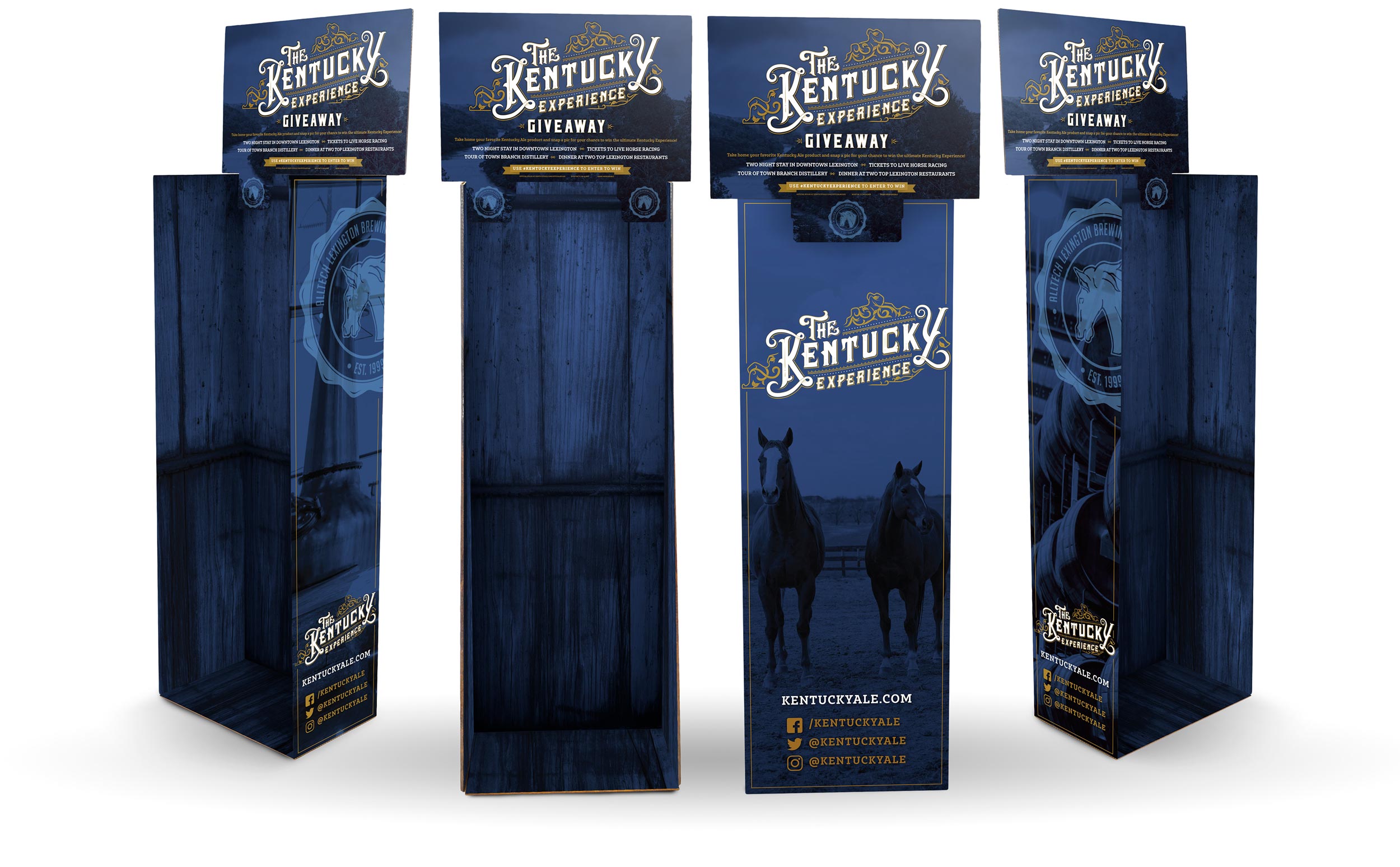
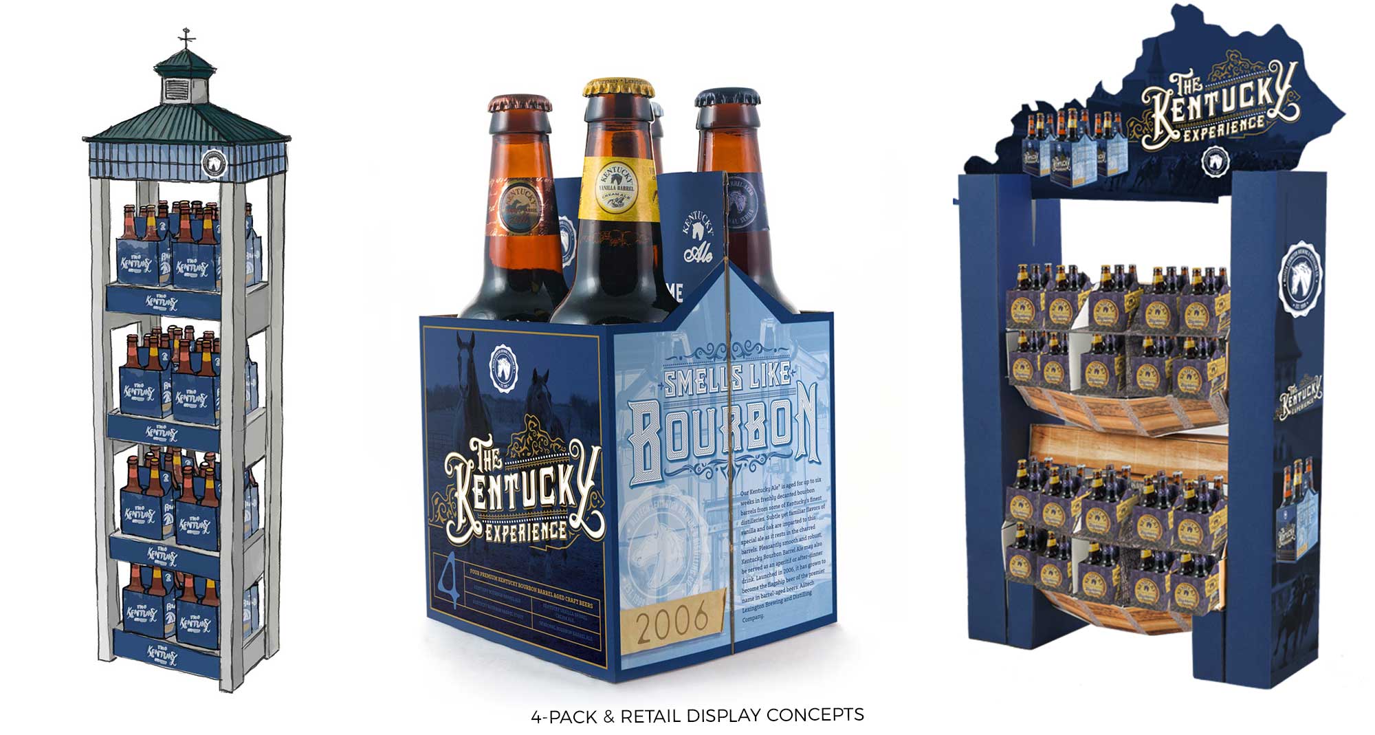
Finally, we re-skinned all of the existing retail displays to be in line with the new brand, featuring deep blues, bourbon barrel textures and the popup header flap for displaying the logo as it’s dominant feature, ready to be filled with four or six packs of product.
With A Sincere Thank You To Kentucky Ale’s Parent Company, Alltech.
KET Education Brand Development
-
Educating the bluegrass
Brand Development, Design, Wesbite Design
-
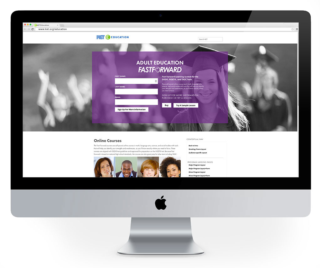
KET Education is part of KET Television, and in a sense is their middle name. They produce digital educational tools for the classroom and are Kentucky’s highest-quality source for public affairs and cultural programming. It’s well-known within the homes and schools of the Bluegrass, and a brand that Kentuckians have come to know and trust.
They were in need of a visual language that informed, and inspired a sense of community better than their current system. Oculus was tasked with creating the new visual system, as well as designing their new website.
-
-
Building Kentucky’s largest classroom
We set out to create a visual hierarchy for their differentiating educational age groups. We accomplished this by using strong, bright colors that could be easily integrated into the various avenues of potential student interactions. From photo overlays, to classroom signs, to hover effects for the website, the goal was eliminate any potential for visual ambiguity. The end result was a website and website lockup that is clear, and easy to navigate so the faculty and students could concentrate on teaching and learning.

-
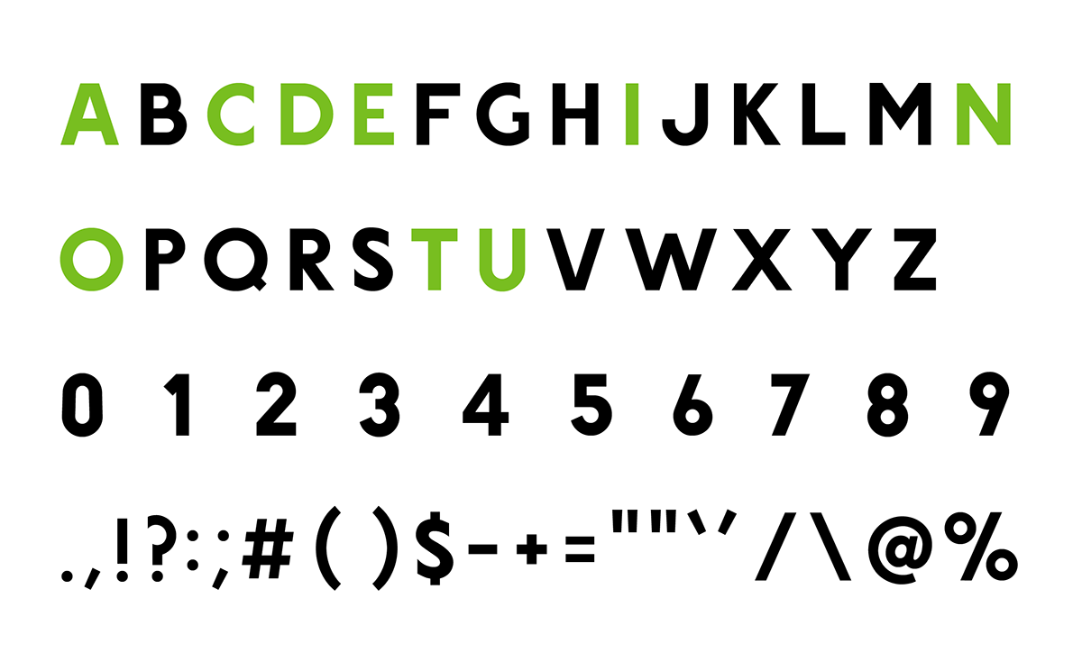
Creating a custom font
One of the most important aspects of KET’s visual rebrand was a truly custom designed font to call their own. We wanted to help ensure that the KET brand is just as unique as the Bluegrass itself that Kentucky is known for. To do that, we did a deep dive into typeface design of their most used fonts internally. We carefully crafted each curve and point of each letter to form a beautiful, bold font that they can be happy to truly call their own. -


MedMyne Digital Animation
-
MYNE-ING CREATIVITY
Illustration, Animation, Sound Design, Asset Design
-
What if there was a world where we could cut lung-cancer deaths in half by preemptively screening those who were pre-dispositioned to it; whether by genetics, lifestyle, or merely environmental factors? With today's healthcare records transitioning from filing cabinets in hospital basements to cloud-based digital databases, one company saw an opportunity to create a machine-learning system to explore the information for previously unrecognized correlations.
MedMyne came to us with an excitement and vigor we just couldn't ignore, and together we set off to create an informative animation that eloquently encapsulates their complex business solutions into a playful and fun video that anyone could easily understand. We began with writing a script and settled on a colorful, soft design language for our protagonist to live in. We had a blast dreaming up such endearing little characters and in the end, the final animation was just what the doctor ordered.

In creating this campaign, Oculus had to craft over 100 unique objects in order to populate the world of each scene. Each one was drawn individually and animated with care to help tell the story. Our goal is to draw your eye to something new you hadn’t noticed before every time you watch it. MedMyne really let us have fun with this project, and as a result, we feel the charm shines through.

-

-
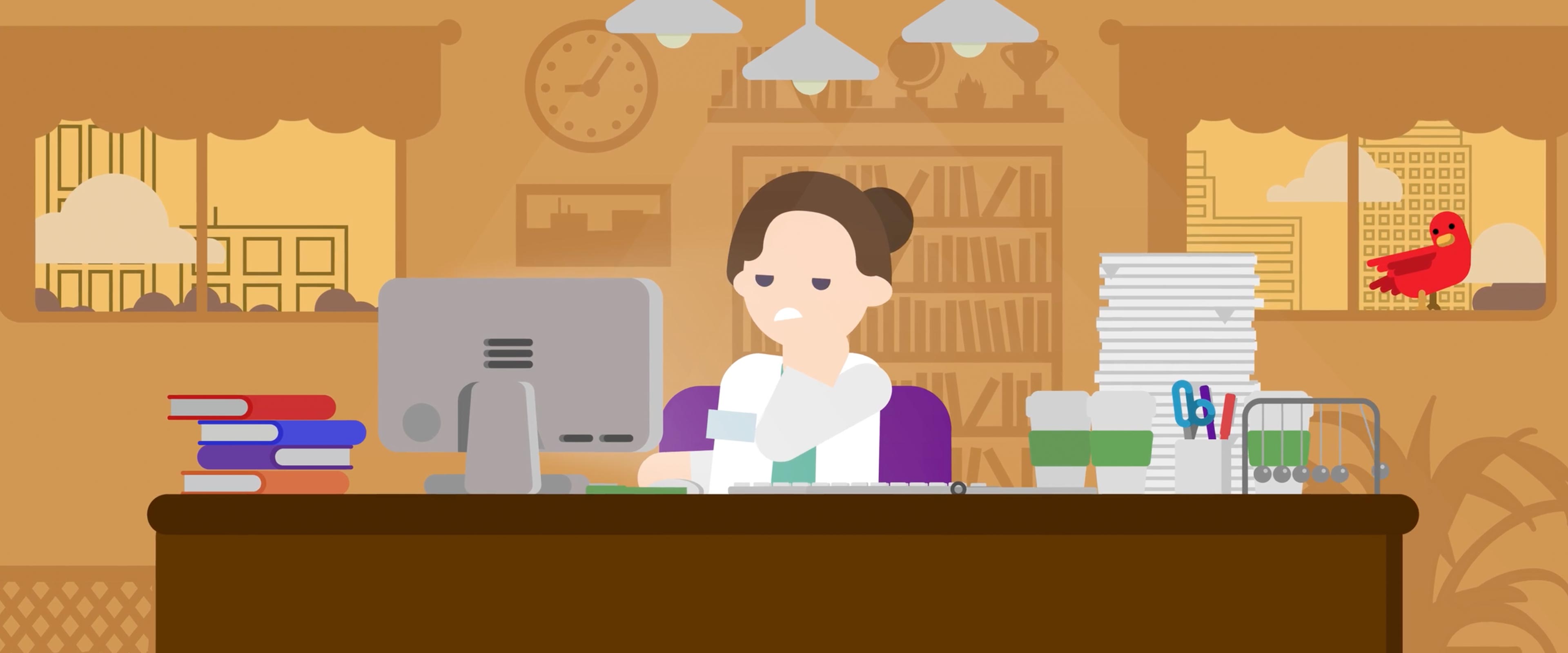
When working with animations, one thing that is of utmost importance is creating a sense of emotion, even if that means through inanimate objects. For instance, in a live-action commercial, the audience can easily relate to the protagonist through his or her body language, facial expression, and eyes. When working with illustrations, it’s always important to exaggerate for clarity. In addition, just like set dressing on a practical shoot adds context and mood, giving those objects their own supportive emotions in animation helps drive the story forward. We end up becoming quite fond of these little characters, even if it is in our own little anthropomorphic way.
-
It’s important to us that we create characters we feel most of our target demographic can identify with. In this instance we chose a female who works in a hospital – she’s overworked and stressed about having to input, manage, or search through clinical records. In the video, we can see this is a common thing that is required of her year round, and sometimes requires overtime or burning the midnight oil to complete. In the end, we successfully introduce a problem, identify a fix, and finally show her and the audience exactly how to acquire that fix.
-

We live to tell stories that connect us all as individuals, and love to flex those creative muscles in new directions with each project. But it’s ultimately even more empowering and fulfilling to flex those muscles to help expand awareness of an important, and possibly life-saving, breakthrough. We were honored to be a part of this movement, and hope our part helps spread new awareness about these amazing new machine-learning, and ultimately life-saving advances.
![]()
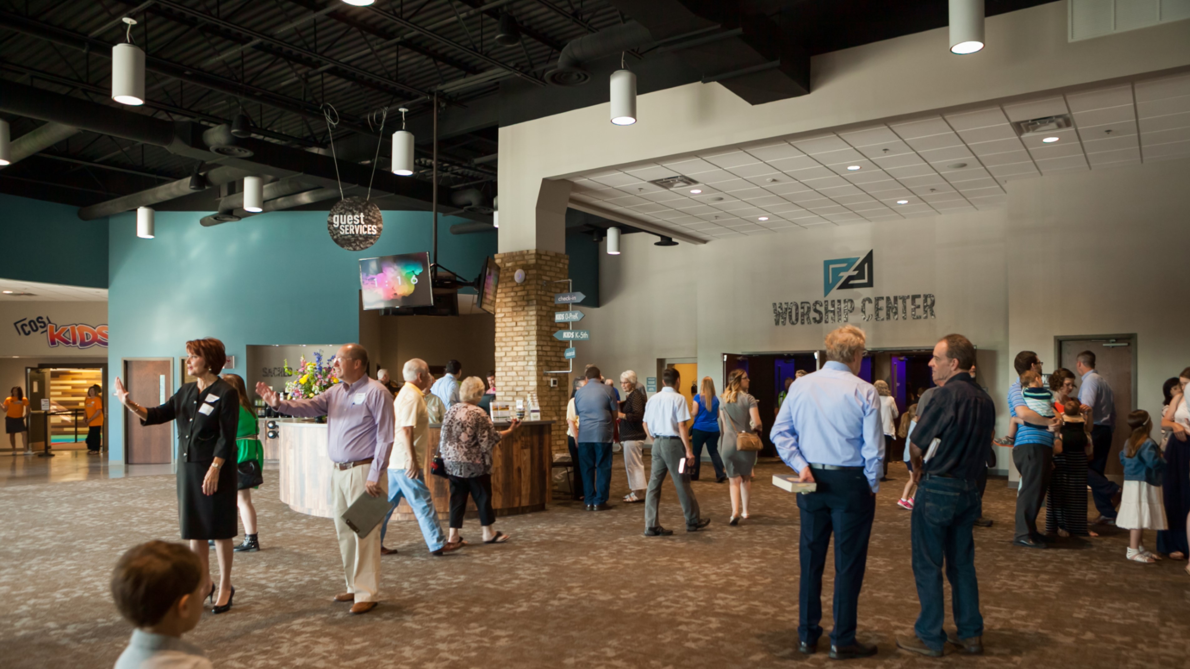
Church of the Savior Brand Development
-
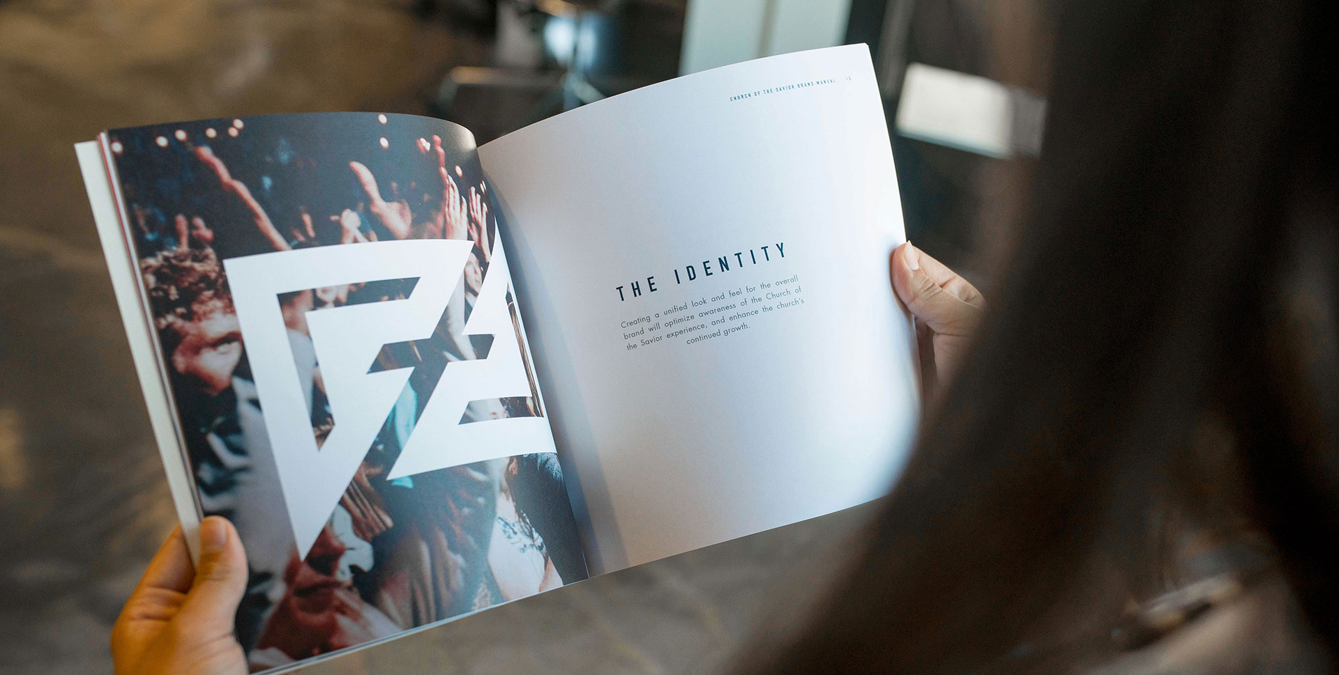
On a mission to serve everyone
Brand Management, Graphic Design, Print
-
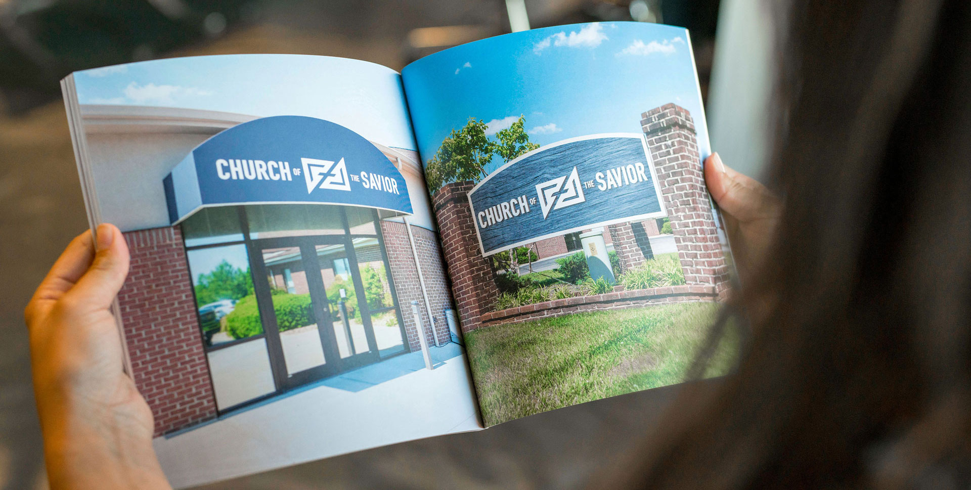
Not every logo has implications that span this world and the next, but that was the goal Oculus set when working with Church of the Savior. The brand is built on the message of Acts 13:47... For this is what the Lord has commanded us: I have made you a light for the Gentiles, that you may bring salvation to the ends of the earth.
By focusing on reaching everyone, all over the world, this brand took on a new level of care and inclusiveness.
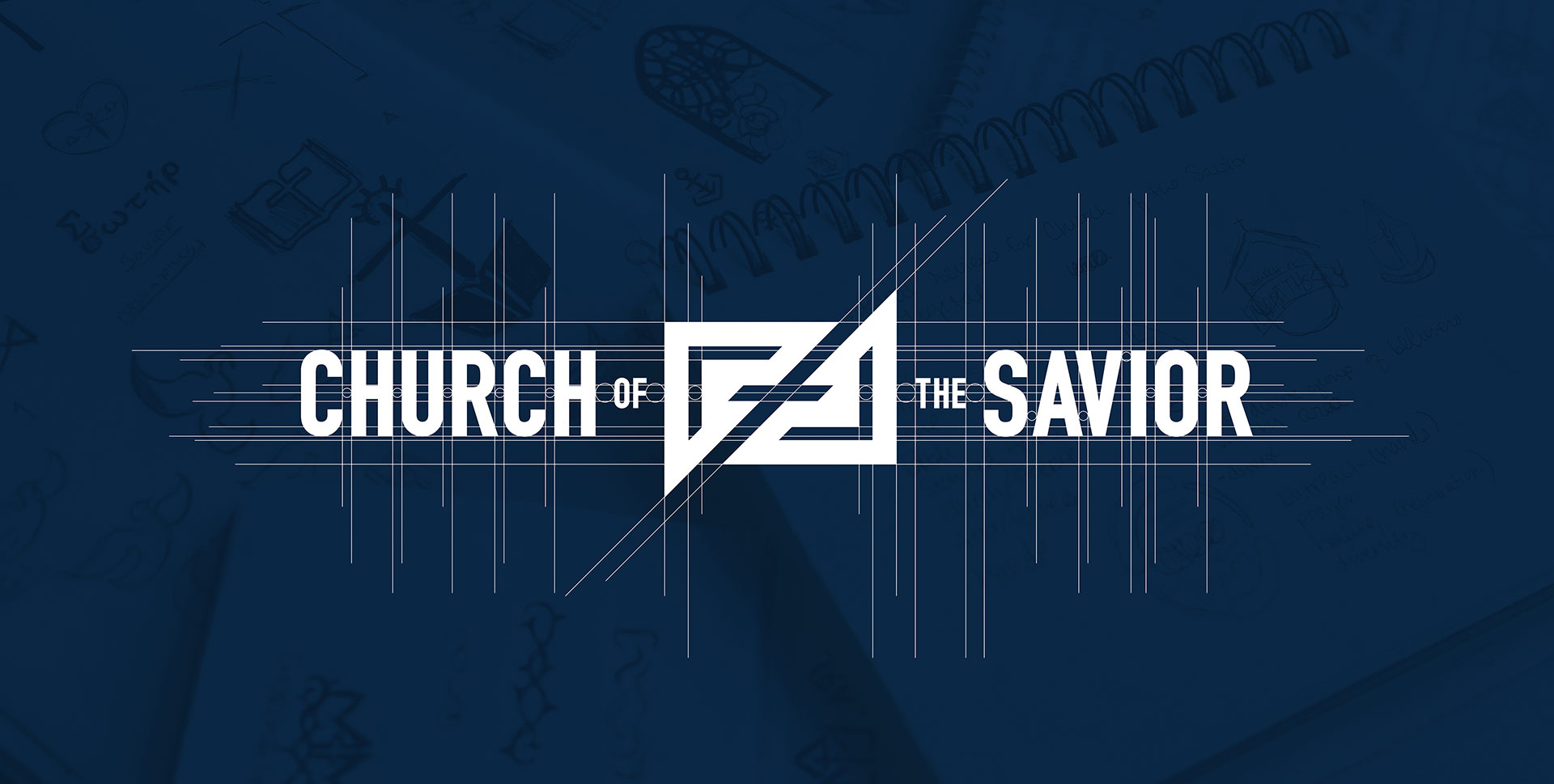
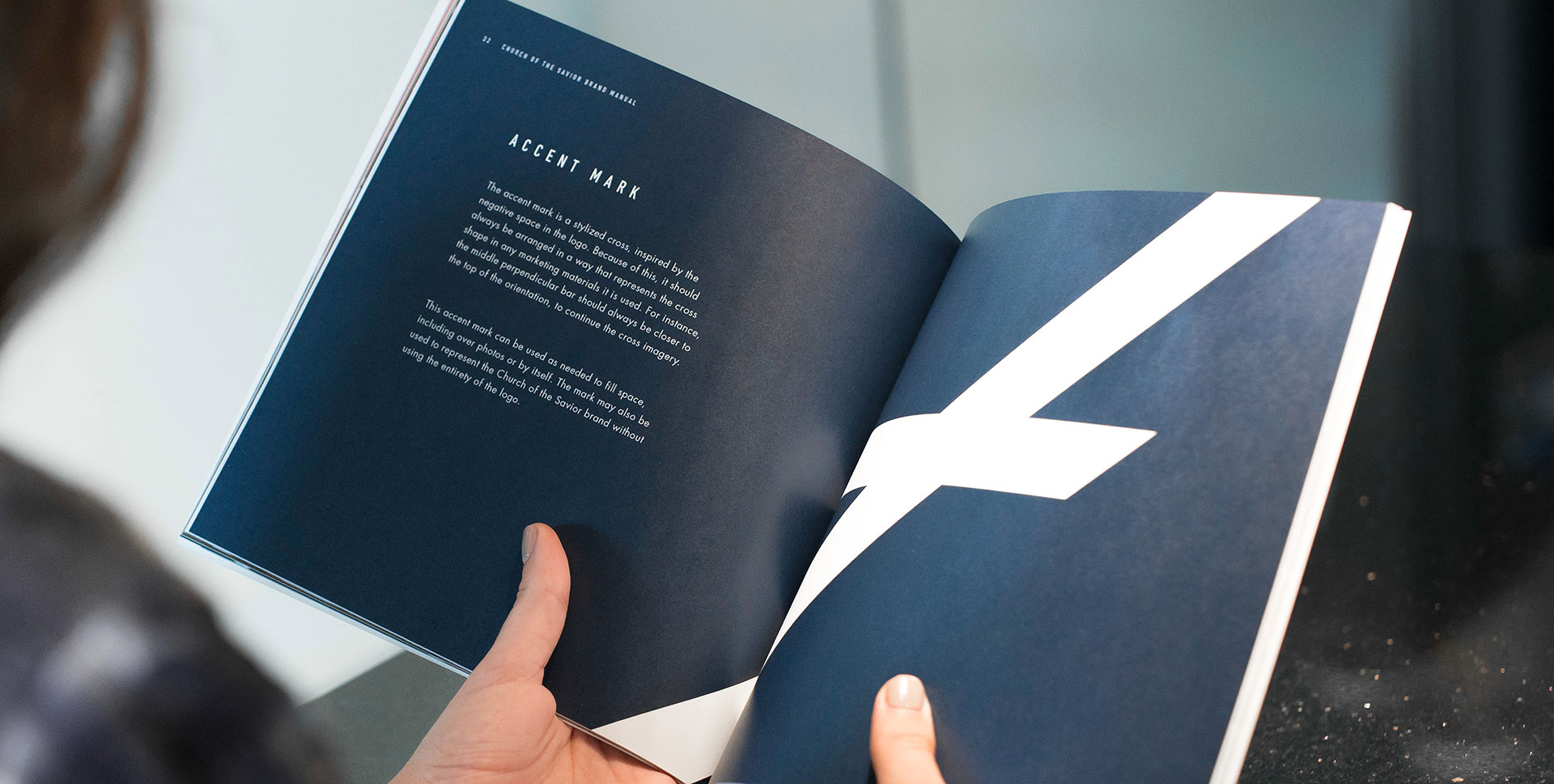
The updated logo uses prayer and outreach, two of the central themes they wanted to focus on, as the main inspiration. To accomplish this, Oculus utilized triangular arrow shapes that come together to create a cross within the negative space. This represents not only the idea of evangelizing, but also of people coming together in worship. The mark strays away from what would be considered a “typical” depiction of a cross with its bold, diagonal lines and strong edges.
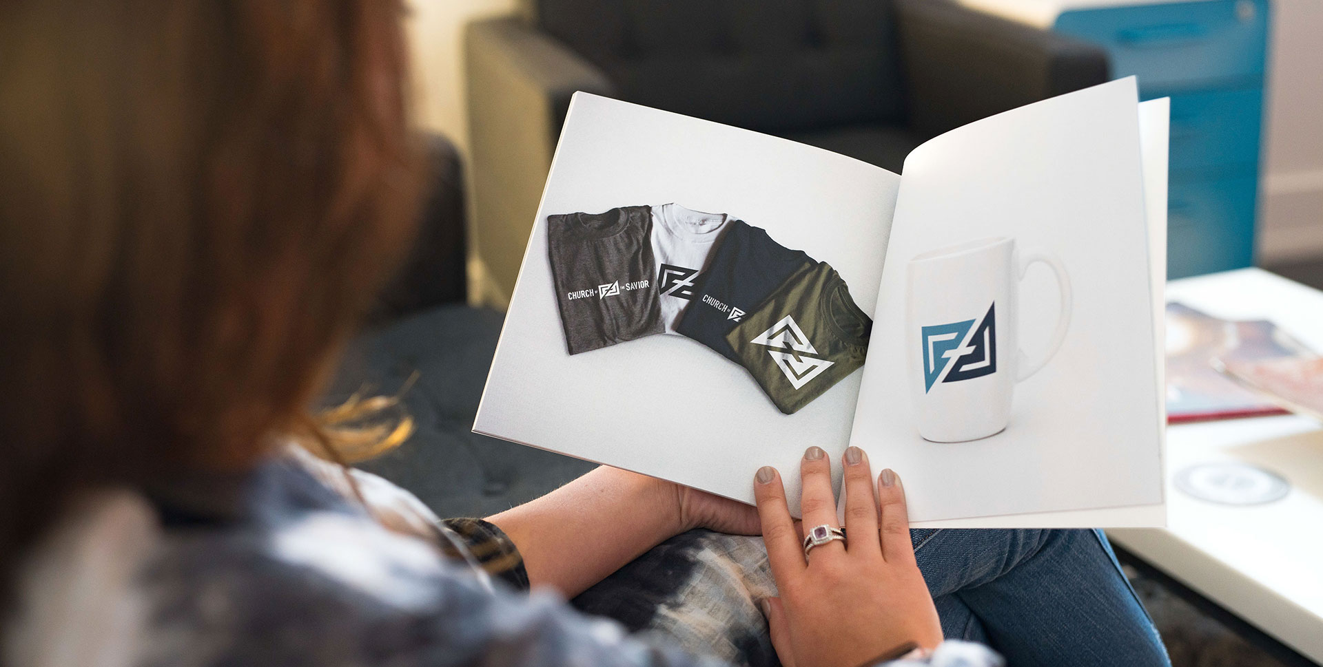
The colors, a combination of a calm, more subdued blue in a light and dark shade, carries a classic feel while still managing to be modern, appealing to both the older and younger generations of the church. This ensures that the color scheme can be integrated into its predetermined environment seamlessly.
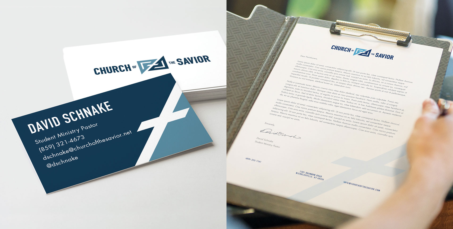
Overall, the brand became more iconic in hopes that it would establish not only an internal identity, but an identity throughout the community as well.
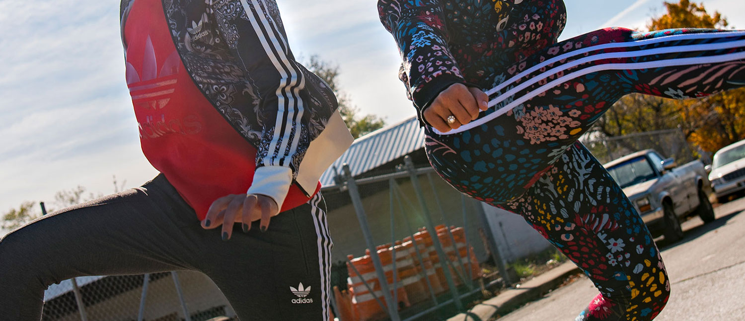
Allsports Marketing
-
STEPPING UP OUR GAME
Brand Management, Video Production, Photography, Graphic Design
-
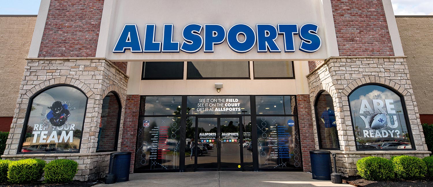
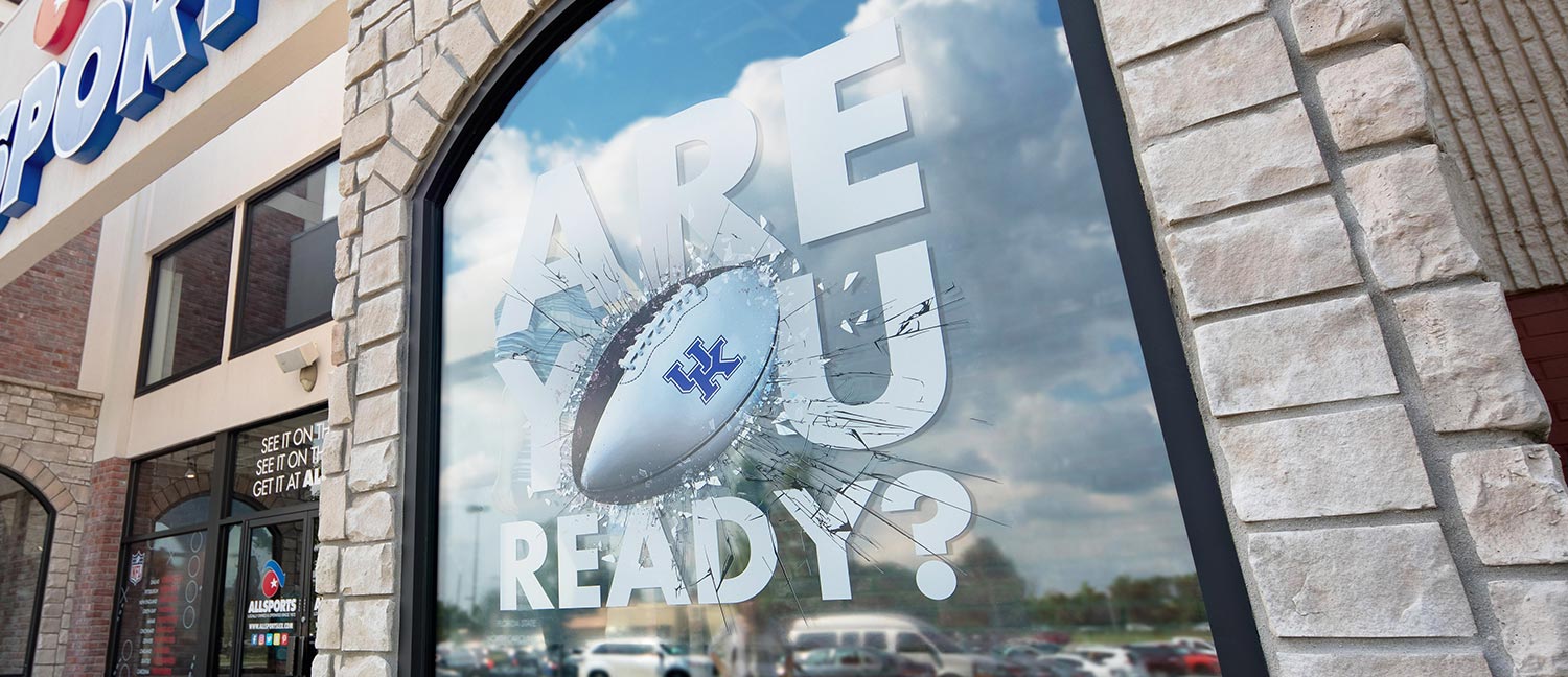
For over 45 years Allsports has been a staple of the Lexington, Kentucky sporting goods landscape, and in 2017 they partnered with Oculus Studios to bring their heavily-traditional branding into the modern, digital era. We set out to elevate their creative to closely match the quality of their product lines. We started off with completely new vision for their in-store signage. Utilizing custom photography along with bold, powerful fonts, the message is clear: Allsports is a pillar of Lexington Athletic Apparel just as much as UK sports itself.
It's been a whirlwind of work so far and there is much more to be done to ensure another 45 years of strong branding, but the bold new look and feel are just baby steps to a larger more unified cultural vision. From broadcast TV & radio commercials, in-store signage and window clings, giant Rupp Arena LED boards, YouTube pre-roll ads, Google Retargeting, Facebook and Instagram, we are pushing Allsports into the digital age while not leaving behind traditional avenues of customer acquisition.
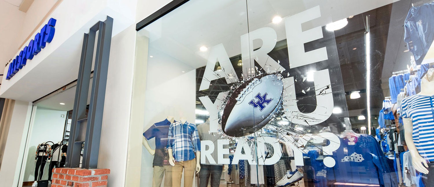
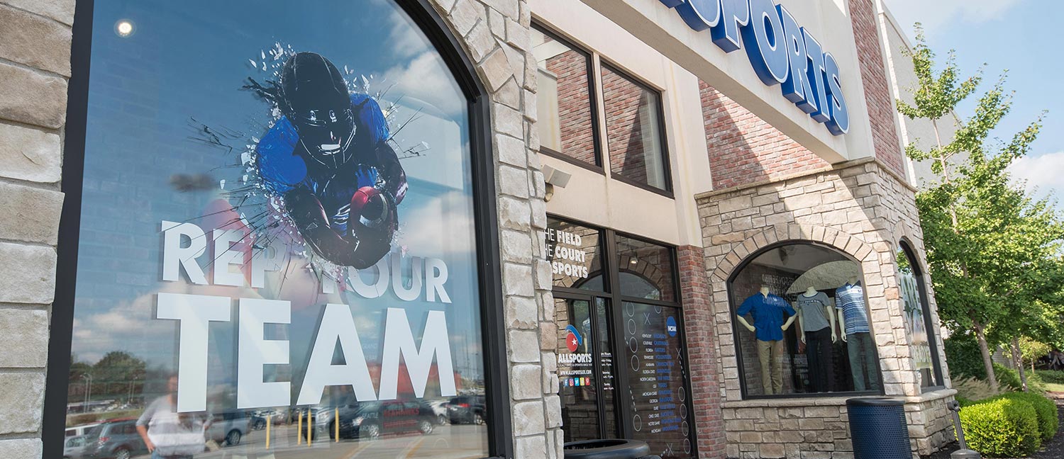
Much of the first year Oculus began representing Allsports was spent re-envisioning the store itself. With a massive renovation and expansion, our team set out to utilize the existing walls and windows as areas we could utilize to promote seasonal apparel changes, upcoming sales, and general brand awareness. One particular area of success was found in large window clings, which allowed customers to be made aware of specials from the sidewalk or even their vehicle out front. Window clings are a great use of existing space, giving potential customers a way to see beyond the cling and into the store itself, while simultaneously still allowing natural light in.
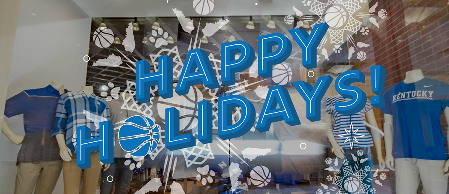
One of the biggest and busiest times of the year are the Holidays, and with that, Oculus was tasked with creating an ad that would work across all mediums. With text-heavy animations, kinetic, bold text and holidays-themed music, this simple 15 second ad worked perfectly to bring Allsports to the forefront of athletic apparel stores across all mediums. Produced in only 72 hours, the commercial required expertise across the entire team, but came together flawlessly.