Brand Management, Photography, Graphic Design, Print
It’s no secret that we like our breweries and distilleries, so when Wise Bird Cider Company, a new cidery, announced that they were opening up in our district, we were thrilled to take on the challenge of creating their logo and branding. They had pulled together some mood boards and inspiration pieces based off of what they were seeing in the cider brewing industry and with that, we were able to get a feel for the overall aesthetic that they wanted to go for.
They were in search of a brand that fit into their price point while keeping their eclectic tastes and rustic-meets-industrial space in mind. At the end of the day, we were aiming to land somewhere between, 'young and fresh' and 'high-end cidery.'
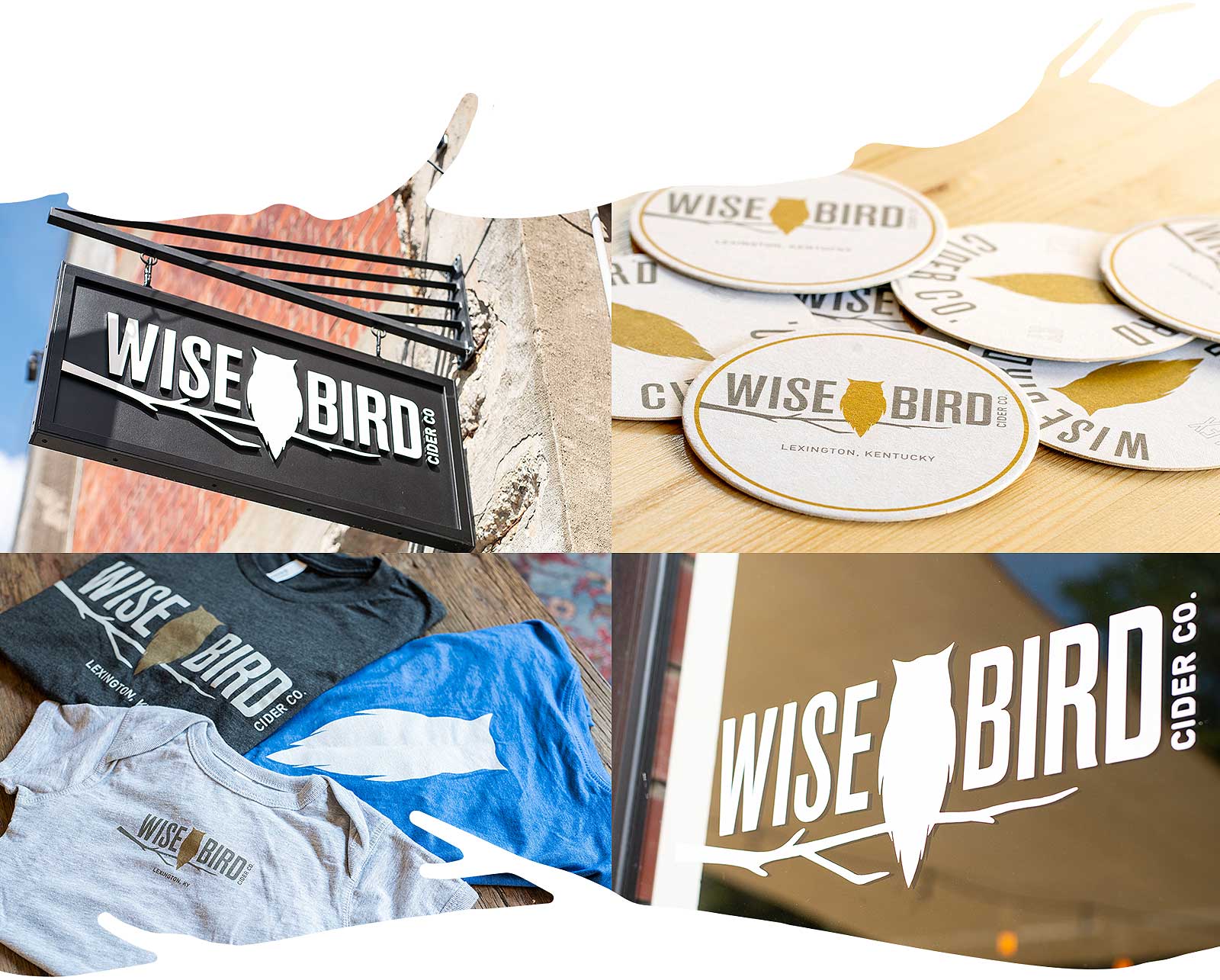
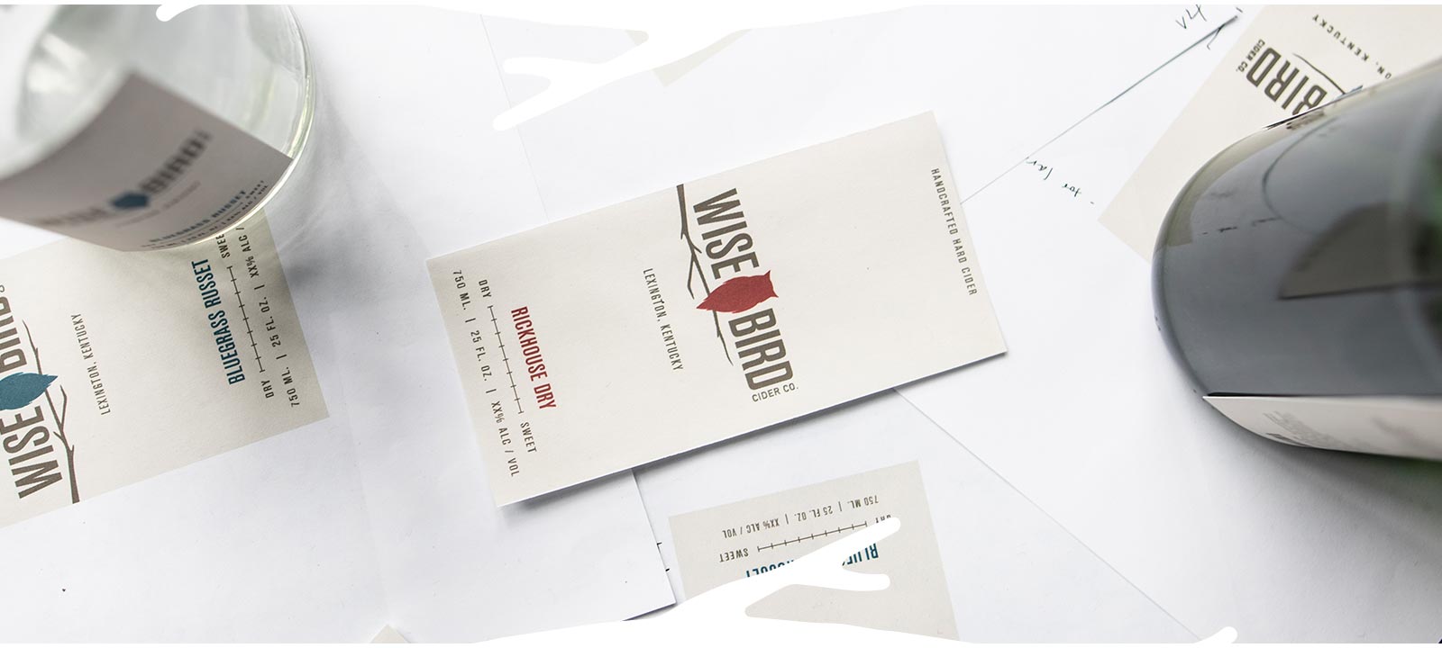
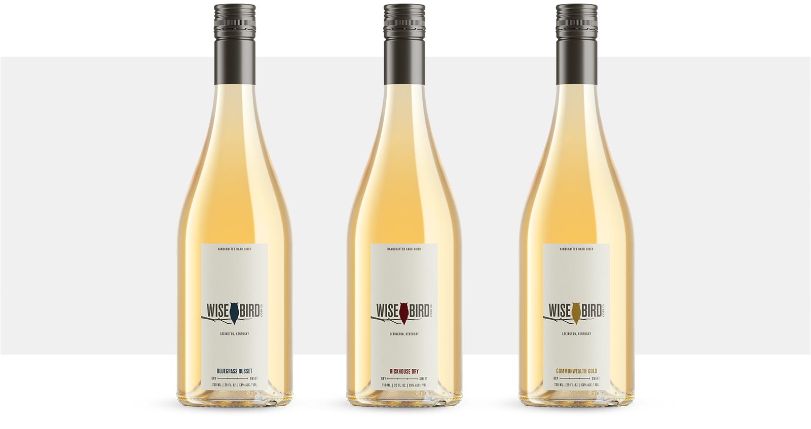
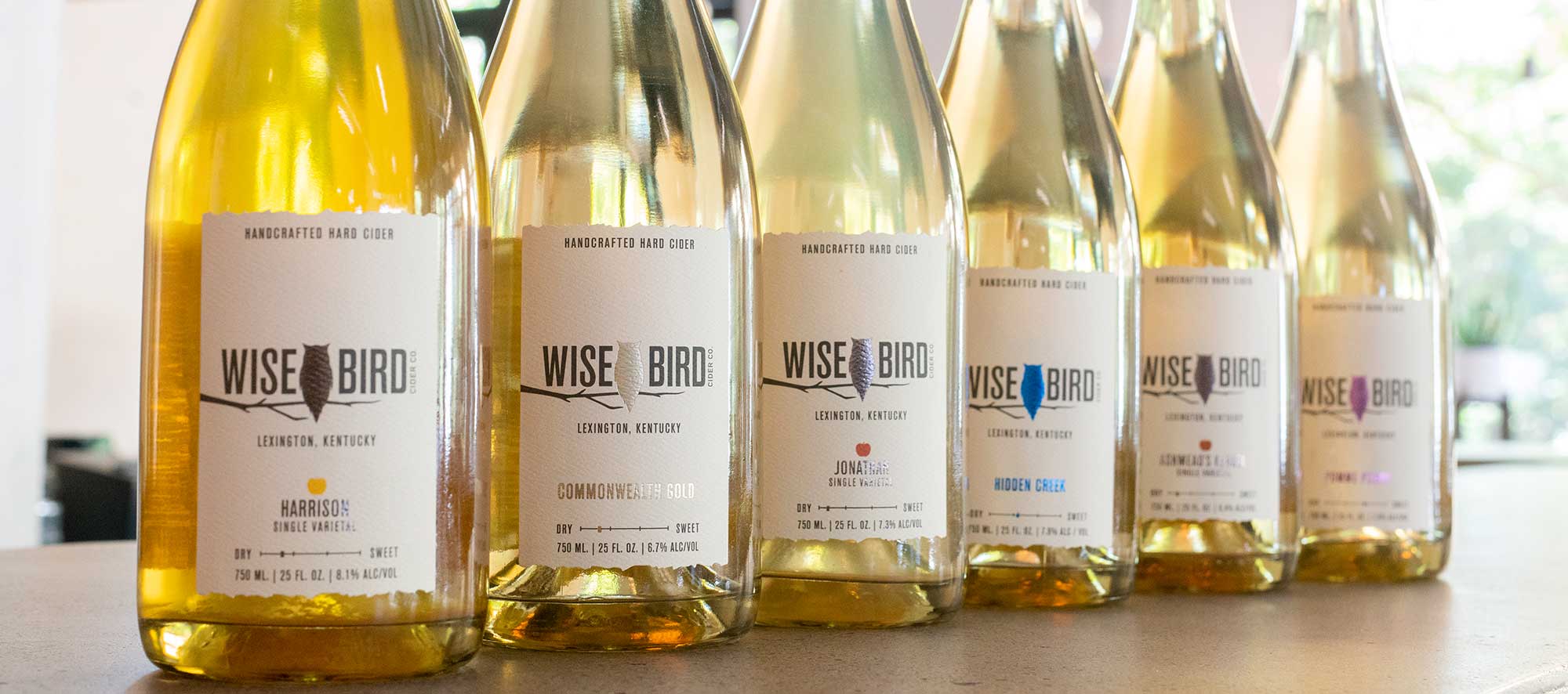
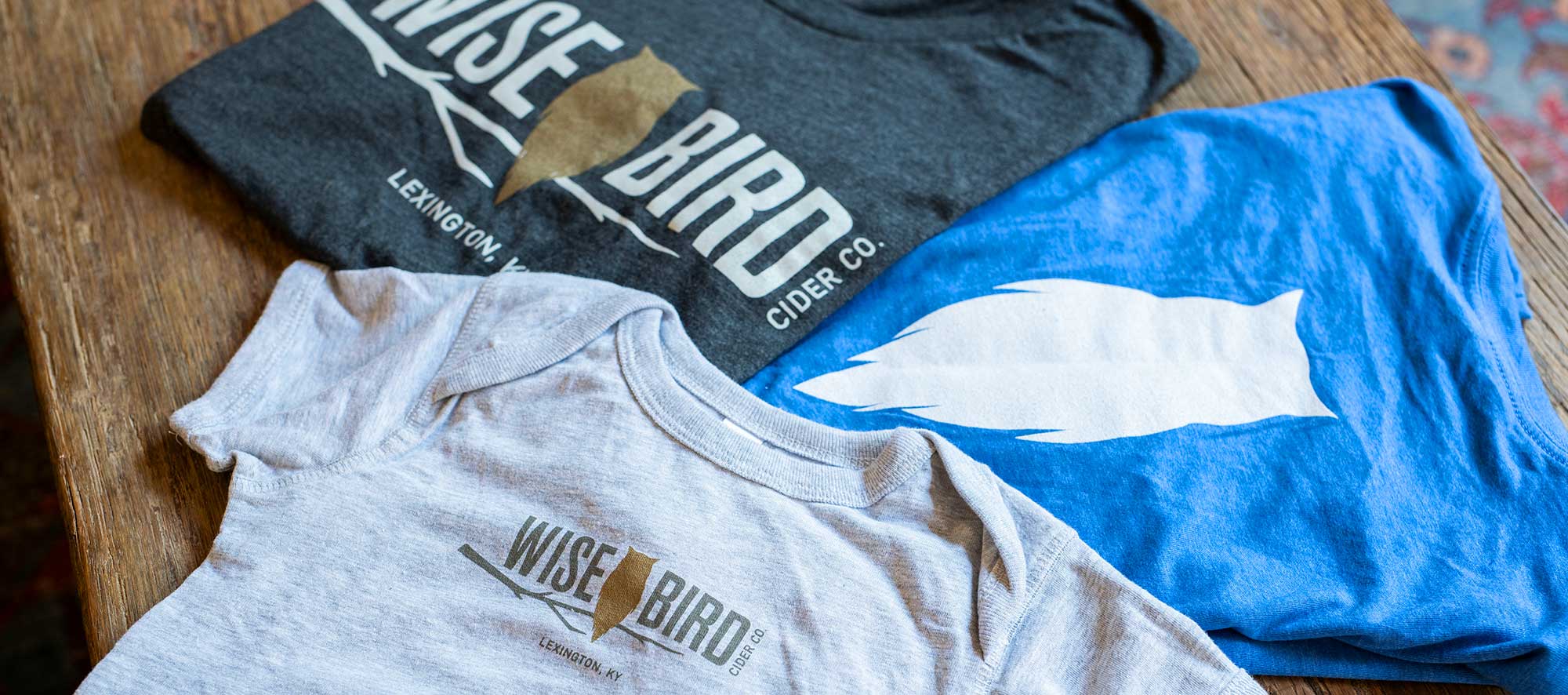
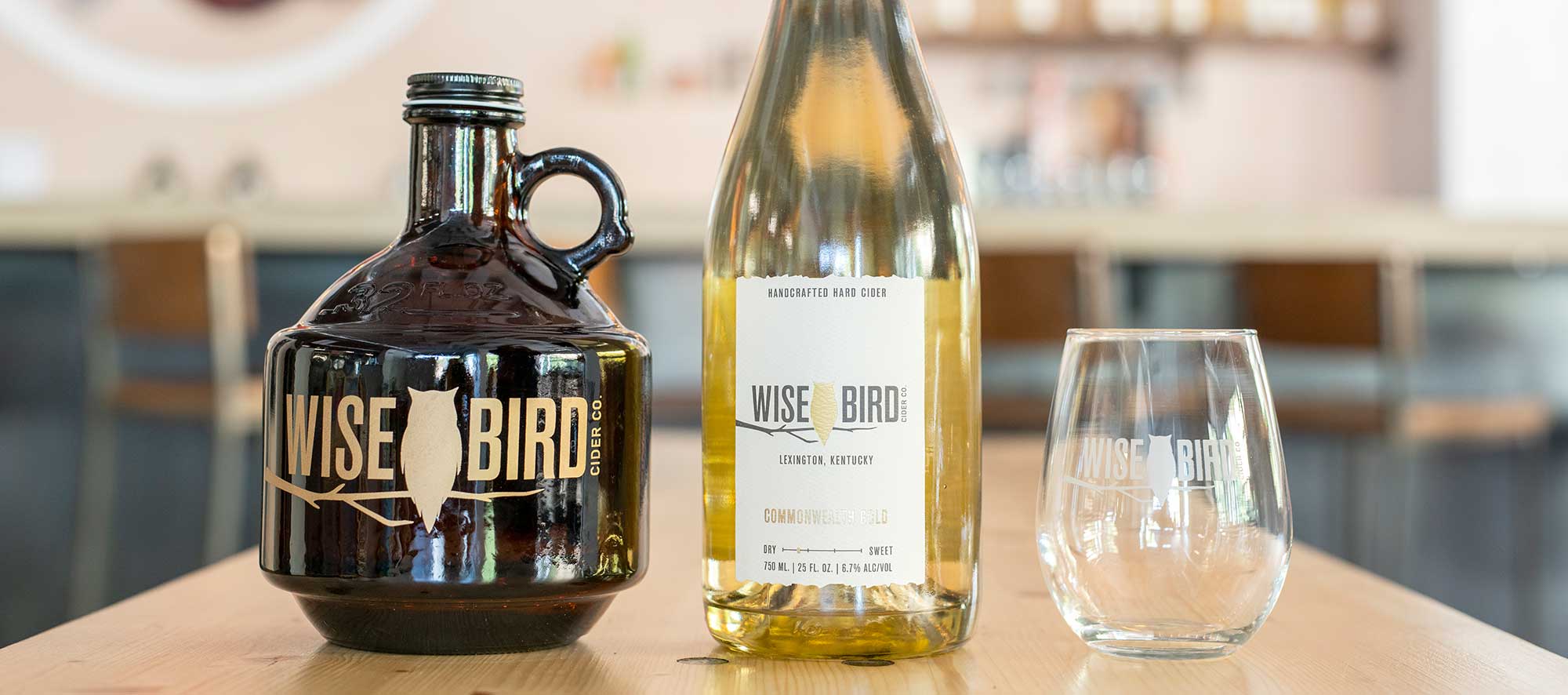
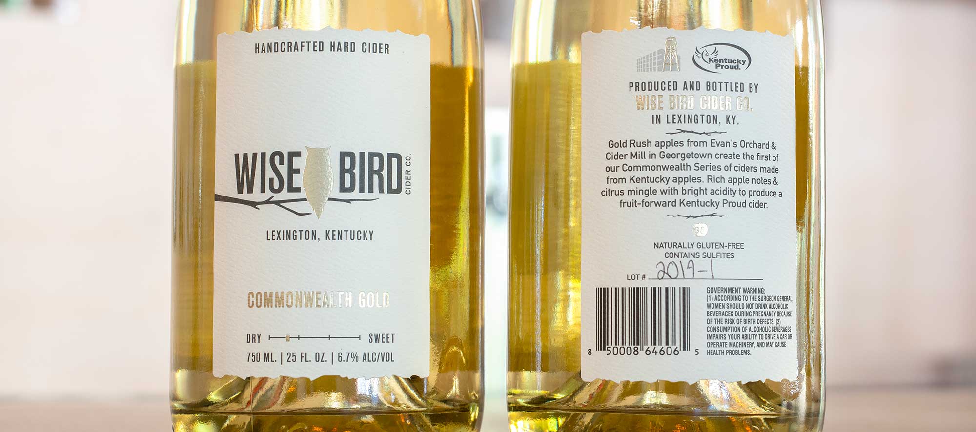
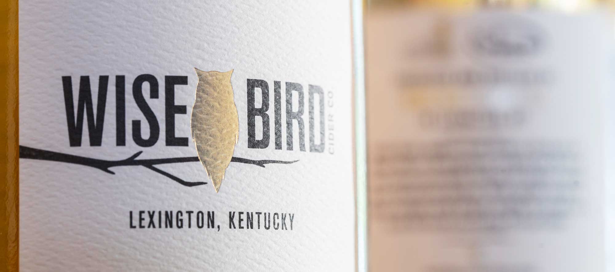
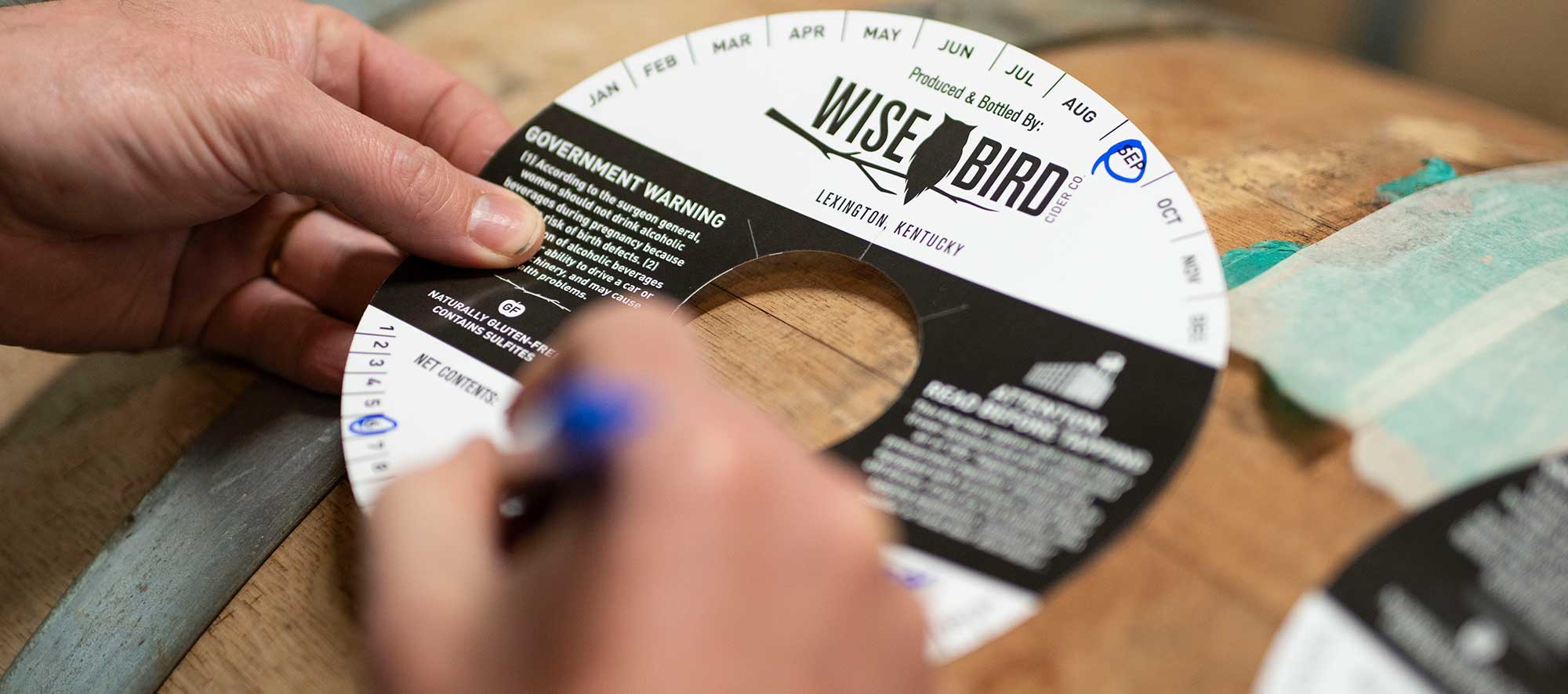
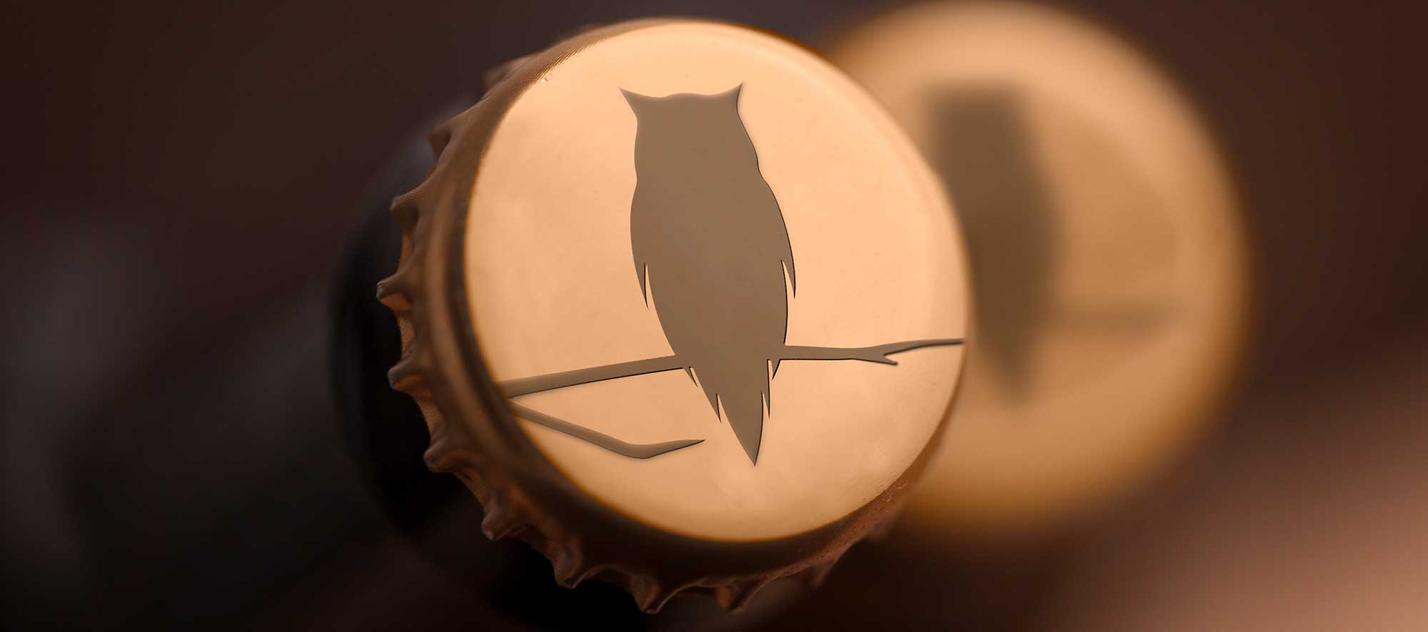
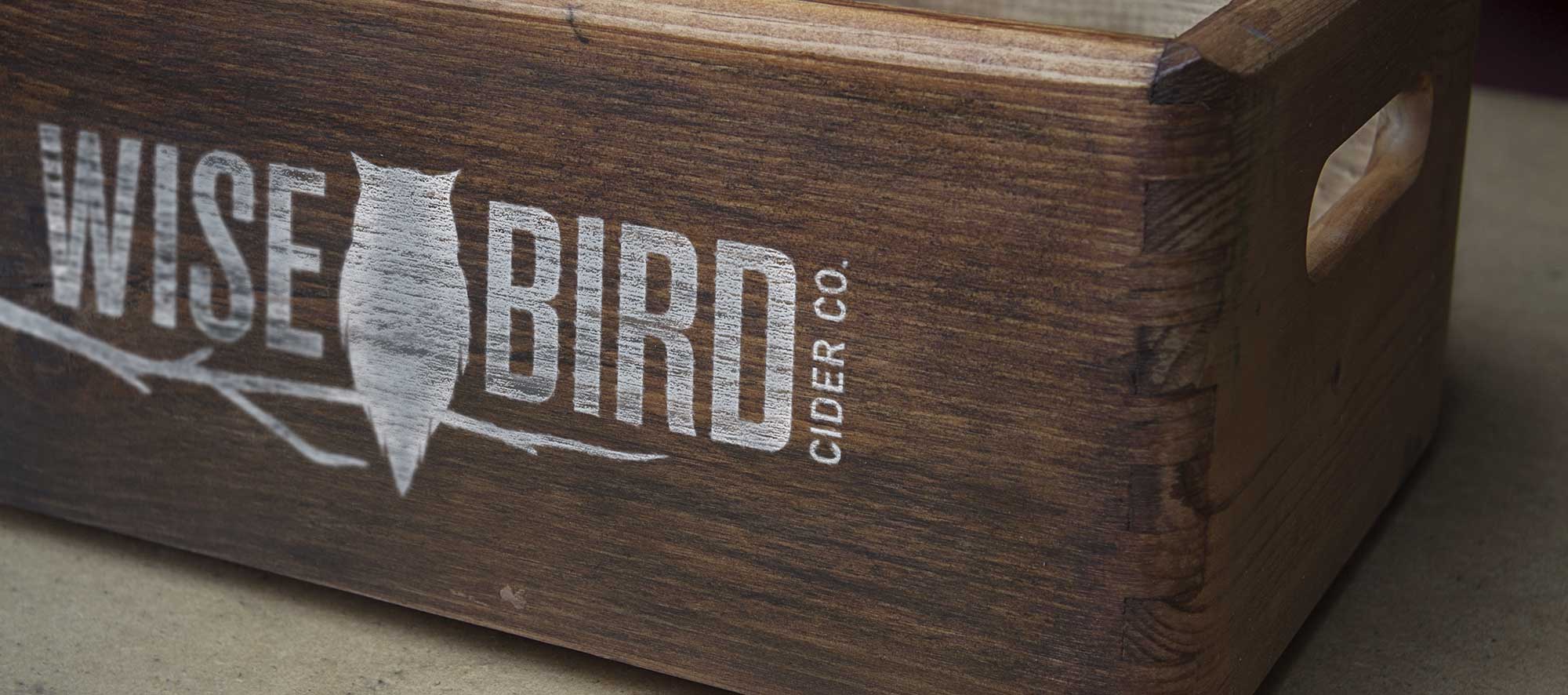
In keeping with the simplicity of the label, the finalized logo features a large owl in the center, with a modern sans serif font that’s equally tall and thin on both sides to balance out the overall design. We worked hand-in-hand with the label printer creating in-house physical mockups to ensure legibility for every element. The label itself is skinnier than the average cider or wine label, with the intention of this design choice being that the size would stand out on the shelves while also feeling at home in the Distillery District location.
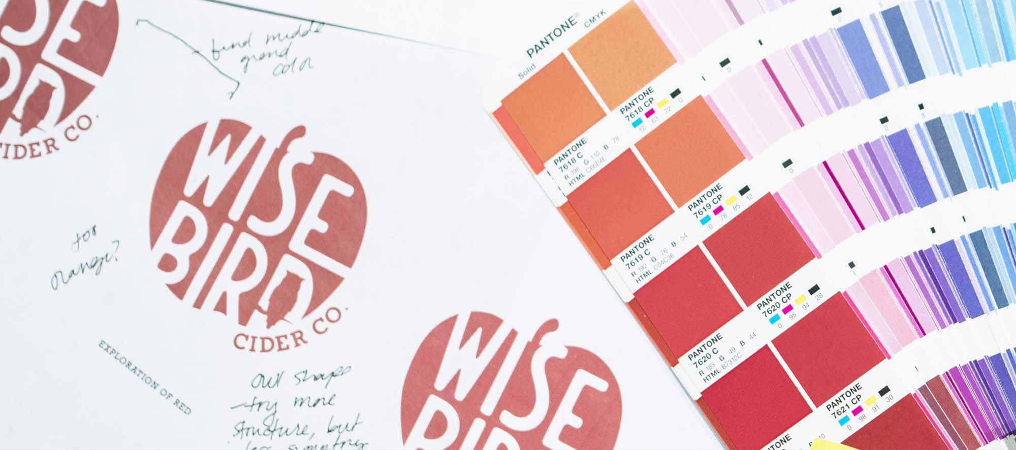
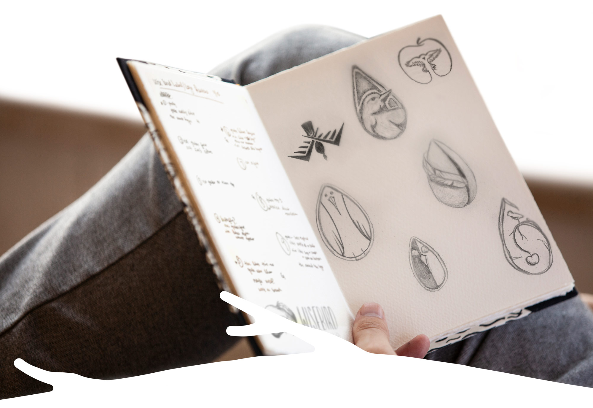
We eventually had something that seemed to really grab the clients’ attention; a simple apple icon with “Wise Bird” cut out and a hawk in the negative space of the D. The refining process began with the request of an owl option and specific apple shapes based on what they would be using in their cider lineup.
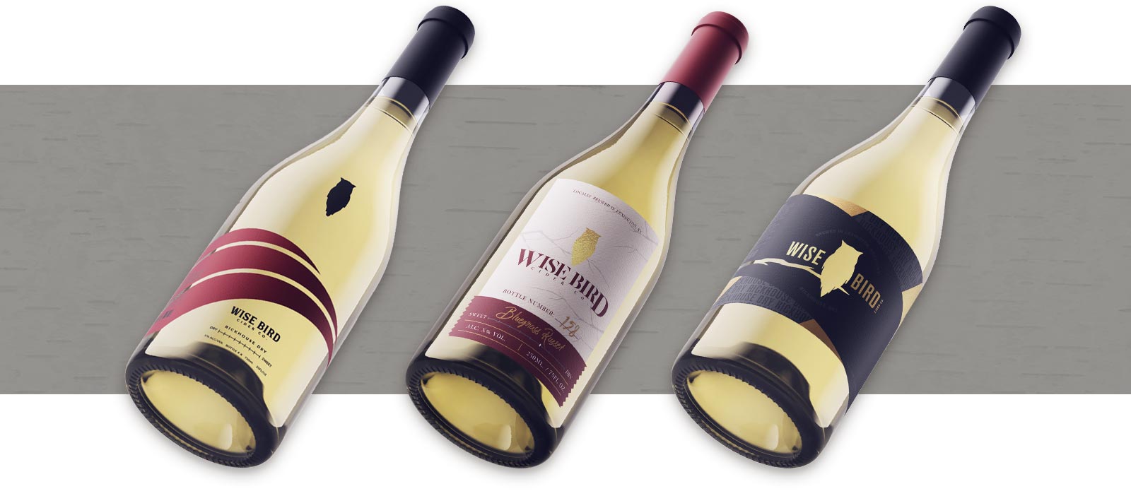
As we wrapped up the logo designs and transitioned into the label design, we were met with a change in vision from the client proposing a new challenge for our team. We decided the only way to address the next round of options would be to work backwards: design our ideal label and find a logo that fits the design with the cidery aesthetic in mind. They ended up choosing a label design that showcased simplicity while still being modern and easily recognizable for a new brand, and we kept that in mind when designing the new logo concepts.
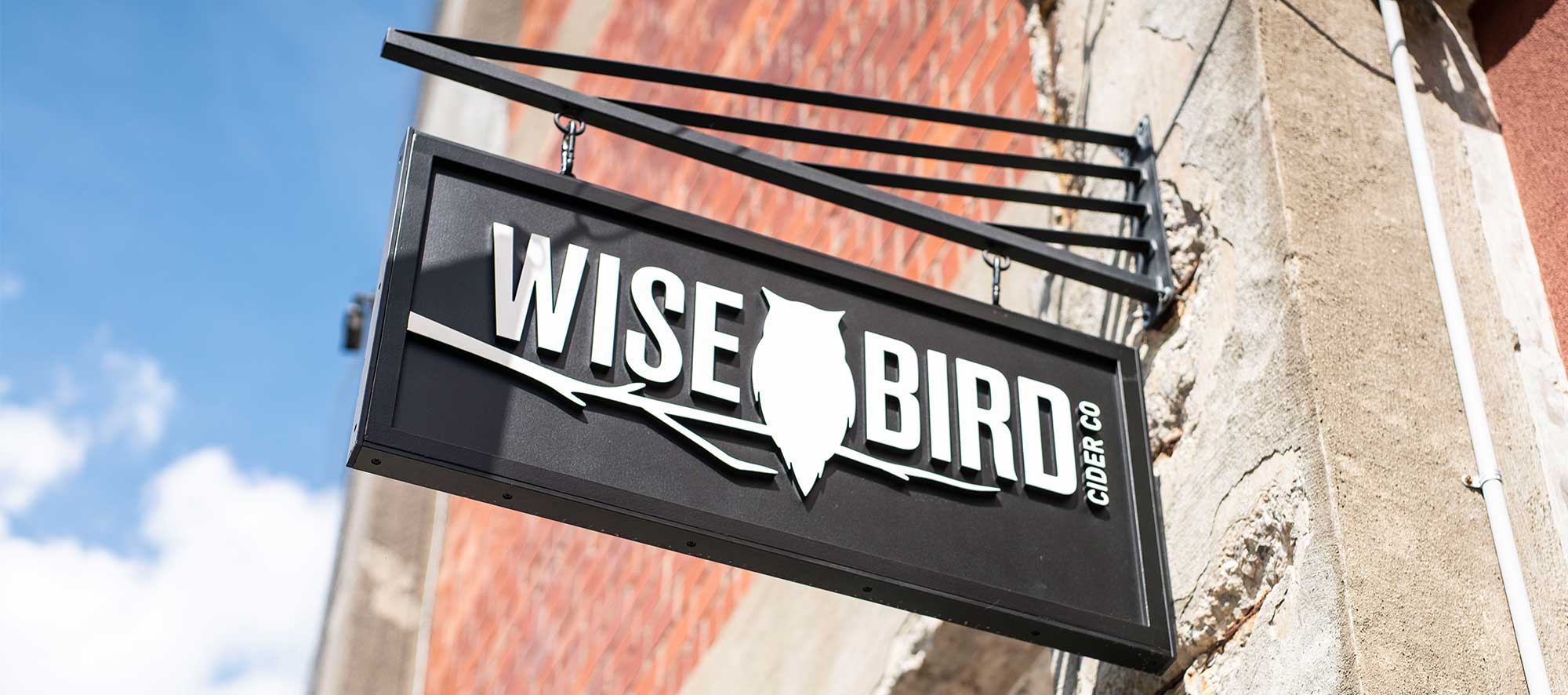
We aim for nothing less than iconic, and we were honored to be entrusted to create Lexington’s premiere cider branding. Simple, strong, and standout, we are thrilled with how the branding mirrors the quality and uniqueness of the product.